Masked Vigilantes on Silent Motorbikes

“As a private person, I have a passion for landscape, and I have never seen one improved by a billboard…When I retire from Madison Avenue, I am going to start a secret society of masked vigilantes who will travel around the world on silent motor bicycles, chopping down posters at the dark of the moon. How many juries will convict us when we are caught in these acts of beneficent citizenship?”—David Ogilvy, advertising executive, 1963

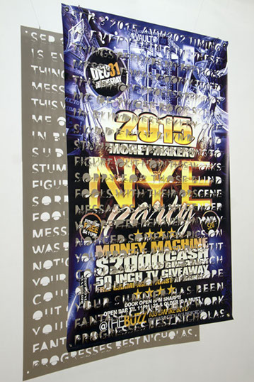
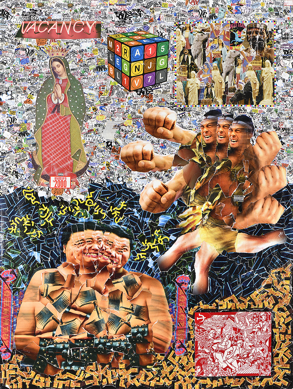
Posters both reflect and shape popular culture. They are put on the street with a simple goal: to occupy the public imagination. A designer can influence culture on a global level with a single compelling image. Posters are also accessible vehicles for everyone from the largest corporations to underground nightlife promoters. Their ubiquity and eye-catching imagery have made posters cultural touchstones with meanings that extend far beyond the products and events they are intended to showcase. Memorable World War I posters, for example, propelled the 19th-century figure of Uncle Sam, the personification of the federal government, and Santa Clause, shown with troops and selling war bonds, into symbols of American patriotism. Movie posters spawn internet memes, gig posters inspire fashion trends, and political posters immortalize the rallying cries that elect presidents or take down governments. Posters are powerful.

Critics, however, have long compared commercial messages in public spaces to visual pollution. In 1887, one London commentator described walls of street posters as “vast vistas of vulgarity.” Although some of the early criticisms of posters look decidedly like conservative resistance to sexually suggestive messages, there have also been concerns about the impact of posters on viewers and their role in the aggressive promotion of capitalism. More recently, organizations like the World Wildlife Fund and UNICEF have condemned the advertising industry for subjecting adults and children to a range of health and social risks related to overconsumption, poor nutrition, and the promotion of materialism. And yet, from bus shelters to private billboards to posters outside construction sites, cities are still filled with large sheets of paper instructing passersby on what to buy, how to think, and what to do.

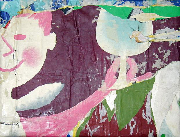
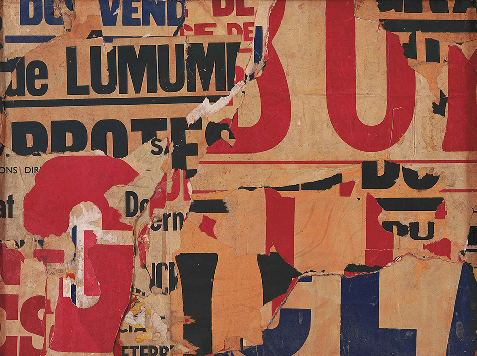
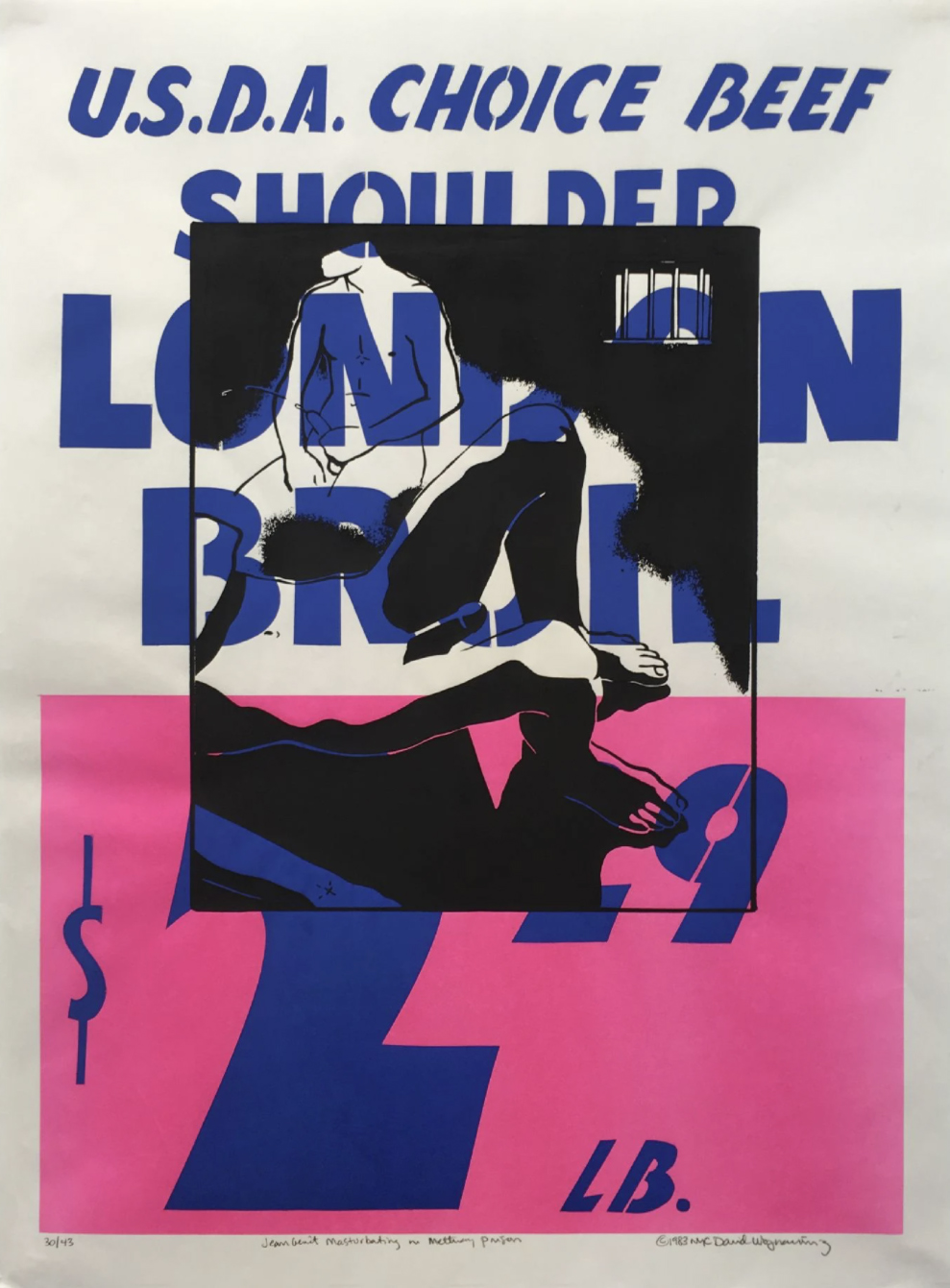
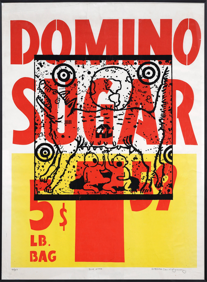
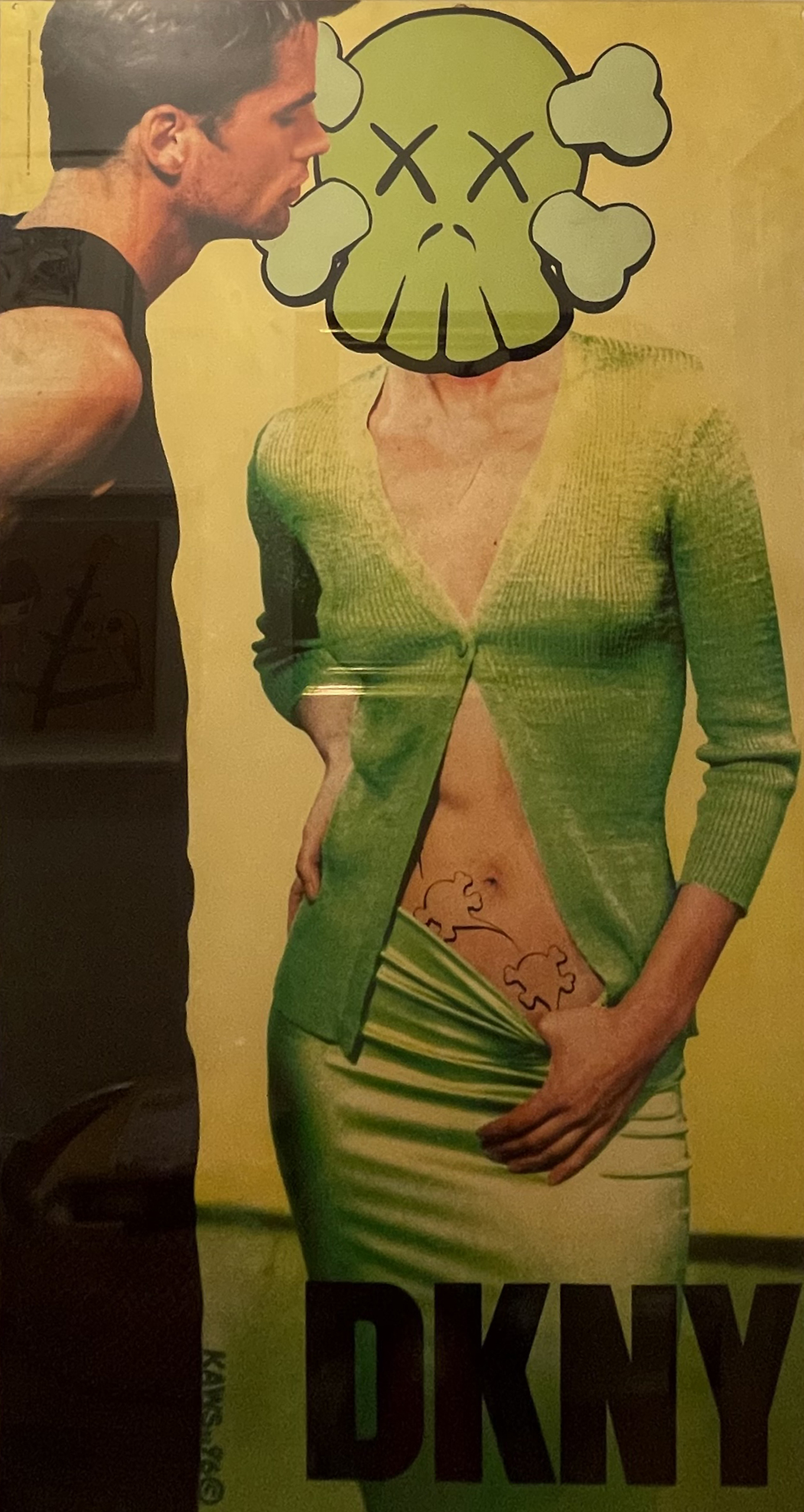
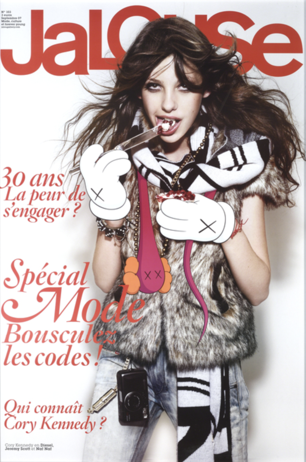
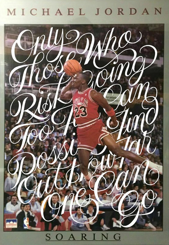
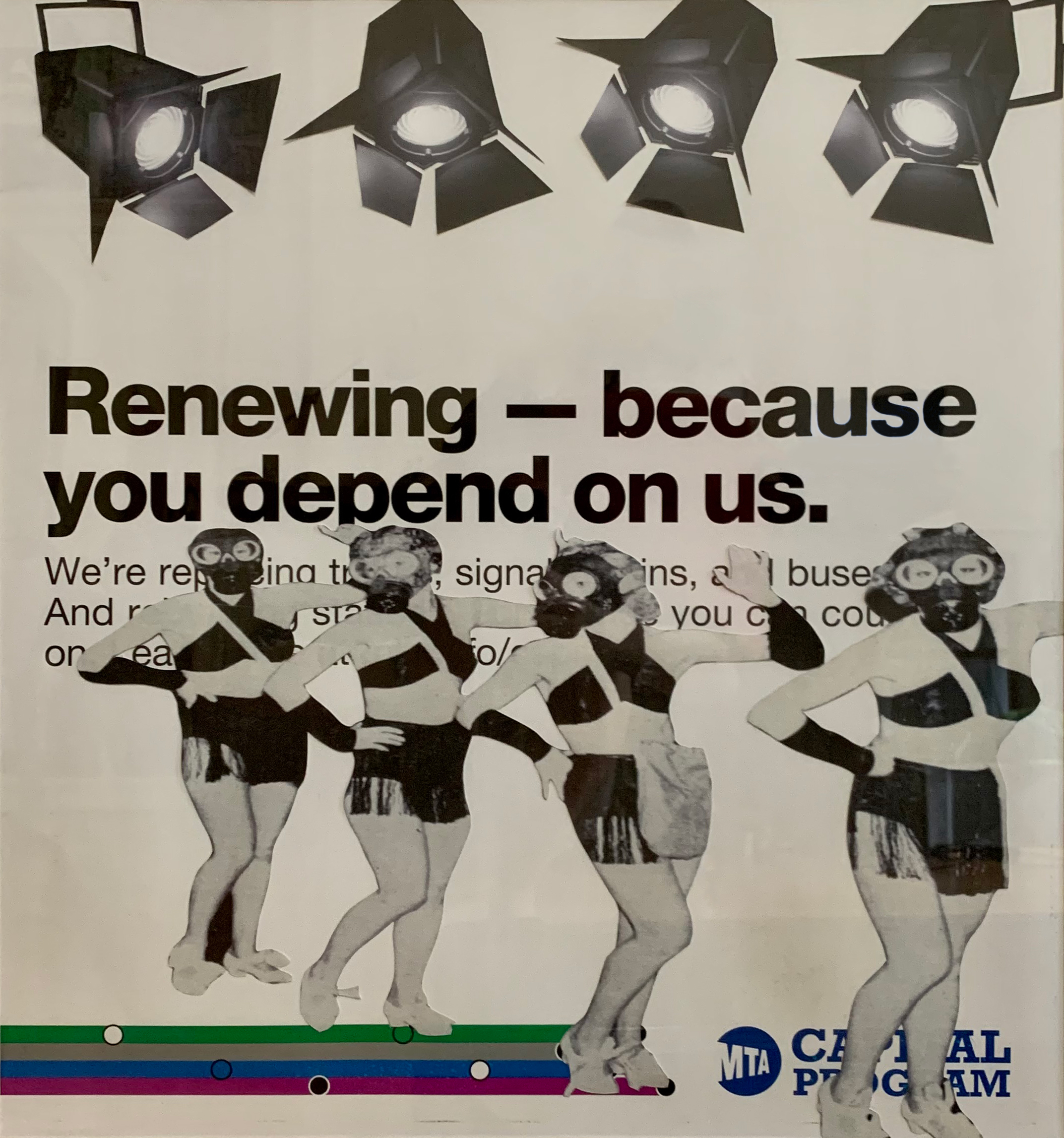
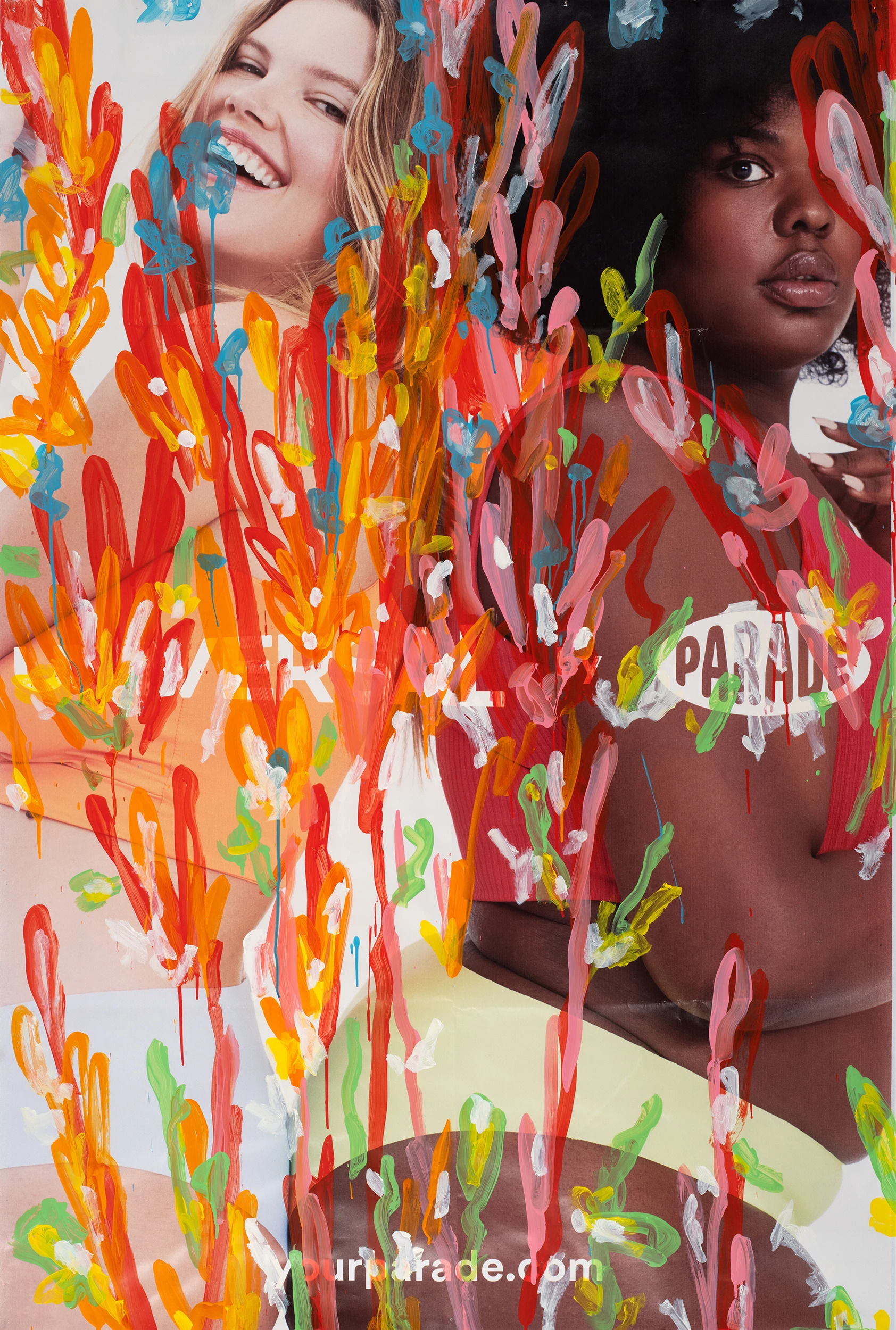
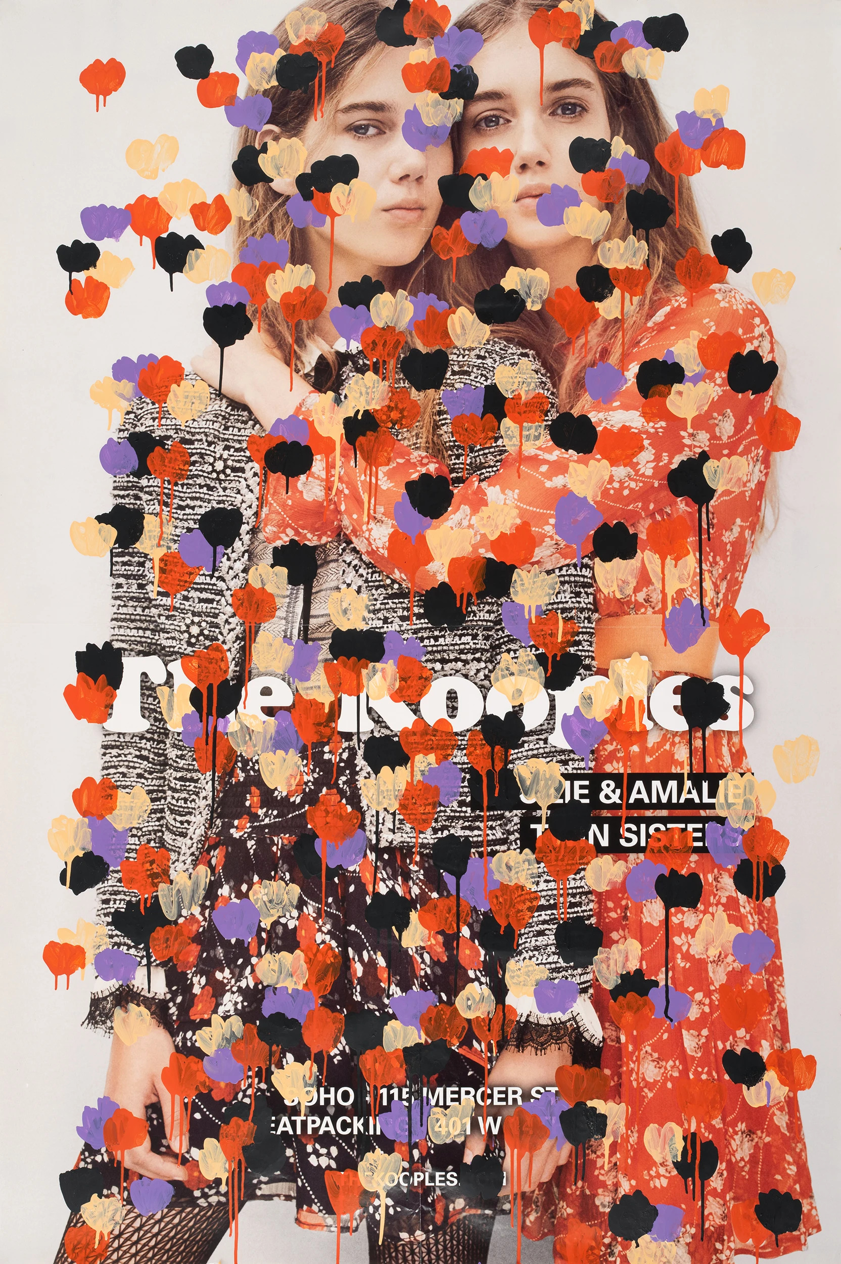
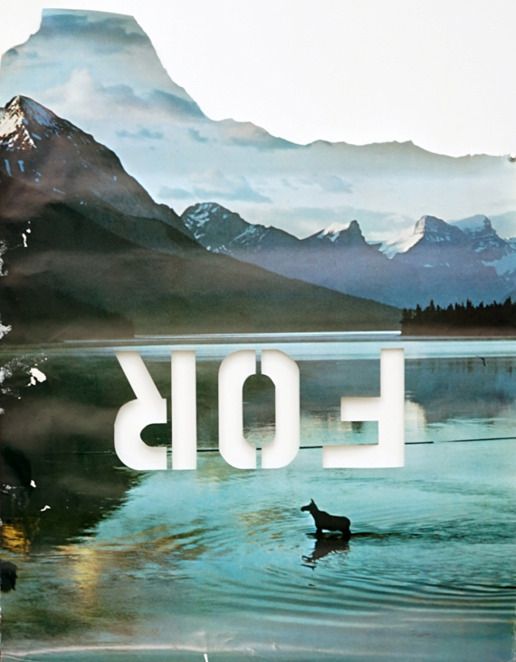
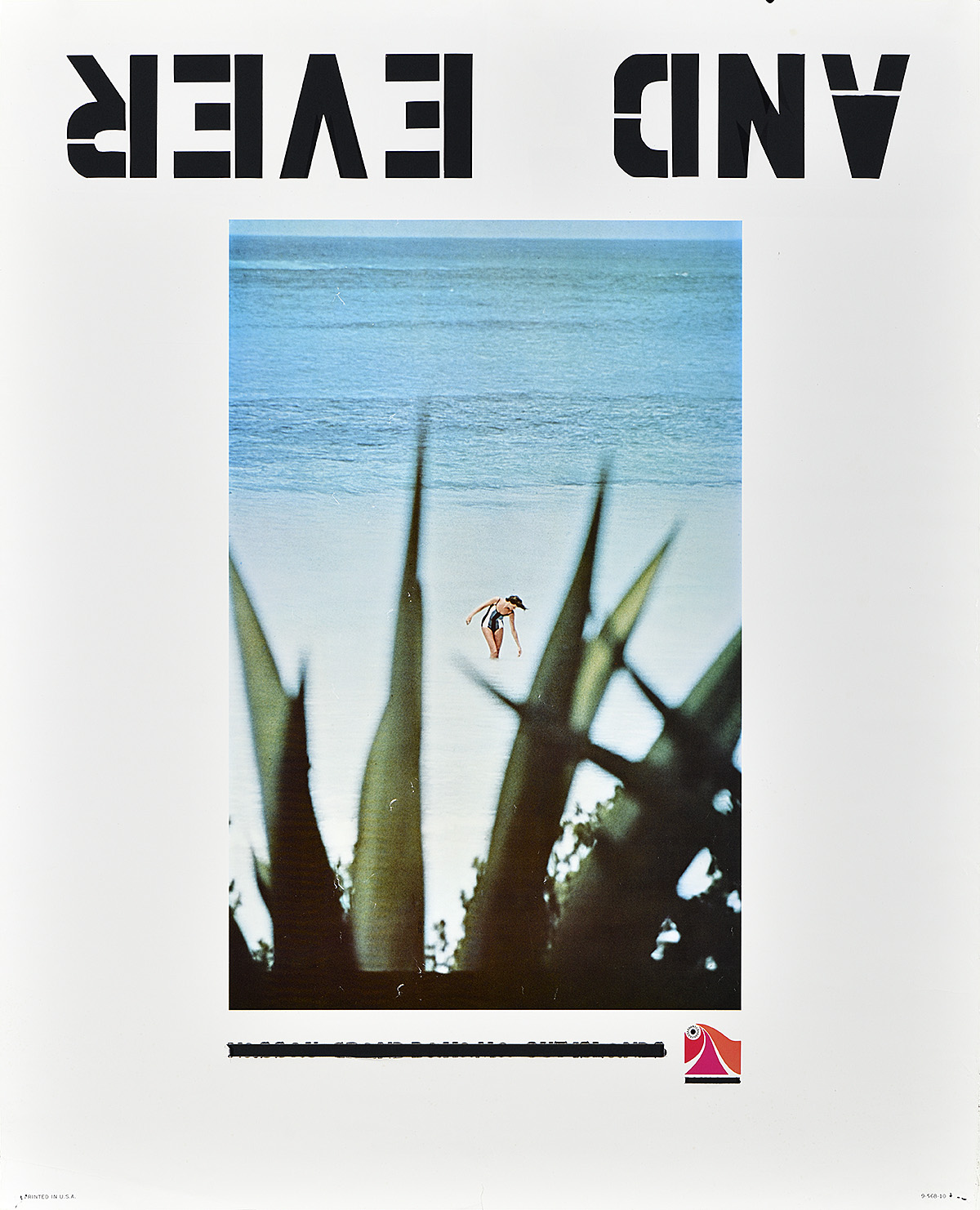
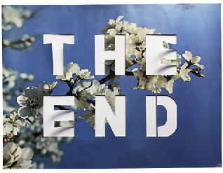
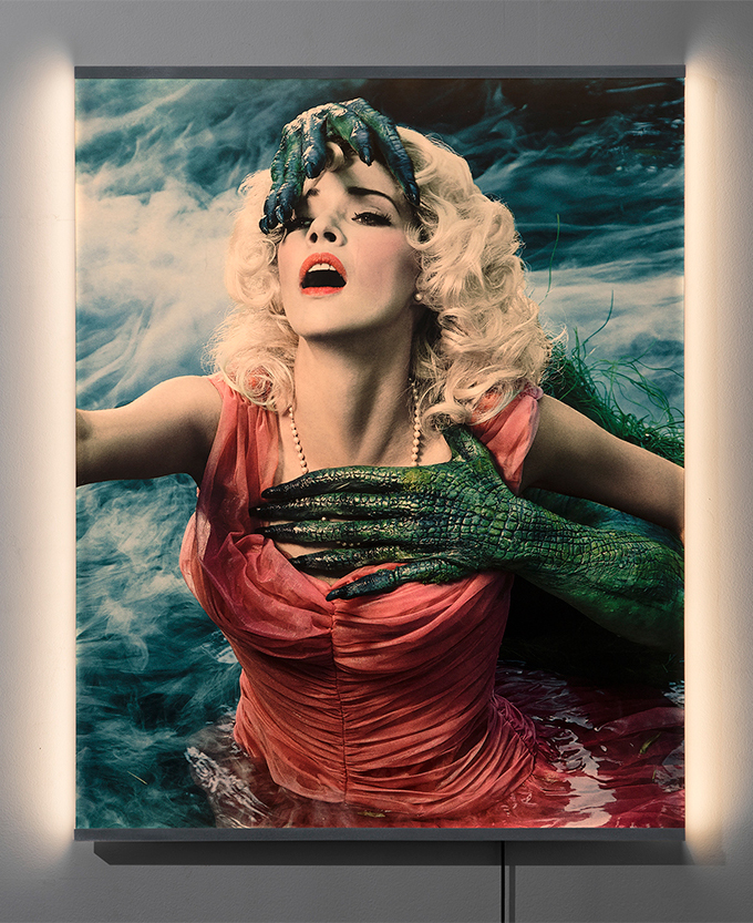
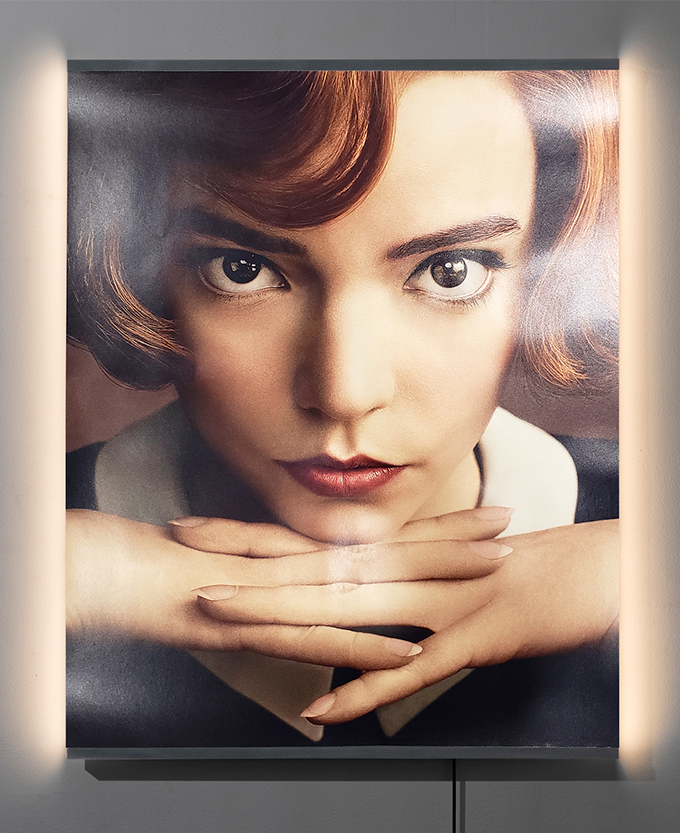
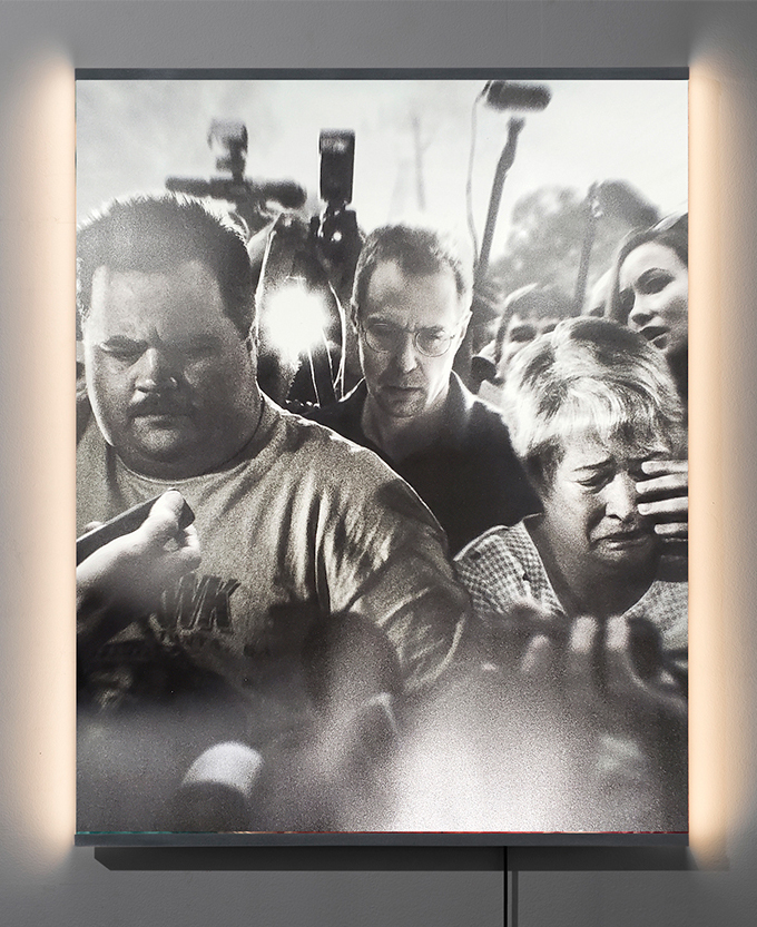
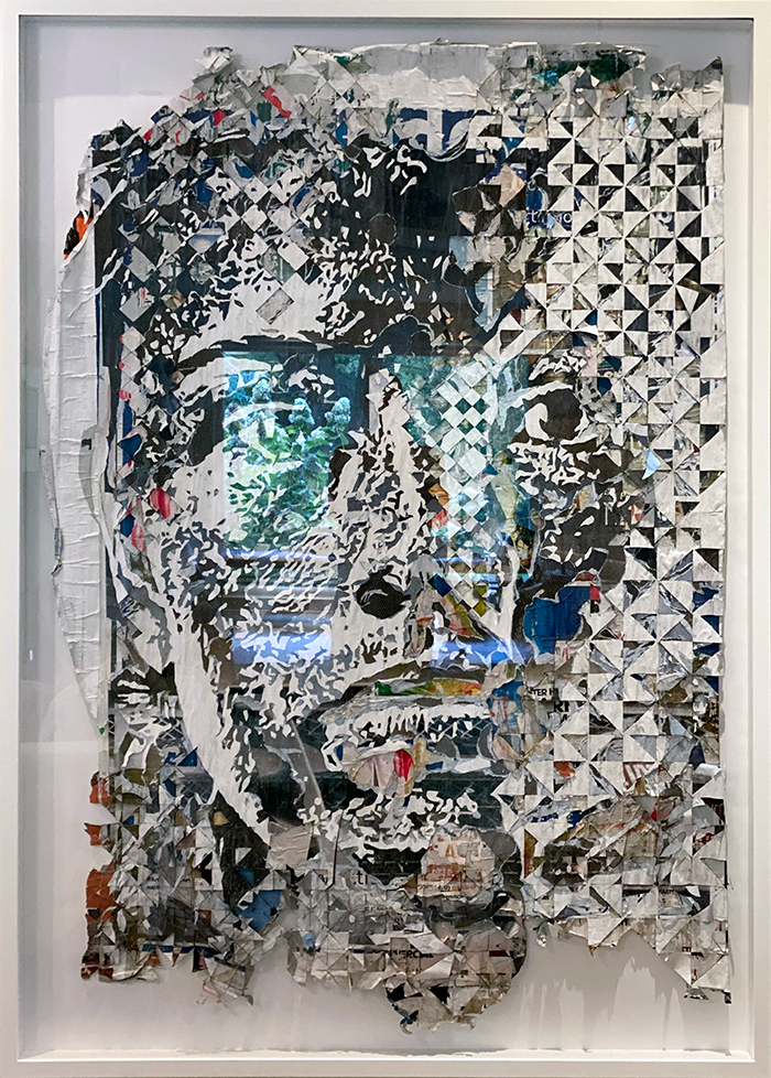
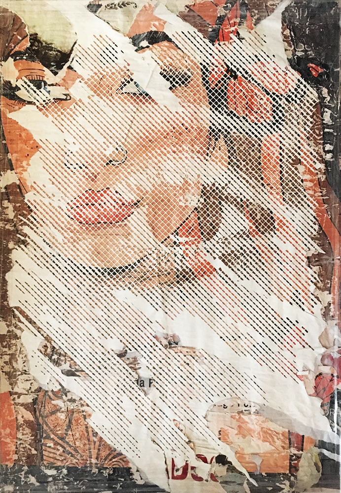
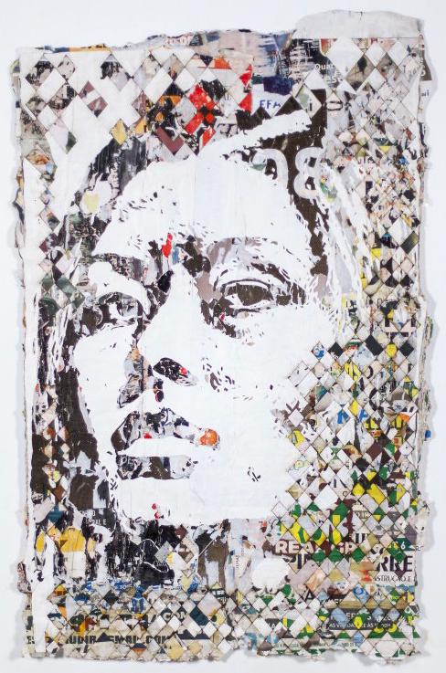
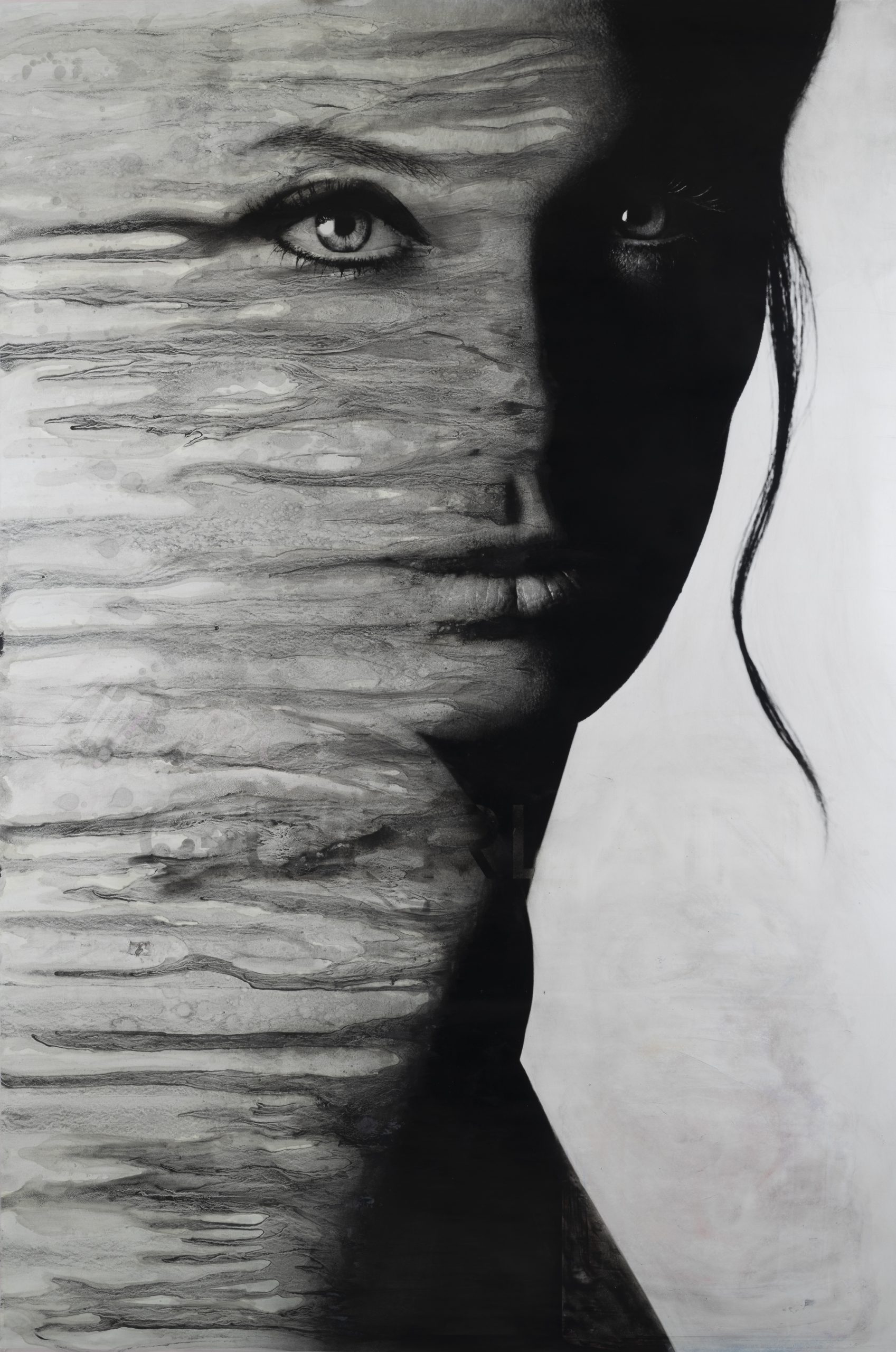
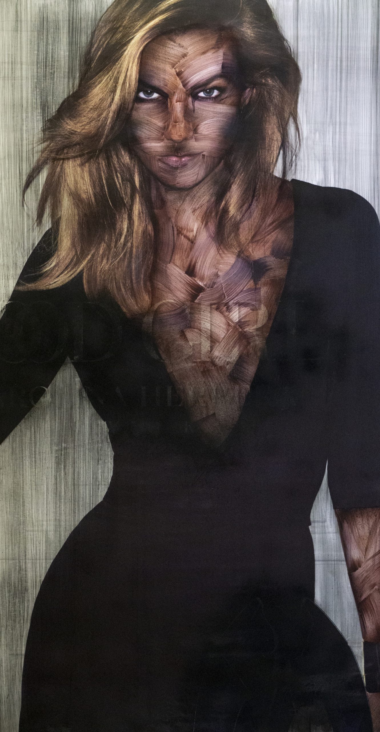
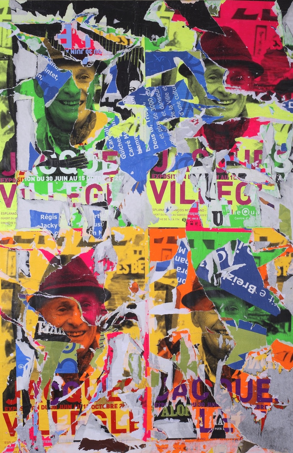
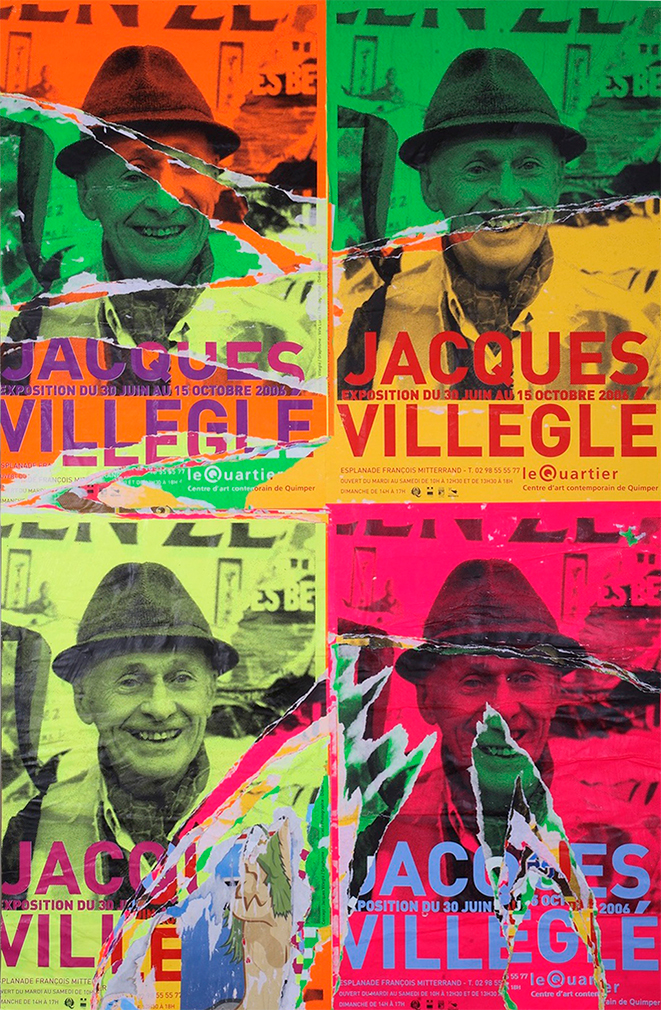
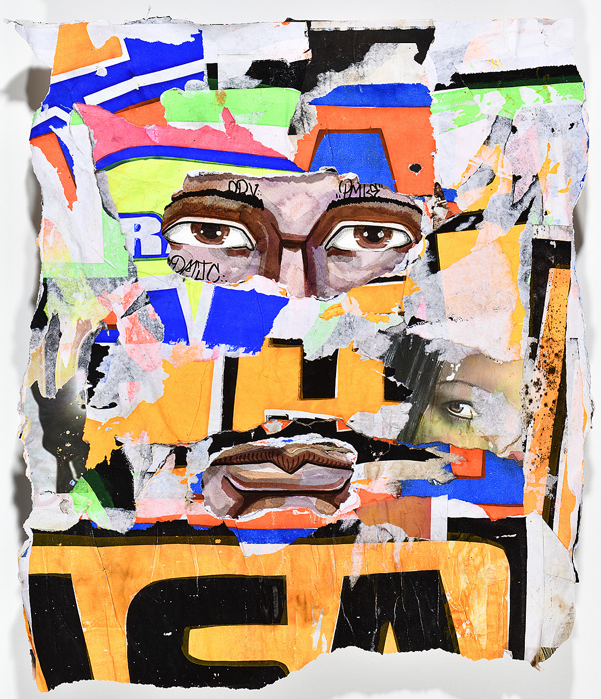
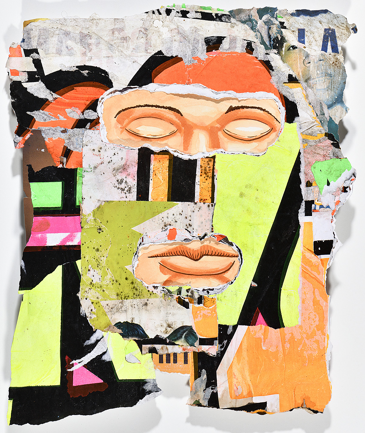
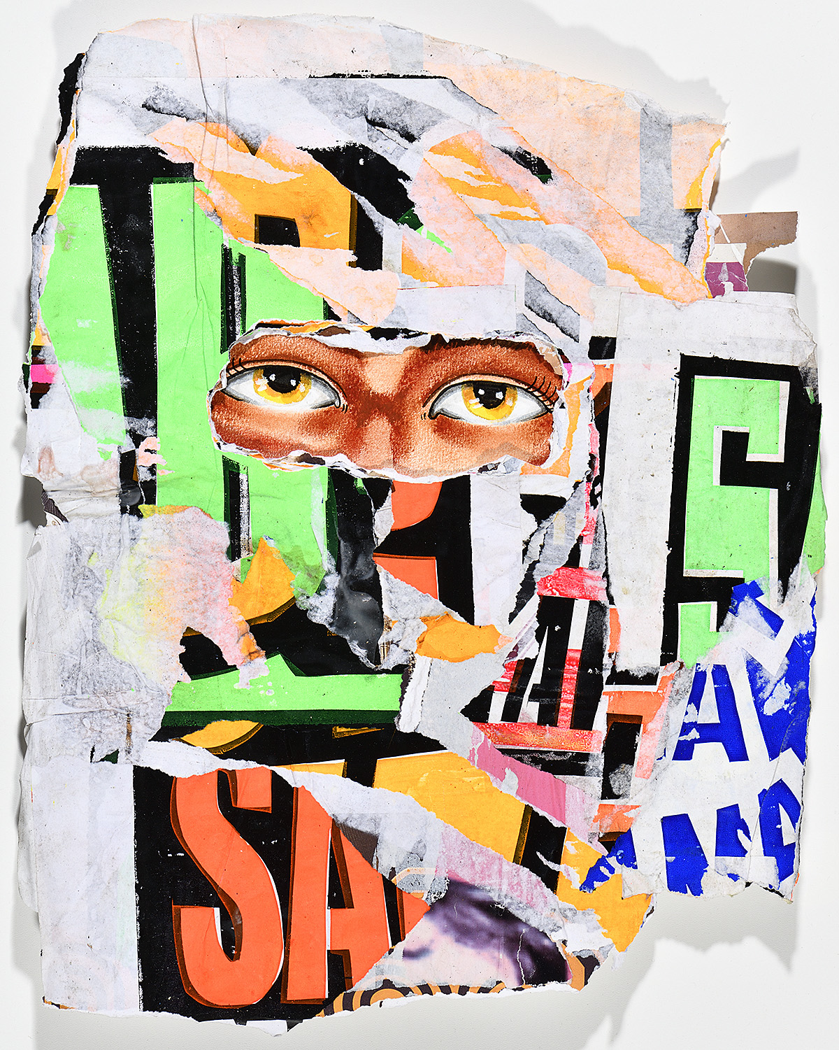
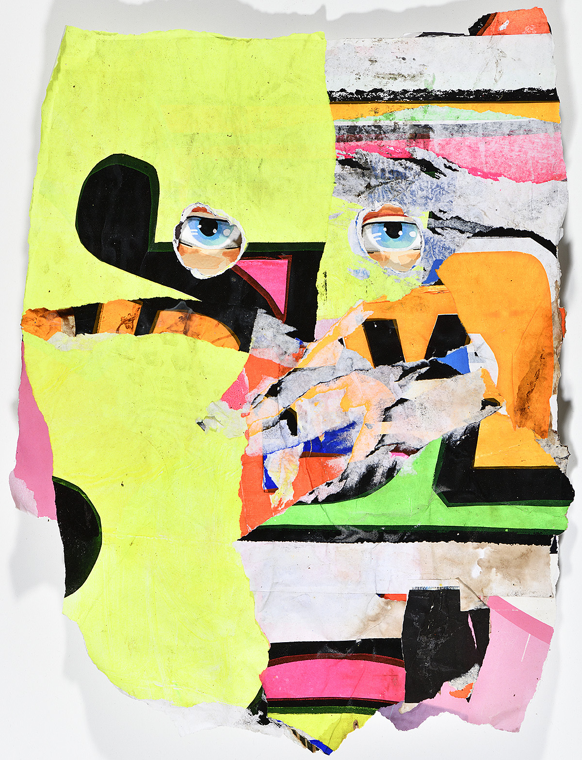
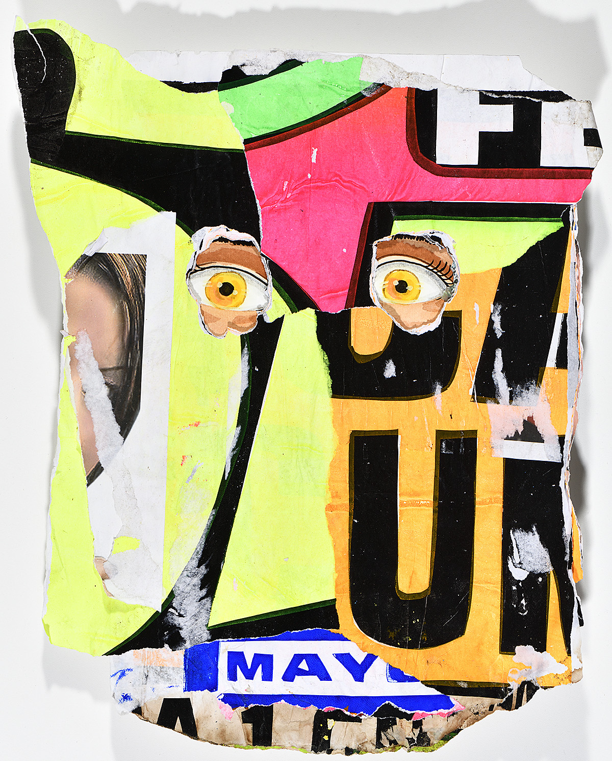
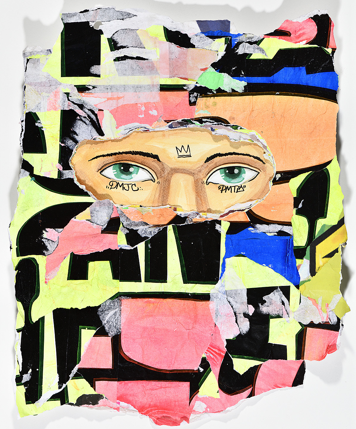
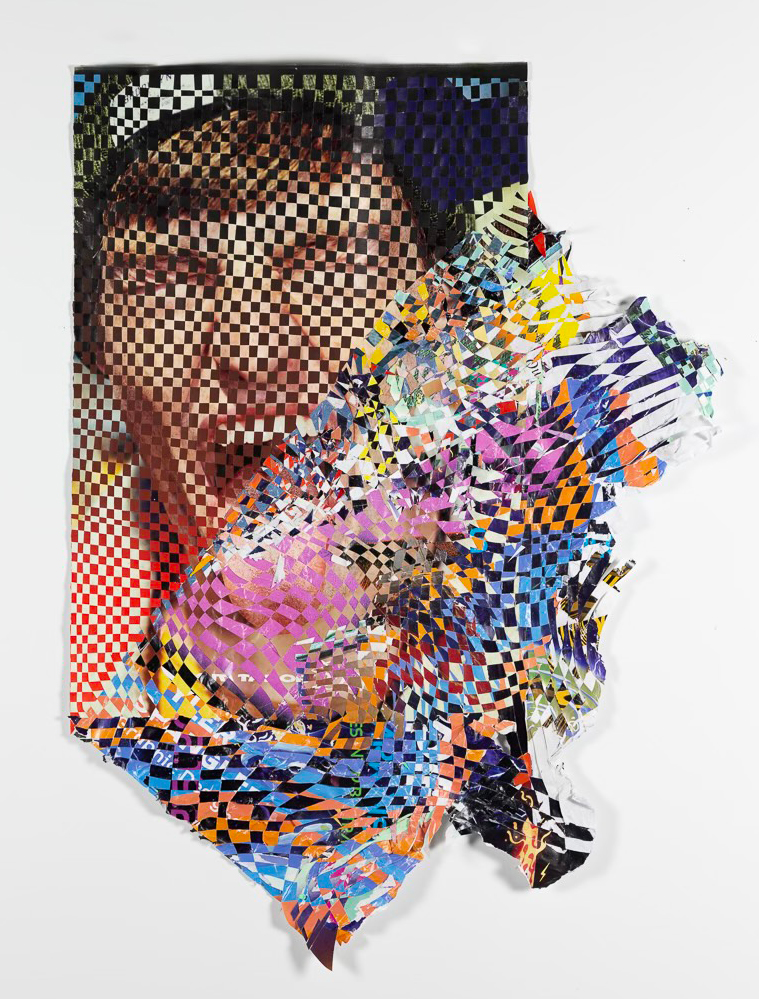
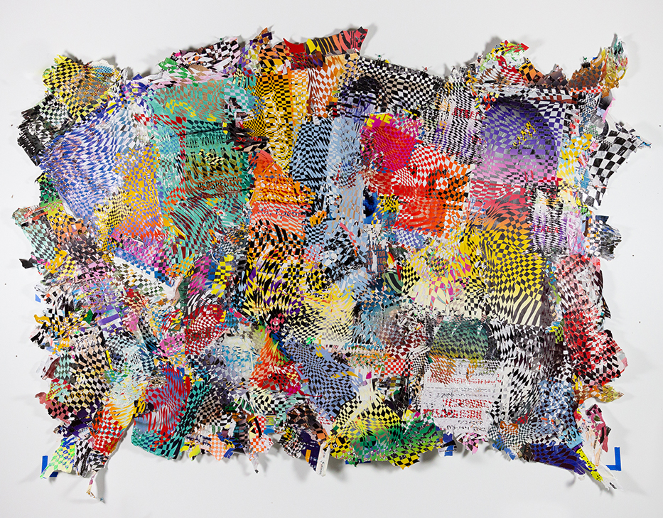
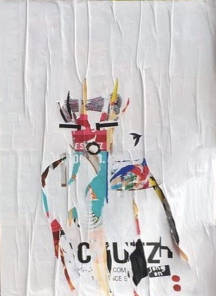
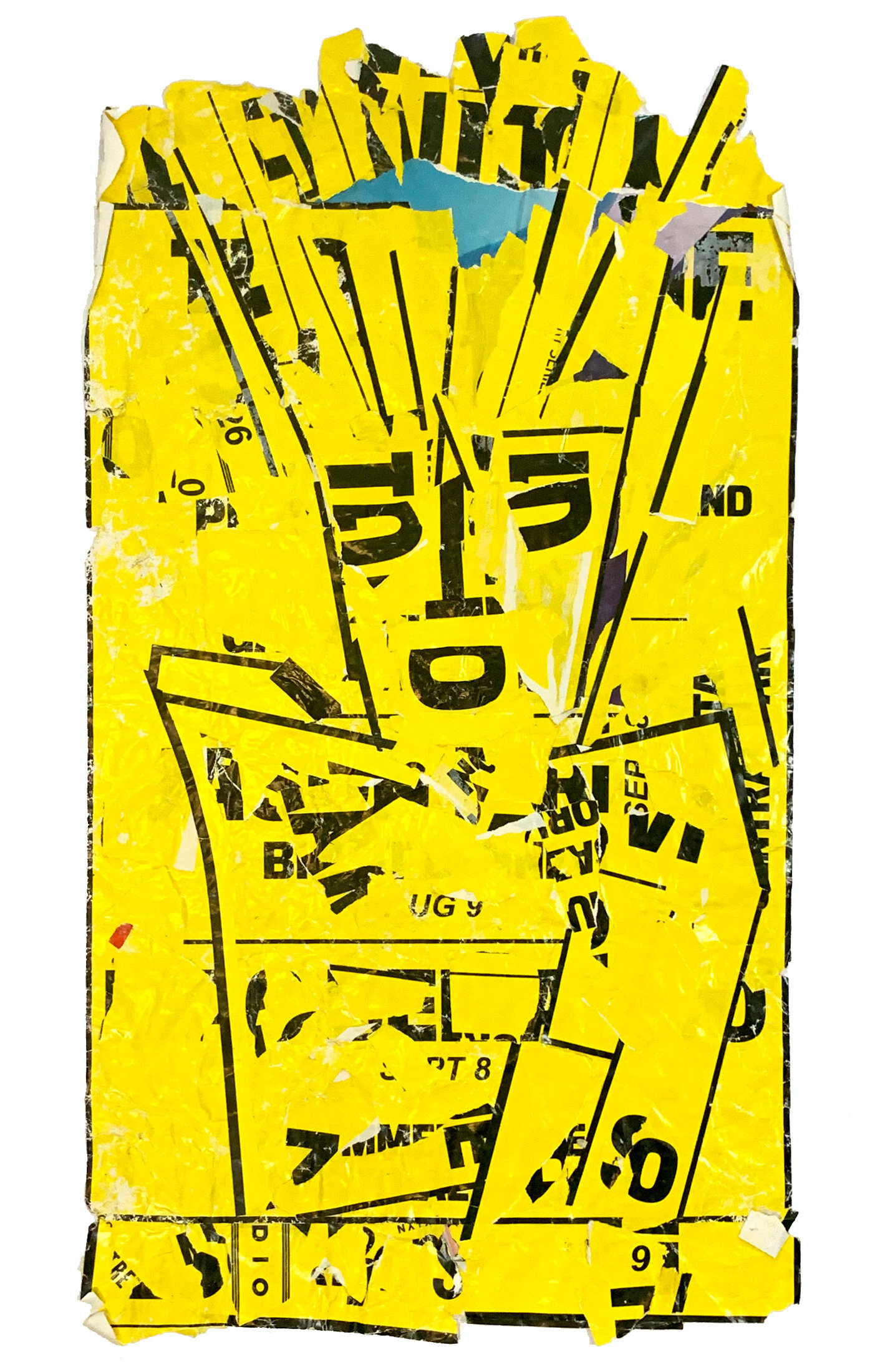
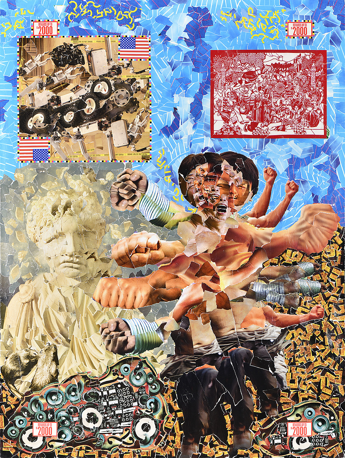
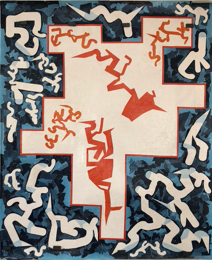
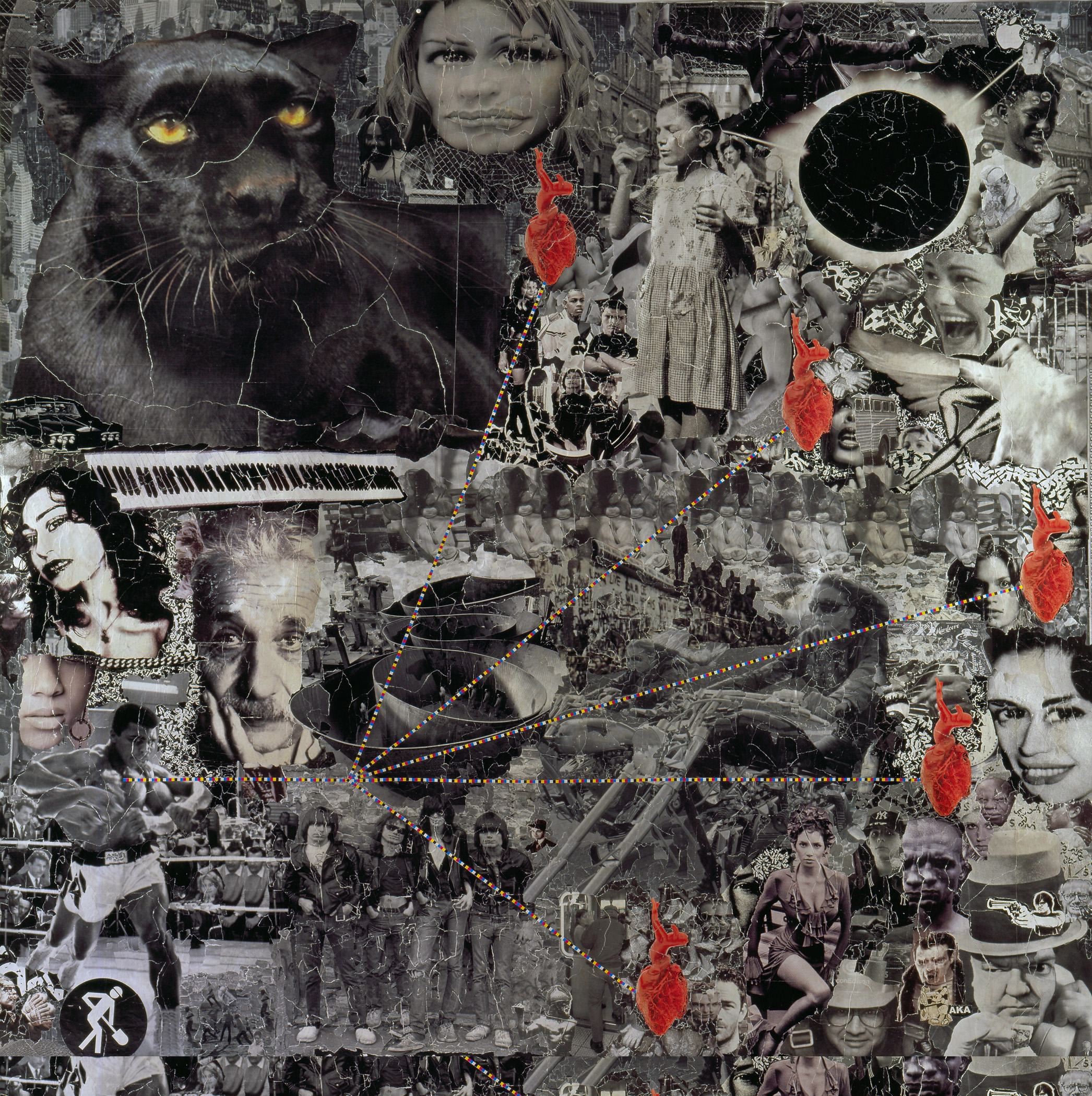
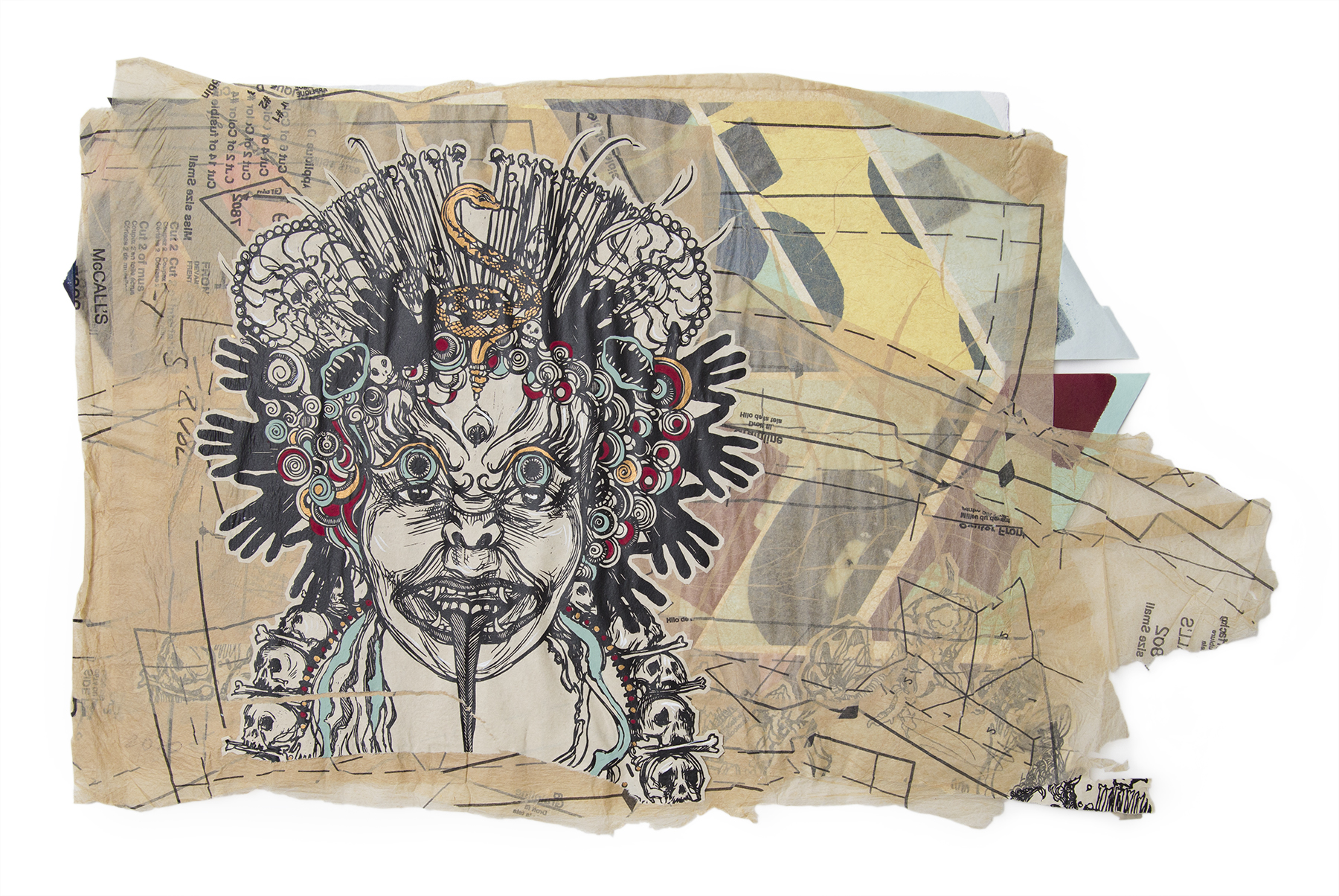
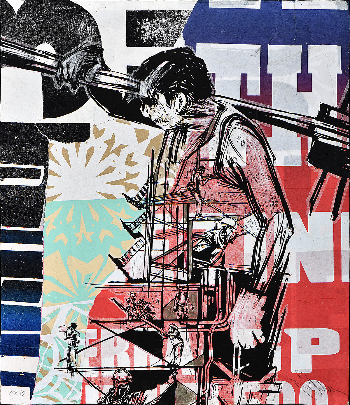
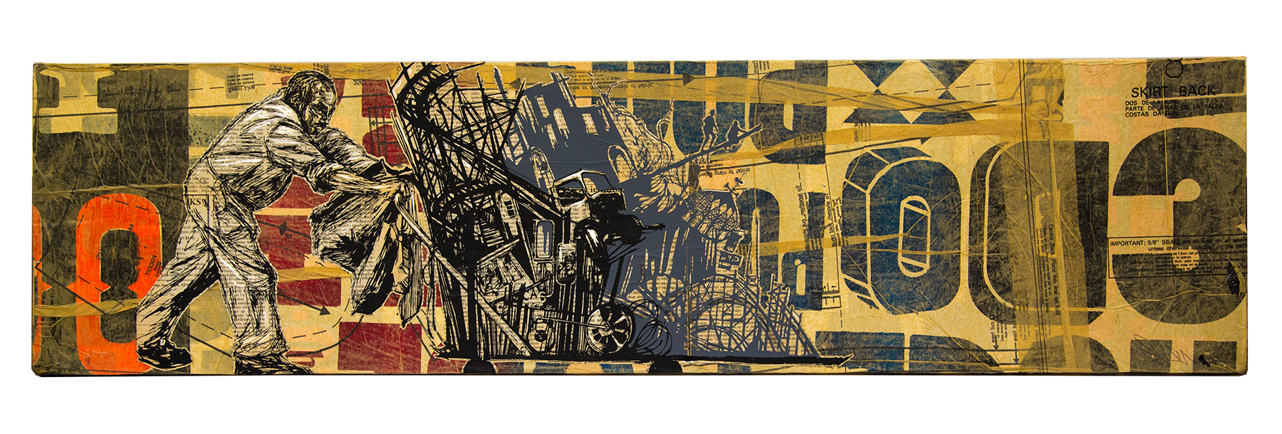
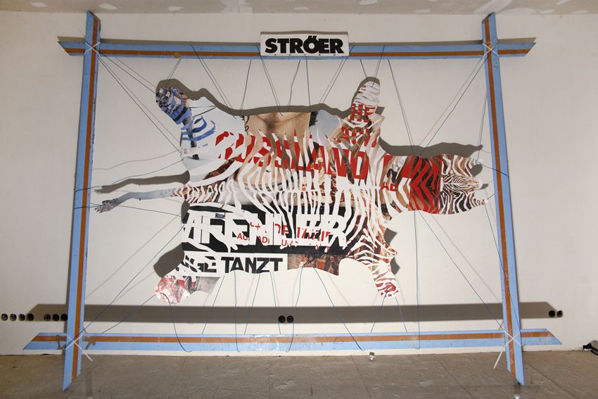
For artists, advertising posters offer easy access to a shared bank of pop-cultural imagery and to the collective imagination. This approach is rooted in the concepts and techniques of French avant-garde artists of the 1950s and ’60s, including the Situationists, the Nouveau Réalistes, and other groups that encouraged artists to recontextualize materials from mass culture to say something new. Their methods, ranging from décollage (literally to “unstick,” used in this context to refer to the making of art from posters torn from walls) to détournement (meaning the “rerouting” or “appropriation” of popular imagery in a new artwork that represents its antithesis), were intended as tools of collective cultural construction. It also relates to the work of postwar American artists, some of whom, like Robert Rauschenberg, applied found objects and printed ephemera to their paintings, and to the Pop art of Andy Warhol and others, which incorporated everyday commercial images. By reconfiguring scraps of posters into works of art, these artists redefined the relationship between brand and audience, criticized or co-opted the powers of capitalism and celebrity, and perforated the line between public and private space. 

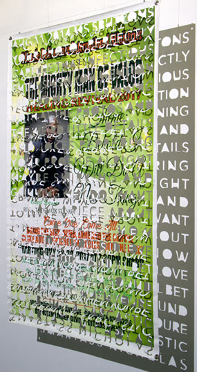
Masked Vigilantes on Silent Motorbikes is not an exhibition of poster art but of art that uses found, reconfigured, and mutilated posters as the raw material for something new. The posters used in these artworks were, for the most part, salvaged from the street by the artists, not directly supplied by the advertisers or printed with the idea of subsequent artistic intervention.

Please be advised that this exhibition contains graphic sexual content and ableist language.

A collaged canvas featuring weathered posters, one of which holds up a glass of water.

Boulevard du Montparnasse, 4 novembre 1961, 1961

Jacques Villeglé (1926–2022)

Posters mounted on canvas
Loan courtesy of the artist, Galerie Georges-Philippe, & Nathalie Vallois

  • Jacques Villeglé was a founding member of the Nouveau Réalistes, a French art movement of the 1960s that embraced “new ways of perceiving the real” in art. The work of the Nouveau Réalistes spanned performance, poetry, sculpture, and painting, but many chose to express “the real” through the use of found materials. In Villeglé’s case, he focused on salvaged posters. His early works are the precursors to everything in this exhibition.
  • The idea of taking posters from the street and using them in artworks can be traced back to the practice of décollage. Villeglé was one of its earliest, most prolific, and most thoughtful practitioners. While making a collage involves building a new artwork by combining material from many sources, décollage entails tearing away at posters in a considered fashion. Villeglé’s décollage works, however, are more like historic documents that have not been subject to the direct intervention of the artist’s hand.
  • To make this and the piece to the left, Villeglé removed sections of ripped and layered posters from the streets of Paris and mounted them on canvas. He joked that “my job is to frame, and then buy a frame.”
  • The central poster in this décollage is part of a design advertising Vichy-Etat mineral water by Hervé Morvan, a popular commercial artist known for his cheery, playful compositions.

A collaged canvas featuring various ripped posters of mismatched text.

Avenue Patrice Lumumba, juillet 1961, 1961

Jacques Villeglé (1926–2022)

Posters mounted on canvas
Loan courtesy of the artist, Galerie Georges-Philippe, & Nathalie Vallois

  • Patrice Lumumba was the first prime minister of the Republic of the Congo between June and September 1960, and had been instrumental in negotiating the end of Belgium’s colonial rule of the country. In January 1961, Lumumba was assassinated during a military coup. The Belgian government was immediately suspected of being involved (this was confirmed years later), which led to international protests. This artwork references those protests, a testament to anticolonial activism in Europe.
  • Villeglé often titled his pieces after the time and place at which he found the posters. In this instance, he invented the street name as a tribute to Lumumba—a bold political statement at the time.
  • The fragmented text in this work can be viewed in several ways. Some literal meanings can be partially deciphered: one poster reads “LUMUM,” with perhaps the word “PROTEST” below it. The work can also be read as a nonsense poem or appreciated purely visually as abstract art. It is also a piece of ephemera documenting the political turmoil of the time.
  • Villeglé’s artworks exemplify a tension that runs throughout this exhibition: both of these objects are the artist’s creations, yet each scrap of paper is a partially preserved design object with its own story.

Addition

It is not unusual for a passenger to see a poster in the subway and be tempted to draw a mustache on the model’s face, an echo of the subversive gesture central to Marcel Duchamp’s L.H.O.O.Q. (1919), in which he drew a mustache on the face of a postcard reproduction of the Mona Lisa. A simple addition of this kind can completely shift how an advertisement is received: a serious message is superseded by a joke or even an insult. The artists in this section participate in a more complex version of the same gesture, using posters as the basis for their creations and responding to what is already on the page by printing or painting on top of it. They have appropriated the posters for their own ends, sometimes hiding the original intent, sometimes complementing it—and often subverting it.

During the 1950s, the avant-garde artists, writers, and poets of the Situationist International developed a powerful artistic and political tactic that they coined “détournement.” The Situationists believed that most people lived in a consumerist realm, one they described as “The Society of the Spectacle,” and that “situations” that broke people out of their consumerist daze were essential first steps in the overthrow of capitalism. Détournement, the practice of appropriating existing imagery or ideas and twisting their meanings to critique a dominant cultural narrative, was one way of creating such “situations.” It is also the intellectual and technical starting point for many artists who work with posters. 

The value of détournement is that mainstream imagery can be used to draw attention, while an unexpected distortion of that imagery then jolts the viewer out of the meaningless consumption of everyday life. Détournement thus aims to turn popular culture and branding against itself. It has most notably been implemented by punk-rock graphic artists and anti-advertising organizations like Adbusters.

Today, détournement has been partially recuperated by capitalism: it might be as common a tactic among leftwing activists as it is among streetwear-clothing brands. Within this exhibition, many artists (some of them also activists) use détournement to create a familiar entry point into an artwork, but only some share the Situationists’ radical intentions. Despite its political roots, contemporary détournement is first and foremost an artistic technique.

A silkscreen supermarket poster stamped with a figure masturbating in a prison.

Jean Genet Masturbating in Metteray Prison (London Broil), 1983

David Wojnarowicz (1954–92)

Silkscreen on supermarket poster, number 28/43
© Estate of David Wojnarowicz. Courtesy of the Estate of David Wojnarowicz & P·P·O·W, New York

  • Wojnarowicz made this piece at a time when openly gay men in the United States were often subject to prejudice and hatred. It depicts the French novelist Jean Genet in a penal colony, suggested here by the window bars. Genet was found guilty of petty theft and incarcerated for two and a half years while still a teenager—an experience he described in his 1946 novel Miracle of the Rose. David Wojnarowicz felt a kinship with Genet, a fellow openly gay political activist who embraced the criminal fringes of society and worked in the sex trade.
  • He wrote that “to make the private into something public is an action that has terrific ramifications.” By printing images representing private subversion on generic posters, Wojnarowicz made such countercultural narratives very public. By cropping the faces of his figures or hiding them in shadow, he encourages viewers to project themselves into this scene of illicit queer desire.
  • Wojnarowicz later became a prominent activist, making art that demanded politicians address the devastation of AIDS as a health crisis rather than as some kind of moral comeuppance for the gay community. In 1992, he died of an AIDS-related illness at the age of 37.

“Every time you go on the streets, there’s a million ads about men and women kissing each other. I am invisible. Why wouldn’t I speak about it?”—David Wojnarowicz

A silkscreen supermarket poster stamped with two babies trying to nurse from a wolf.A silkscreen supermarket poster stamped with two babies trying to nurse from a wolf.

True Myth (Domino Sugar), 1983

David Wojnarowicz (1954–92)

Silkscreen on supermarket poster, number 23/47
© Estate of David Wojnarowicz. Courtesy of the Estate of David Wojnarowicz & P·P·O·W, New York

  • David Wojnarowicz combined popular imagery with his own iconography to create juxtapositions and suggest counternarratives. He was interested in exploring what he called the “pre-invented world”—the social norms that people have imposed upon them. Through his practice, he questioned dominant historical and social narratives, those written by and for the victors.
  • The image of two babies reaching up hungrily with open mouths to the teats of a she-wolf references the story of Romulus and Remus, twin brothers sentenced to death by their uncle, a powerful king, and left to die by the Tiber River. The infants were saved by divine intervention and the she-wolf that suckled them. Many years later, Romulus killed Remus and became the founder of Rome. The story became the city’s founding legend and the image of the young boys with the she-wolf its symbol.
  • By combining a violent, ancient political myth with a modern supermarket poster, Wojnarowicz encouraged his audience to consider the empires that had crafted such mythologies, and, more importantly, the political and social structures that supported them. He draws attention to everyday acts of violence (often committed by the state) that maintain a supposedly peaceful status quo of ignorance, bliss, and, in this case, plentiful sugar.

A photo-offset poster of a model with a skull head standing next to another model.

Untitled (DKNY), 1996

KAWS (Brian Donnelly, b. 1974)

Acrylic on poster
Loan courtesy of Andre Ljustina, Los Angeles

  • In the era before social media, KAWS built his own luxury brand by hijacking the advertisements of such internationally recognized companies as DKNY and Calvin Klein, inserting his personal logos (like the skull and crossbones with X’s for eyes), and reinstalling the painted posters in the bus shelters and payphones from which he had taken them. Before KAWS had become a household name, and artistic collaborations with international fashion conglomerates had become commonplace, such interventions, commonly referred to as “ad disruptions,” might have led the casual observer to believe that he was actually working on a campaign with a high-fashion brand.
  • Graffiti writers tend to pass down secrets from generation to generation, such as instructions for making homemade painting tools or breaking into certain buildings. Barry McGee, a well-established fellow graffiti writer and artist nearly a decade his senior, gave KAWS a special tool that allowed him to open up payphones to access posters.
  • KAWS’s paintings are fascinating examples of détournement. While he is a master of the technique, he has never shared the Situationists’ countercultural or anticapitalist ideologies. His “ad disruptions” can be described as cunningly parasitic or aspirational, more subversive than critical. He admires the photographers, designers, and brands whose works he modifies, and does not align politically with anti-advertising activists.

A photo-offset print magazine cover of a model with cartoon hands drawn over theirs.

Jalouse, 2007

KAWS (Brian Donnelly, b. 1974)

Offset print
Loan courtesy of Tanley Wong, New York City

  • By the mid-2000s, KAWS no longer needed to manufacture fake connections to major brands. His work has become so sought after that his artistic brand rivals those he once appropriated, and his professional collaborations are now licensing deals instead of illicit takeovers.
  • In 2007, the French fashion magazine Jalouse commissioned KAWS to design the cover of its September issue. Posters featuring the cover image were installed throughout Paris, including outside the now-defunct, trendsetting boutique Colette.

A photo-offset poster of Michael Jordan shooting a basketball with text behind him.

Soaring, 2022

FAUST

Screenprint on poster, numbered 1/23
Loan courtesy of the artist

  • FAUST began his career as a graffiti writer, where his distinctive and refined handstyle elevated a gesture derived from vandalism to that of artistic calligraphy. Today, he continues to execute elegant text-based works in public spaces and in his studio. FAUST is also an accomplished designer, collaborating with such major brands as Nike, The Gap, and Tiffany & Co.
  • Soaring is FAUST’s update on the classic sports-hero poster. While similar images of pop stars and sports icons are inexpensive and disposable, they are also the first pieces of visual art to which many people have access. A generation of kids hung posters like the original Soaring on their walls, inspiring themto borrow from the iconic 1991 Gatorade campaign featuring Michael Jordan—to “Be Like Mike.”
  • Each print in this series is slightly different. FAUST sourced the 1988 vintage posters online, collecting examples that range from pristine to slightly tatty. He then updated each image by screenprinting a quote from Jordan over the background.
  • The photograph of Jordan is by Andrew D. Bernstein, a long-time sports photographer known for his iconic images of NBA players including Jordan, Kobe Bryant, and Magic Johnson.
  • The edition size of 23 refers to the number of the jersey that Michael Jordan used throughout his career.

A mixed-media poster of dancers wearing gas masks on stage with transit text behind them.

Renewing Because You Depend On Us, c. 2010

Jilly Ballistic

MTA poster, laser print, & adhesive
Loan courtesy of the artist

  • Brooklyn artist Jilly Ballistic is best known for her work in the New York City subway system where she modifies existing advertisements or takes advantage of blank spaces to add her own politically charged messages. Her work is often anticapitalist, anticonsumerist, and pro-queer. For many New York City commuters, Jilly Ballistic’s practice is an unexpected introduction to détournement.
  • For this collage, Ballistic added 1940s photographs of dancers from the Windmill Theatre in London to a subway poster issued by New York City’s Mass Transit Authority (MTA). Even at the height of the Blitz, in 1940 and ’41, the theater remained open. Each week, hundreds of Allied soldiers visited the cabaret for free alongside paying Londoners. The “Windmill Girls,” who notoriously posed nude and motionless in a variety of tableaux, became minor celebrities, and staged photographs of them dancing in gas masks or sleeping on cots in the underground levels of the theater were frequently printed in the press.
  • Ballistic’s addition of the images of the Windmill Girls changes the meaning of the phrase “renewing—because you depend on us” from an official acknowledgment of a minor inconvenience into a feminist declaration as it recognizes the essential morale-boosting work of a group of largely forgotten female entertainers during wartime.

A photo-offset poster of 2 models advertising underwear, obscured by painted multicolor lines.

Untitled (Molly Constable and Gia Love for Parade, 2020), 2021

Michael De Feo (b. 1972)

Acrylic on poster
Loan courtesy of the artist

  • While artists choose the found posters they use in their work, they inevitably depend on whatever the industry is producing. If a particular style, look, or body type does not appear in fashion advertisements, it is unlikely to make it into De Feo’s paintings. By drawing attention to existing fashion advertisements, De Feo encourages the viewer to consider some of the sources of our conventional understanding of beauty. 
  • Founded in 2019, Parade positions itself as a new kind of fashion brand. Cami Téllez, the company’s CEO, has said, “I grew up going to the mall, seeing supermodels blown up on storefronts and thinking: this is what it means to be sexy…we’re rewriting the American underwear story—in full-spectrum color.” Brands like Parade are now responding to a growing demand for the representation of more racial diversity and a wider range of body types in advertising. This gives De Feo and other artists a broader choice of material.

“De Feo’s fashion interventions are a dialogue, a call-and-response with the power of the given image.”—James Danziger, gallerist

A photo-offset poster of 2 models advertising clothes, obscured by painted dripping dots.

Untitled (Amalie and Cecilie Moosgaard for The Kooples, 2016), 2021

Michael De Feo (b. 1972)

Acrylic on poster
Loan courtesy of the artist

  • Twin sisters Amalie and Cecilie Moosgaard were teenagers when they modeled for the high-end fashion brand The Kooples. While the original advertisement uses the girls’ youth and innocence to sell clothing, De Feo’s addition to the poster transforms it into a portrait of sisters holding each other in a field of flowers.
  • De Feo made all three of the works in this exhibition specifically for display in a gallery or museum rather than as advertising disruptions on the street. 
  • The artist’s passion for flowers has earned him the nickname “The Flower Guy.”

A photo-offset poster of Natalie Portman advertising perfume, obscured by painted flowers.

Untitled (Natalie Portman for Miss Dior, 2013), 2021

Michael De Feo (b. 1972)

Acrylic on poster
Loan courtesy of the artist

  • Michael De Feo has been installing art on the street for nearly 30 years and has worked with bus-shelter posters since 2015. He is typically drawn to fashion advertisements representing youth, femininity, sexiness, and luxury. He superimposes flowers over these images to add a sense of ephemeral beauty and supersede their corporate messaging. 
  • Like KAWS, De Feo has returned some of these painted posters to the street, reinstalling them at bus shelters as if they have the same authority as the original advertisements. 
  • Bus-shelter advertising kiosks can only be opened by specialized tools, nicknamed “keys” because of the way they allow access to a forbidden space. De Feo obtained his “key” from Jordan Seiler (also included in this exhibition), who also sells the homemade tools as small sculptures.
  • In this piece, an oversized Miss Dior perfume bottle—prominent in the original poster—is obscured by flowers. Unlike KAWS, who integrates corporate logos into his work, De Feo minimizes the branding, creating meanings that largely mask the corporate messaging of the poster while responding to the content and celebrating the creative work of the models and photographers. 
  • Despite the way he treats branding, De Feo’s work has also caught the attention of the corporations whose posters he modifies. Some companies have reappropriated his appropriations, posting photos on social media. These paintings do not represent artistic protest against the fashion industry or capitalism. Rather, they show De Feo adapting its imagery to his own aesthetic vision.

Subtraction

The artists in this section cut away, manipulate, and obscure their source material, subtracting to emphasize absence, disfiguration, negative space, and the hidden. By working specifically with advertising images, they address what it means to live in a modern city and the role of capitalism in defining culture. Some reveal ideas lurking just below the surface of the posters, while others mount an all-out attack, distorting and covering content as if proposing that these advertisements should never have existed in the first place. Each engages with the important role of branding in contemporary culture, removing what is already there or offering elements of their own identities as they eliminate the commercial content. The artist Vhils calls this subtraction process “creative destruction.”

Removal and erasure are well-established tactics in modern and contemporary art, as demonstrated by Robert Rauschenberg’s Erased de Kooning Drawing (1953), Jean-Michel Basquiat’s crossing out of words on canvases, and Jenny Holzer’s Redaction Paintings (an ongoing series she started in 2005) that feature images of redacted documents declassified by the U.S. government. 

Posters are designed to move the viewer, typically encouraging the purchase of a product or the embrace of a specific idea. The pieces in this section shift the focus, directing the viewer away from the advertiser’s original intent. This approach evokes the German philosopher Martin Heidegger’s notion of “sous rature”—a visible erasure or redaction that draws attention to what is missing. Viewers are encouraged to consider what they see on the wall, but they are inevitably left wondering about what has been removed. The substance of the art lies somewhere between those two positions.

A photo-offset poster depicting text overlaying a mountain range with flowing water.

A photo-offset poster depicting text overlaying a mountain scene and a body of water.

A photo-offset poster depicting text overlaying plants covering a beach scene.

A photo-offset poster depicting text overlaying ruins on a mountain.

A photo-offset poster depicting text overlaying a mountain and greenery landscape.

A photo-offset poster depicting text overlaying a smoky forest landscape.

A photo-offset poster depicting text overlaying evergreen trees on a mountain.

A photo-offset poster depicting text overlaying white flowers.

Falling From Paradise
FOR EVER
AND EVER
AND EVER
AND EVER
AND EVER
WHAT EVER
THE END
, 2016–22

Ghost of a Dream (est. 2008)

Hand-cut posters
Loan courtesy of the artists

  • Ghost of a Dream is the collaborative project of artists Lauren Was and Adam Eckstrom. The name comes from their choice of materials, which they describe as “ephemera created from people trying to attain their hopes and dreams—usually in a too-quick method.” They often use discarded lottery tickets and pulp-romance novels in their work.
  • This installation is made from vintage travel posters. Was and Eckstrom have cropped or cut out segments of advertising copy, leaving just the photographs of idyllic landscapes, images of the “perfect vacation.”
  • This work is rooted in Ghost of a Dream’s concern about global environmental catastrophes and climate change. Since the travel posters the artists work with might be decades old, some of the scenes depicted on them might no longer exist; these slices of paradise may already have been destroyed by human negligence or encroachment on natural environments.
  • Ghost of a Dream simultaneously pays homage to and disfigures such source material: the original posters selected by the artists effectively create a yearning for the unattainable. The artists’ process itself reflects the paradox of tourism: any place that is promoted for its natural beauty is at risk of being completely overrun by tourists who will, by their very presence, ruin the exact thing they have come to enjoy.

A spray painted poster depicting pink handwritten text on a white background.

A spray painted poster depicting black handwritten text on a pink background.

A spray painted poster depicting pink script on a black background.

Untitled, 2022

Caroline Caldwell (b. 1992)

Spray paint, marker, and oil bar on posters; payphone
Loan courtesy of the artist; payphone courtesy of Jordan Seiler

  • For more than a decade, Caroline Caldwell has been replacing corporate posters with her own art, using her work to publicly question the harmful effects of consumer capitalism on individual self-esteem.
  • These three works are made on posters that originally promoted Coolspa, a body-contouring center. Installed in payphones along Fifth Avenue, the advertising images featured chiseled bodies and messages about procedures to remove “love handles” and a “beer belly,” as well as to “permanently eliminate underarm sweat and odor.” Caldwell has replaced that original messaging with life-affirming and body-positive aphorisms.
  • Caldwell’s rallying cry that “in a society that profits from your self doubt, liking yourself is a rebellious act” was first written on the back of a poster displayed in a Metro-North train. A photograph of the image went viral in 2015 and has since been quoted by celebrated feminists and appropriated by commercial brands. In such instances, the original anti-advertising context of the work is often erased.

“What beauty can we find at the heart of an advertisement’s utility?”—Jordan Seiler

A mixed-media artwork depicting a blurred figure wearing a fancy dress and shawl.

Banana Republic, 2020

Jordan Seiler (b. 1979)

Poster and Plexiglas with lightbox
Loan courtesy of the artist

  • Jordan Seiler explores the physical and economic structures of out-of-home advertising, which he considers an insidious industry. He both installs his own artworks in place of commercial posters and incorporates advertising-related materials that he has recovered from the street into his studio work. Unlike some artists in this exhibition, Seiler does not hide his face or use a pseudonym, proposing that such a move “would be my own admission that what I am doing is criminal. And what I think I’m doing is acting within my right as a public citizen to question the way our city is being used.”
  • This piece is from Seiler’s Labor series in which he removes a poster from a payphone or bus shelter along with the sheet of frosted acrylic that is typically installed behind it to diffuse its backlighting, paints over the text in the poster and sands out any blemishes on the acrylic, and, finally, installs layers of acrylic on top of the poster. Tens of thousands of dollars have been spent on makeup, set dressing, and photography for the original posters, elements that Seiler diffuses into a subtle, abstract glow.
  • The title of the series is a reference to the idea that consumers work for advertisers. When a poster catches a person’s attention, that person must process its content in a way that Seiler describes as “unpaid and services a persuasion industry intent on capturing our focus in an effort to change our minds.” As viewers attempt to decipher a blurred poster, Seiler alerts them to these subconscious efforts.

A mixed-media artwork of a frightened woman in water with reptilian hands pulling her in.

Selections #1, American Horror Story (Season 6), 2021

Jordan Seiler (b. 1979)

Poster with glass, aluminum, and LED lights
Loan courtesy of the artist

  • Each piece in Seiler’s Selections series incorporates a cropped photograph taken from an advertising campaign. The original advertisements involved much creative energy and talent, including models, a photographer, a lighting designer, a makeup artist, a photo editor, a project manager, an ad buyer, and numerous other behind-the-scenes workers. When Seiler removes the branding and messaging from them, he highlights both these creative efforts and the complicated relationship between art and commerce.
  • This image was originally part of a poster promoting season six of the television show American Horror Story (2016). Photographed by Frank W. Ockenfels III and with art direction by Stephan Lapp, the scene references the 1954 film Creature from the Black Lagoon. There are two levels of appropriation happening here: American Horror Story’s nod to a classic horror movie and Seiler’s cropping and reframing of the promotional image for the series.

A mixed-media artwork depicting a woman gazing intensely forward and resting her head on her hands.

Selections #2, The Queen’s Gambit, 2022

Jordan Seiler (b. 1979)

Poster with glass, aluminum, and LED lights
Loan courtesy of the artist

  • Photographer Charlie Gray created this image of the actor Anya Taylor-Joy as Beth Harmon for the 2020 Netflix series The Queen’s Gambit. Seiler’s tight cropping removes not only the branding but also the lead figure’s chessboard littered with chess pieces, bottles of alcohol, and prescription medication. His erasure of any text or reference to the show’s plot leaves the viewer only with Taylor-Joy’s intense gaze.

A mixed-media lit artwork depicting three distressed people walking through a crowd of cameras.

Selections #3, Richard Jewell, 2022

Jordan Seiler (b. 1979)

Poster with glass, aluminum, and LED lights
Loan courtesy of the artist

  • Legion Creative designed the poster in this piece for the 2019 biopic Richard Jewell, with actors Paul Walter Hauser, Sam Rockwell, and Kathy Bates. Hauser plays Jewell, a security guard who discovered a bomb at the 1996 Olympics in Atlanta and was falsely accused of having planted it. Rockwell plays Jewell’s attorney and Bates his mother.
  • By removing its promotional aspects, Seiler emphasizes the intense emotions in this image and suggests a more general story about the pressures of media scrutiny.

A collaged canvas featuring a face made up of cut outs from various posters.

Dissonance #14, 2013

Vhils (Alexandre Farto, b. 1987)

Hand-carved and laser-cut posters
Loan courtesy of Jodi & Hal Hess, Nashville, TN

A black-and-white rendering of a human eyeball carved into layers of old posters.

Allusion, 2019

Vhils (Alexandre Farto, b. 1987)

Posters and laser-engraved paper, hand-finished, signed, and numbered 21/35
Loan courtesy of FAUST

  • Unlike FAUST or KAWS, Vhils is agnostic about the messaging of the ​​posters he uses. He obscures, rips, and removes to reference the chaos of outdoor advertising in cities, but his portraits do not represent a direct response to the original content. Instead, the posters become an illegible mess. The visible poster scraps are visual metaphors for the way that streets and cities change over time as well as a reaction to the sense of visual overload created by the sheer volume of billboards. Such public imagery can also be absorbed into the imagination of passersby and ultimately shape their thinking. 
  • Each work in this edition of 35 features the same laser-engraved eye glued onto a unique set of posters that has then been carved by hand.

“The idea of destroying to create, that’s my style.”—Vhils

A collaged canvas featuring a face made up of posters cut into squares.

Dicey Series #05, 2018

Vhils (Alexandre Farto, b. 1987)

Hand-carved and laser-cut posters
Loan courtesy of Greg & Christina Strangman

  • Vhils’s practice involves locating hoardings thickly covered in old posters. He removes these compressed posters from the street and, in his studio, pastes a blank sheet of paper on top of them to create a fresh canvas. He then carves three-dimensional portraits into these layers, revealing slivers of the many advertisements.
  • Vhils thus emphasizes how individual identities are strongly influenced, often subconsciously, by consumer culture and the unavoidable onslaught of visual media created by street advertising.
  • His methods and artistic aims are closely related to décollage. Like Villeglé, he is interested in the history embedded in a city’s walls. He posits that “carving these walls, peeling away these layers, it’s like contemporary archaeology.”

A mixed-media artwork of a New Years Eve advertisement with words reflected behind the poster.

AVW202 (Money Makers), 2016

Nicholas Fraser (b. 1969)

Hand-cut banner
Loan courtesy of the artist

  • Nicholas Fraser uses street advertising to blur traditional boundaries between private and public life. His work incorporates vinyl banners found on fences throughout Brooklyn, each one usually advertising a single event. The independent promoters behind these advertisements frequently promise extravagant evenings in designs featuring bottles of champagne, promises of cash prizes, and a mess of typefaces describing all the details. As the banners attempt to stand out from the visual noise of the street, they inevitably also contribute to it. 
  • Fraser combines these signs with private messages he has sent on online-dating websites—a realm full of similarly deceptive and impossible promises. He only uses messages that have never actually received replies, evidence of his failed efforts to spark a connection. Rather than adding his messages to posters by painting or printing over them, Fraser carefully cuts into the banners, not removing much material but heavily distorting it.
  • This banner is part of the series Left Hanging, suggesting both the status of Fraser’s messages and the physical letters dangling from the signs.

A mixed-media artwork of an advertisement with various words reflected behind the poster.

MSSBUTTONS (Mighty Man of Valor), 2019

Nicholas Fraser (b. 1969)

Hand-cut banner
Loan courtesy of the artist

  • In these pieces, Fraser’s carved letters hang precariously, revealing hollow spaces in the vinyl banners and making the original messaging of these lavish but generally vacuous advertisements challenging to decipher. Only by ignoring the busy signage and looking at the gallery wall can one read the artist’s own text, made visible in the banner’s shadow.
  • The original banner here advertises six nights of sermons led by popular clergyman Prophet Mark Stewart, who preaches across Jamaica and the United States. At this event, Stewart promises “miracles from the lord” for “the sick, dumb, lame, and the cripple.” In addition to being a faith healer, Stewart uses Instagram to sell teas and pills promising weight loss, relief from arthritis, and enhanced libido.

A mixed-media poster of a model's face smeared across the page.

WHITEOUT, 2020

Vermibus (b. 1987)

Solvent on poster
Loan courtesy of the artist

  • Originally a bus-shelter advertisement for Mon Guerlain perfume featuring the actress Angelina Jolie, this work demonstrates Vermibus’s ability to change the context of an image by washing away branding and bringing the model, albeit a distorted version of her, to the forefront.
  • Like Michael De Feo, Vermibus emphasizes the fleeting nature of the kind of beauty often glorified by mainstream fashion, melting Jolie’s “ideal” features in an effort to subvert a dominant cultural narrative about perfection.

A mixed-media poster of a model with brushstrokes covering it.

WILD, 2020

Vermibus (b. 1987)

Solvent on poster
Loan courtesy of the artist

  • Vermibus believes that advertisements perpetuate unrealistic beauty standards and a dehumanizing consumerist ideology. He uses the posters themselves to resist such messaging, replacing the impossible-to-achieve with images that persuade viewers to consider just what (and how) fashion advertising is selling.
  • His process involves modifying each poster with a solvent, retaining the basic image while removing the polish and details from a model’s face and body. Inks smudge and logos dissolve. Vermibus’s physical “un-Photoshopping” creates a new portrait in which the fashion industry’s ideals of human perfection have been wiped away.
  • This piece was originally a bus-shelter advertisement for Carolina Herrera’s Good Girl fragrance. Model and Project Runway host Karlie Kloss told Interview magazine that “Carolina Herrera and Good Girl encourage us to rebel against what’s comfortable, take a stand for what we believe in, and, most importantly, empower other women to do the same. I feel strong, confident, sexy, and like the best version of myself.”

A collaged canvas forming 4 images of a figure made from many ripped pieces of colorful paper.

Opération quimpéroise – Mairie de Penhars – Le Quartier, 2006

Jacques Villeglé (1926–2022)

Posters mounted on canvas
Loan courtesy of Galerie Georges-Philippe & Nathalie Vallois

“In my posters, I wanted to show my time.”—Jacques Villeglé

A collaged canvas forming 4 images of a figure made from few ripped pieces of colorful paper.

Opération quimpéroise – Quimper, Gare SNCF (1) – Le Quartier, 20 juillet, 2006

Jacques Villeglé (1926–2022)

Posters mounted on canvas
Loan courtesy of Galerie Georges-Philippe & Nathalie Vallois

  • Both of these pieces feature posters by Véfa Lucas and were originally designed to promote an exhibition of Jacques Villeglé’s décollage work in his hometown of Quimper, France. Unlike the posters for a typical advertising campaign, these were printed in varying colors and layered on top of each other. After the posters had spent weeks on the street, Villeglé recovered, framed, and exhibited selected segments of them as finished artworks.
  • This body of work brought Villeglé’s practice full circle. For the first time in his décollage practice, he was responsible for his own source material. He had once been interested in advertisements torn down by anonymous hands; now he allowed his own portrait to be ripped, sliced, and weathered.

Multiplication

This section might also be titled “collage,” referring to the act of cutting up and recombining fragments of paper into something new. Although collage was developed thousands of years ago, it gained new relevance with the commercial printing of posters and related printed ephemera from the end of the 19th century. The public was increasingly bombarded in the streets with images. In an effort to recreate this visual cacophony in their work, many artists, from Georges Braque and Pablo Picasso to the Pop artist Richard Hambleton, began working with collage. More recently, hip-hop music has popularized the techniques of audio sampling and remixing, spurring new interest in collage as a visual parallel.

Posters are designed to engage the viewer, sometimes even subconsciously. In the mind of someone who is repeatedly exposed to them, these thousands of commercial messages might gradually accumulate and blend together to create a larger notion like “city,” “buy,” or “fight.” While some of the works in this section use repetition to remix a single image, most combine a wide range of source material. In each piece, the recombination is greater than the sum of its parts. From sometimes superficial materials, artists use collage to create complex images full of new meaning.

A collaged canvas featuring a pair of glasses, eyes, and mouth overlaying colorful ripped pieces.

I Am Tired of This Shit, 2020

Entes (Joan Jiménez, b. 1982)

Collage and mixed media
Loan courtesy of the artist & Superchief Gallery


A collaged canvas featuring closed eyes and mouth overlaying colorful ripped pieces.

The Dream of the Revolution, 2020

Entes (Joan Jiménez, b. 1982)

Collage and mixed media
Loan courtesy of the artist & Superchief Gallery


A collaged canvas featuring open eyes and mouth overlaying colorful ripped pieces.

No Mas AFP, 2020

Entes (Joan Jiménez, b. 1982)

Collage and mixed media
Loan courtesy of the artist & Superchief Gallery


A collaged canvas featuring eyeballs overlaying colorful ripped pieces.

Ready for All, 2020

Entes (Joan Jiménez, b. 1982)

Collage and mixed media
Loan courtesy of the artist & Superchief Gallery


A collaged canvas featuring surprised eyeballs overlaying colorful ripped pieces.

The Attack is Coming, 2020

Entes (Joan Jiménez, b. 1982)

Collage and mixed media
Loan courtesy of the artist & Superchief Gallery


A collaged canvas featuring a pair of eyes overlaying colorful ripped pieces.

Waiting for Freedom, 2020

Entes (Joan Jiménez, b. 1982)

Collage and mixed media
Loan courtesy of the artist & Superchief Gallery

  • Entes is an Afro-Peruvian artist living in Lima. He began his career as a graffiti writer and ultimately became one of Peru’s most prolific muralists. His street-facing work often revolves around enlivening neighborhoods with joyous and colorful portraiture—in contrast to his fine art that integrates direct political commentary.
  • For this body of work, Entes combined painted elements with posters from the streets of Peru. In the process, he removed entire walls of advertising and recombined the most striking sections into something resembling the deteriorating segment of a wall.
  • While the poster elements in these works may look like Villegle’s décollage, they are drawn from multiple sources and constructed with intention. Once the base collage has been assembled, Entes carves holes into it and paints watercolor portraits of protesters on top, embedding them into fragmented segments of city walls.
  • The use of Day-Glo colors in these works comes from chicha posters, a style of poster art native to Peru that advertises a music genre of the same name. Chicha music mixes indigenous songs from the Andes mountains with funk and electric guitars. Both the music and the genre’s posters represent the blending of indigenous Peruvian, African, and European cultures.
  • These portraits of protesters are the artist’s response to the instability and corruption of recent political events in Peru. He represents these figures using a visual language deeply tied to the country’s popular culture, an affirmation that societies are made up of ordinary people, not politicians and plutocrats.

A collaged canvas featuring a screaming face made out of colorful checkered pieces.

The Scream, 2021

Galen Gibson-Cornell (b. 1987)

Posters from Berlin and New York City, monotype on paper; sliced and woven
Loan courtesy of the artist

  • Gibson-Cornell’s art exemplifies a contemporary take on the theories of the Situationists and Nouveau Réalistes. Although it is less overtly political than other examples in this exhibition, it involves a version of détournement. The artist appropriates the commercial messages of advertisers and creates a narrative that runs counter to them, twisting simple, definitive statements into abstract and poetic assemblages of color, shape, and text.
  • The title of this work, The Scream, invites comparison to Edvard Munch’s iconic 1893 painting popularly known by the same name. Gibson-Cornell’s work features a man with an agonized expression, much like the central figure in Munch’s composition. 
  • Like the “perspective” text in Aerial, the central poster in The Scream comes from an advertisement for Tom Tailor Denim from about 2017.
  • Artists who work with street posters can choose the images they collect and reuse, but are inevitably restricted to the material created by the advertising industry. This is one of only a few works in this exhibition in which a source poster prominently features a male model and the only fashion advertisement in which the figure might be seen as angry.

A collaged canvas featuring layered checkered posters.

Aerial, 2022

Galen Gibson-Cornell (b. 1987)

Posters from Berlin, Venice, Plovdiv, Sofia, Buenos Aires, New York City, and Philadelphia, monotype on paper; sliced and woven
Loan courtesy of the artist

  • An inveterate traveler, Galen Gibson-Cornell explores cities on foot, studying and preserving the layers of what he calls “urban skin”posters, flyers, and street-level advertisements. Back in his Philadelphia studio, and informed by the memories of these explorations, he methodically dismantles and reconstructs these materials into meditative artworks.
  • Gibson-Cornell created these pieces by weaving together advertising posters that he recovered from countries around the world. In them, he builds colorful scenes that reference his wanderings, the imperfections of memory, and the language of street-level visual culture. This piece in particular implies a sense of motion or a half-remembered scene, a static record of blurry glimpses of the city as the visitor rushes by.
  • Note the text toward the upper left, still largely legible: “Are you ready to change perspective?” This quote was originally part of an advertisement for the German fashion label Tom Tailor Denim. In Gibson-Cornell’s piece, it takes on a broader significance.

A collaged abstract canvas featuring a white background with ripped multicolored images.

Untitled, 2018

Robert Janz (1932–2021)

Collaged posters
Loan courtesy of SacSix

  • Until he was in his 80s, Robert Janz took daily walks around New York City, making ephemeral art along his route. As a senior citizen painting or pasting onto walls in broad daylight, Janz hardly looked like a typical “vandal,” allowing him to hide in plain sight and work relatively freely.
  • He often incorporated outdoor advertising and its infrastructure into his art, frequently working with posters that had been installed illegally. Sometimes he returned to the same construction hoarding or street-level billboard again and again, painting or pasting on something fresh each time his work was covered. By using spaces ostensibly reserved for advertising, Janz noted that “erasure, so essential for Transient Art, is guaranteed.”
  • For Janz, a poster advertising a luxury handbag carried a much deeper and more antisocial message than was superficially obvious. He felt that all advertising masked or distracted viewers from social injustice. With his remixing of advertising posters, Janz effectively obliterated the original messages and replaced them with more positive ones.

“[My art is] about rearrangement and erasure and transience and portability and change.”—Robert Janz

A collaged canvas featuring a yellow figure made from multiple street posters.

Street Collage 22, 2018

Robert Janz (1932–2021)

Collaged posters
Loan courtesy of Jennifer Kotter

  • Flyposting is a common guerrilla tactic in advertising, one in which posters are wheatpasted to street-level walls or plywood construction barriers. Although common and usually tolerated by city officials, most flyposting is technically illegal; yet individuals who put up their posters under the guise of street art are more likely to be prosecuted than those posting advertising material.
  • Janz frequently created impromptu street collages with flyposted advertisements of this kind. These pieces remain on the street for only a short period before being pasted over with a batch of pristine, new posters.
  • Although this and the previous work were created on the street, they were intended to be immediately removed by the artist for preservation and exhibition.
  • Even ripped and transformed into figures, the black text on the bright-yellow background remains familiar to many New Yorkers as the trademark style of The Bowery Presents, one of the city’s major concert promoters. A prolific flyposting advertiser, the company has long used this simple but eye-catching aesthetic to promote its shows.

A collaged canvas featuring various street posters, including Kung-Fu and rubik's cube images.

Kung-Fu Graffiti, 2006

Michael Anderson (1968–2020)

Collaged posters
Loan courtesy of Jean Pigozzi

A collaged canvas featuring various street posters, including Kung-Fu and statue images.

Kung-Fu Hustle III, 2006

Michael Anderson (1968–2020)

Collaged posters
Loan courtesy of Jean Pigozzi

  • Michael Anderson was an obsessive collector and connoisseur of street ephemera, amassing thousands of posters and graffiti stickers. He used fragments from this collection in his art, layering them to “explain the way it feels to be alive” in the early 21st century.
  • Anderson’s collages emphasize the raw energy of street advertisements, distilled, highly concentrated, and redirected into narratives full of dark humor. Many of the artists in this exhibition believe that the popular understanding of what is true, recognizable, ethical, and valuable is a kind of collective psyche shaped both by the push of advertising content and the pull of consumer preference. While Wojnarowicz aimed to provide alternative content to such mainstream ideas, Anderson tried to expose their dark side.
  • He restricted himself to street materials and elements of pop culture that he described as “super-saturated and obvious,” channeling that onslaught of imagery into something recognizable but new. As he combines the Virgin Mary, the names of hundreds of “criminals” writing graffiti, and fists flying in all directions, a story emerges like one in a Renaissance painting, now told confrontationally through the use of contemporary posters.
  • Anderson used multiple copies of the same poster in a single artwork to express motion that was not necessarily present in the original material. In Kung-Fu Graffiti, a man’s violent fury is represented by one person with three heads, three legs, and six arms splayed in all directions, assembled from at least three copies of the same poster.

A collaged canvas featuring red, blue, and white abstract shapes.

Untitled, 2019

Michael Anderson (1968–2020)

Collaged posters
Loan courtesy of Tom Webster

  • Some of Anderson’s works are entirely abstract, forming new shapes reminiscent of wildstyle graffiti from the negative space in posters. Like the abstract paintings of Piet Mondrian, this work conveys the vibrating energy of city life.

“I make art about the world we live in, a document to show what it’s like to be alive today.”—Michael Anderson

A collaged canvas featuring various images of famous figures, animals, and people.

Black Panther/Apocalypto, 2007

Michael Anderson (1968–2020)

Collaged posters
Loan courtesy of Jean Pigozzi

  • Art critics Marc and Sara Schiller have described Michael Anderson as emblematic of “a new generation of contemporary artists who have grown up not only with mass media, but also with the philosophy that pop culture is there for the taking and the true power of a work is not found in its original form, but rather discovered only when remixed and rearranged into something completely new and fresh…What he adds is an emotional dimension—a soul to the work—that was completely lacking in the original.”
  • Recognizable cultural reference points are employed by Anderson to draw viewers into a more complex and profound experience. This collage features pop-culture icons from a wide range of fields, including sports (Muhammad Ali), science (Albert Einstein), visual art (Richard Serra sculptures), music (The Ramones), and film (Halle Berry).
  • Anderson was a fan of martial-arts films and often included references to them in his work. Here, the five hearts may be a subtle allusion to the “Five Point Palm Exploding Heart Technique” from the 2004 film Kill Bill: Vol. 2.

A collaged canvas featuring a figure wearing an extravagant crown with skulls on their shoulders.

The Devouring, 2020

Swoon (Caledonia Curry, b. 1977)

Silkscreen, hand painting, and collage on paper
Loan courtesy of the artist

  • All four pieces by Swoon feature posters by Grafica Fidalga, a printer in São Paulo, Brazil. The studio’s colorful prints are made using hand-carved wooden letters on a moveable-type press from the 1920s. It is the last remaining workshop specializing in lambe lambe posters, a style of advertising that was common throughout São Paulo from the 1970s to the ’90s.
  • Lambe lambe posters advertise concerts and cultural events. They have distinctive graphic qualities, and their name translates to “lick it, lick it”—a reference to the process of wheatpasting in which installers “lick” walls with their brushes to apply the paste and then “lick” the posters with another layer of glue to seal them in place.
  • Inexpensive screenprinting and digital printing, coupled with São Paulo’s 2007 “clean city law” criminalizing outdoor advertising, has led to a recent decline in the production of lambe lambe posters.
  • These pieces are a good example of planned collaboration between an artist and a poster-maker. When Swoon visited Grafica Fidalga in 2011, the studio printed her a poster with the Portuguese phrase “hoje pode,” roughly translating as “today, it’s possible.” The Grafica Fidalga staff gave her scraps from the workshop, including some from the “hoje pode” poster and other lambe lambe advertisements, knowing that she would collage them into her own art.

A multi-media artwork of a construction worker and scaffolding overlaying text.

Construction Worker 12, 2018

Swoon (Caledonia Curry, b. 1977)

Silkscreen and acrylic gouache on paper and wood
Loan courtesy of the artist

  • Swoon’s work explores the complexities of individuals, the relationship between trauma and addiction, and the never-ending collaborative endeavor that is city life. She first gained widespread recognition as a street artist in the early 2000s, wheatpasting lifesized linoleum block prints and cut-paper portraits onto the walls of New York City. Her practice has grown to include public art, architecture, painting, printmaking, immersive performances, and film.
  • In her work intended for museums and galleries, Swoon incorporates what she calls “the language of the collage of the streets,” frequently using found wood, handmade paper, scraps of fabric, and old notebooks.
  • This piece and Street Sweeper combine a micro view of an individual with a macro view of the city and the world. When Swoon first moved to New York City in the late 1990s, she marveled at the buildings under construction, each one “a collective work of art on a massive scale.”

A multi-media artwork featuring a figure looking down at their hands, surrounded by moths.

Yaya 5, 2016

Swoon (Caledonia Curry, b. 1977)

Silkscreen and collage on paper and found object
Loan courtesy of the artist

  • This is a portrait of the artist James “Yaya” Hough who was incarcerated at the age of 17 for first-degree murder. After serving 27 years, he was released in 2019. While in prison, Yaya taught himself to draw and paint. He also mentored other young artists and assisted with at least 50 murals.
  • Swoon first met and worked with Yaya through a program for incarcerated artists. She carved this portrait in late 2015, meaning that Yaya’s image appeared in public spaces nearly four years before he was released from prison. 
  • This work presents a hopeful future for Yaya in which he is free and surrounded by nature.

A collaged canvas featuring a figure pushing a cart of large objects, overlaying text.

Street Sweeper, 2018

Swoon (Caledonia Curry, b. 1977)

Silkscreen, letterpress, and acrylic gouache on wood
Loan courtesy of a Private Collection, Italy

  • In this imaginary scene, a street sweeper gathers cultural debris, including images from the United States’ invasion of Iraq, Coney Island’s Cyclone roller coaster, and people looking through the windows of a subway car. 
  • Coney Island is a recurring theme in Swoon’s work as a site of escapism and play as well as one of danger. Here, the Cyclone appears on the verge of collapse, perhaps burnt in a fire like the one that destroyed Dreamland, the Coney Island amusement park, in 1911. Still, the excitement and positive messages of the lambe lambe posters offer an enduring sense of joy: “today, it’s possible.”
  • Through this combination of images, Swoon captures some of the ways people unconsciously absorb their surroundings, whether through a deeply felt experience, a newspaper headline, or a poster glimpsed in passing.

“A kind of anti-consumerist Zorro with a razor blade.”—Randy Kennedy, arts writer

A collaged and illustrated canvas featuring a room with wall openings that melt on the floor.

El Pillo, 2022

Poster Boy

Billboards and sheetrock
Loan courtesy of the artist

  • Poster Boy is a decentralized group of vandals about whom little is known. They have made headlines for slicing up and remixing posters on New York City subway platforms, creating works of détournement full of textual and visual puns that attack powerful brands and institutions.
  • Expanding on the title of this work, the artist noted: “on the island of Boriken (Puerto Rico), El Pillo is the name of a penny that could steal power. Utility companies on the island, which are run by private U.S. interests, have a longstanding policy of price gouging. Back when the electric meters had a horizontally spinning dial to track usage, a U.S. penny was heavy enough, and had a low enough profile, to slow the rate at which this dial would spin without disrupting the rotation—thus lowering the bill. Everyone did it, but you had to remove the penny when the meter-maid was in town. So the first person in the neighborhood to spot the meter-maid would yell out, ‘El Pillo, El Pillo!’”
  • El Pillo is a three-dimensional collage with exaggerated layers made from billboards. These advertisements once loomed large on the street, but Poster Boy has rendered them powerless, like guts spilled over this museum’s floor.

A collaged canvas featuring a square of shredded purple papers.

Bohemian Rhapsody, 2022

Jordan Seiler (b. 1979)

Found advertising posters
Loan courtesy of the artist

  • Bohemian Rhapsody is the first in a new body of work by Seiler titled Shred. In this series, Seiler shreds posters dominated by a single color into small strips which he then collages into a textured color field. Like the works of Mark Rothko and Donald Judd, the finished pieces play with texture, light, and shadow—and encourage contemplation. They therefore represent the polar opposite of Seiler’s source material, which demands attention and shouts one specific message.
  • The success of this work depends on the creative energies and technical expertise that go into making a great poster. It was the skilled designers and printers who chose the range of vibrant purples for the original posters that make this work so alluring. Through his abstraction of their material, Seiler proposes that their efforts might more usefully serve purely artistic rather than commercial ends.
  • This piece was made from the remains of a poster for the 2018 film Bohemian Rhapsody, about the life of Freddie Mercury, the lead vocalist of the rock band Queen.

A collaged pelt of a sprawled out animal hung up by string.

Safari in the Urban Jungle, 2013

The Wa

Billboards, plastic, and string
Loan courtesy of the artist

  • The Wa is a Berlin-based artist whose works are often installed in public or made from salvaged street-facing materials. This piece is composed of posters, most prominently from a billboard for Systemfehler (System Failure, 2013), a German teen-comedy film. 
  • He carved a series of animal shapes and patterns out of advertisements in Düsseldorf and Berlin, leaving the billboards with oddly shaped chunks missing and giving himself the raw materials to construct a pelt of posters.
  • The Wa draws a parallel between big-game hunting and the practice of using posters in fine art. Instead of lions, his trophy is billboards, captured and conquered in a gesture of both destruction and preservation.
  • This work can also be read as a challenge to the premise of this exhibition: The Wa has transformed the posters into a sculpture that effectively condemns the very existence of street advertising—and yet the work is on display in a museum dedicated to the conservation and celebration of posters of all kinds.

Acknowledgements

Curation
RJ Rushmore

Exhibition Design
Ola Baldych

Installation
John F. Lynch

Special Thanks
Pedro Alonzo, Independent Curator
Carlo McCormick, Critic & Curator
Rachel Mazza, Editor
Jennifer Kotter, Artist
Tom Sanford, Artist