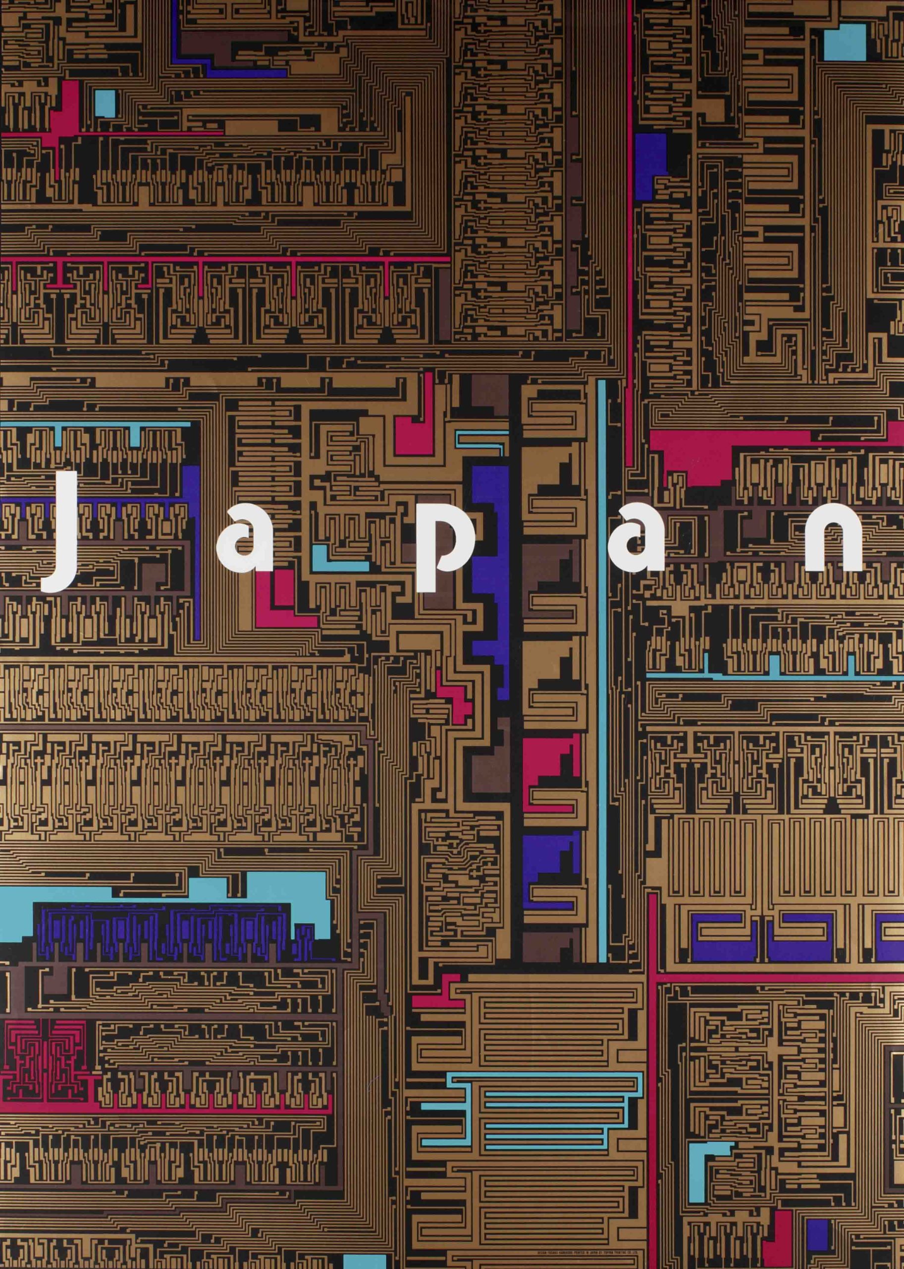
Made in Japan: 20th-Century Poster Art

Modern Japan & Poster Design

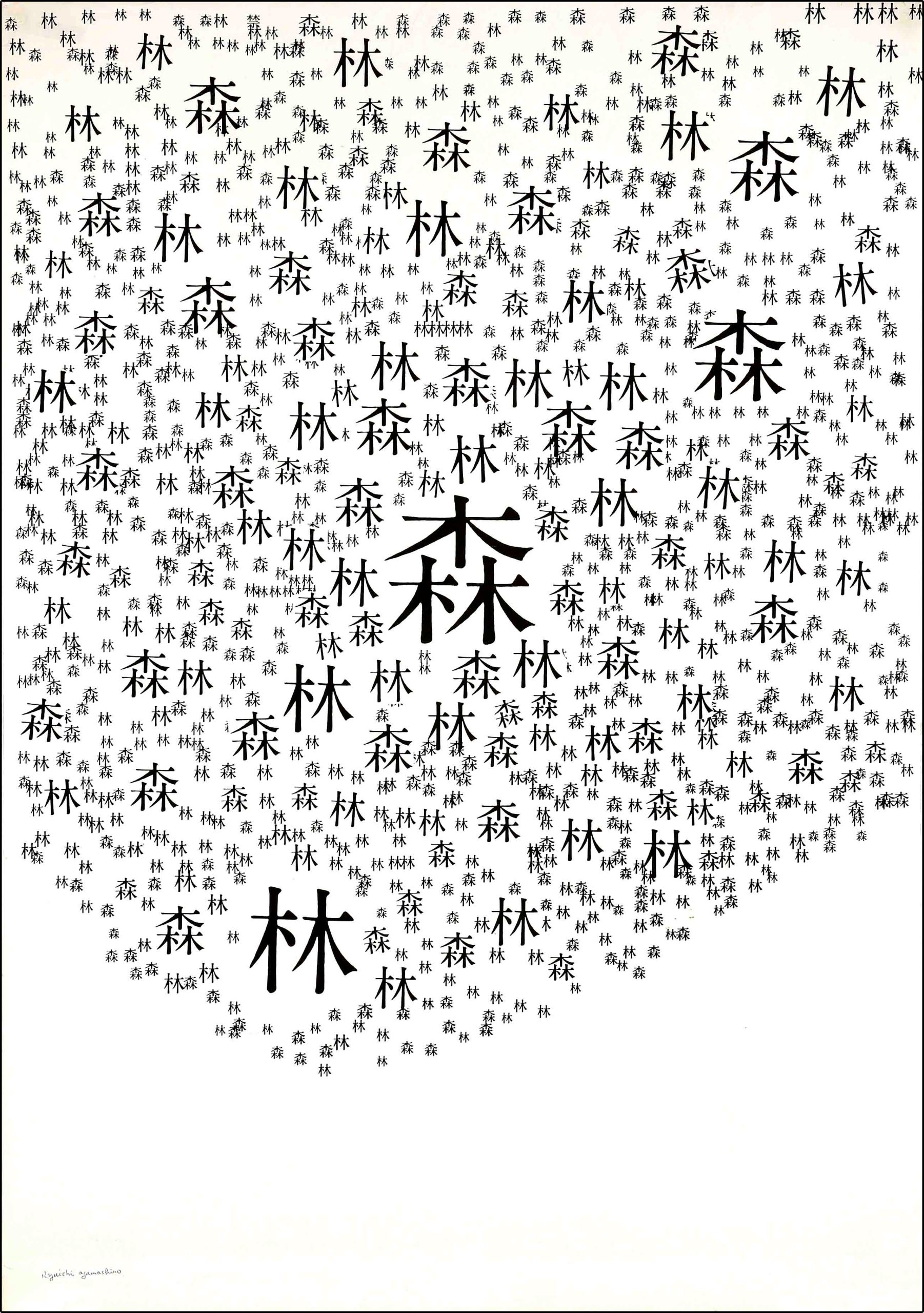
Japanese poster design reflects the country’s rich visual culture and printmaking tradition, and was used throughout the 20th century to represent the country to domestic and international audiences. Two world wars, in addition to rapid industrialization, urbanization, and the rise of mass media fundamentally transformed modern Japan, and its specific journey as both an aggressor and a victim of war reinforced the nation’s efforts to revamp its image. Within this context, posters allowed Japanese artists, designers, corporations, brands, and the government to shape the social, political, and ideological values of the time with compositions that blended elements of traditional and modern design.  

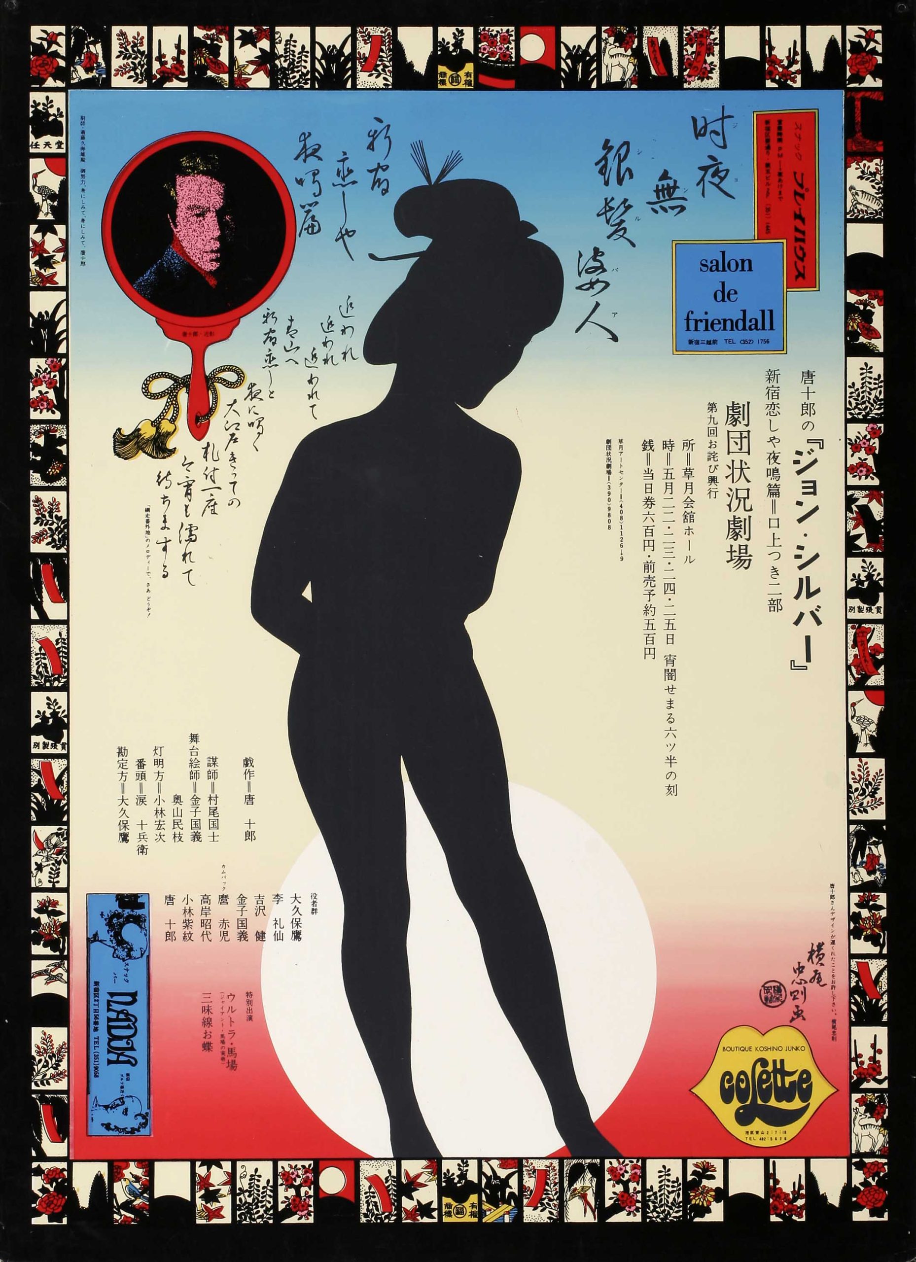
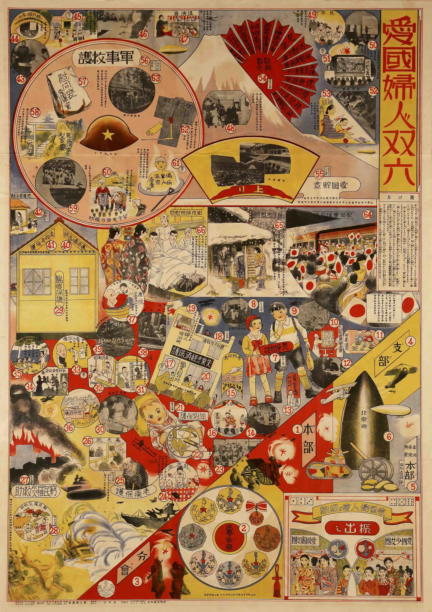
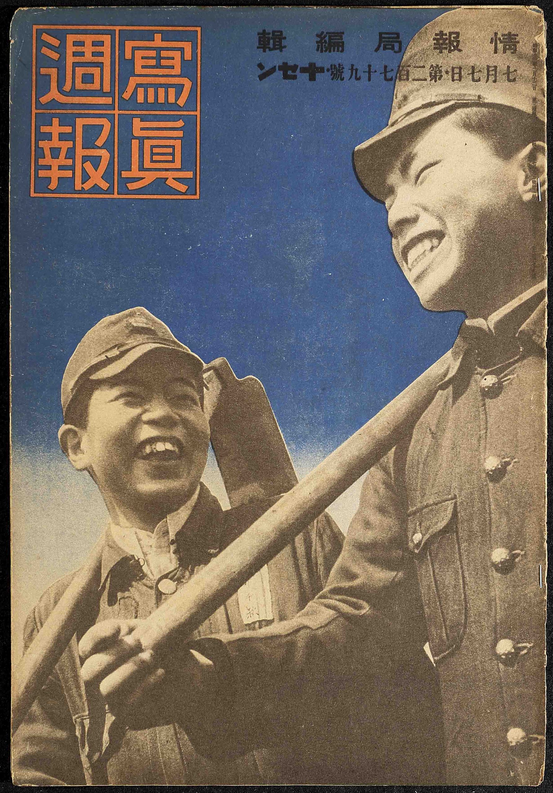
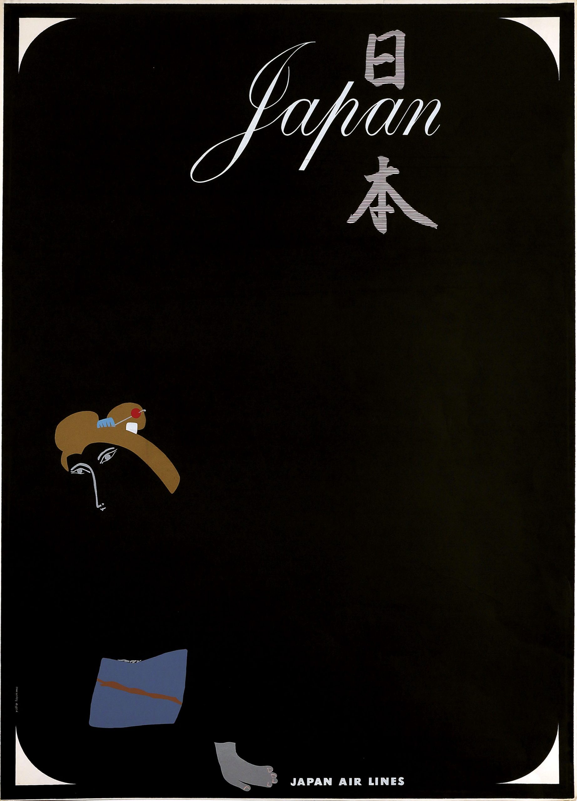
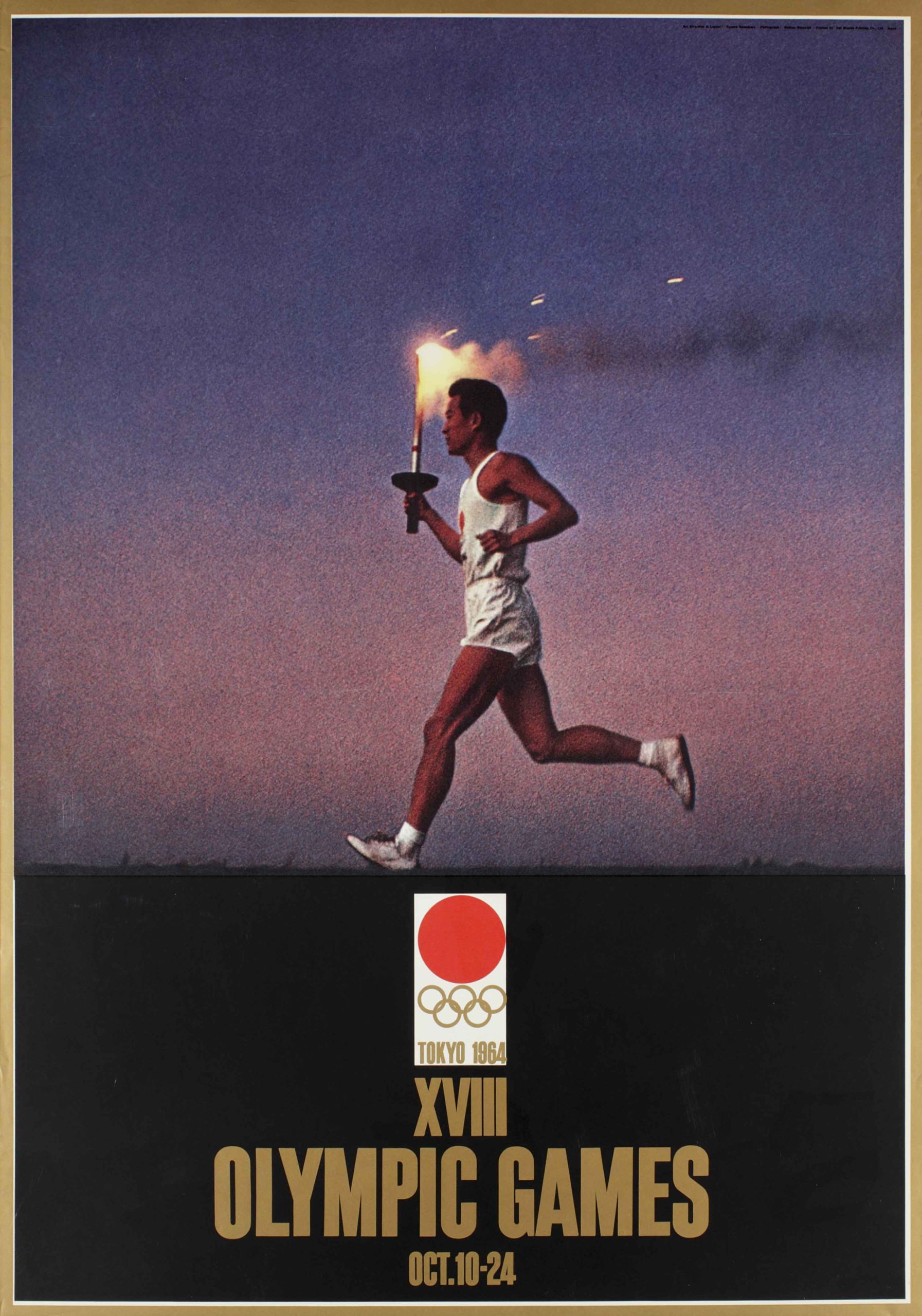
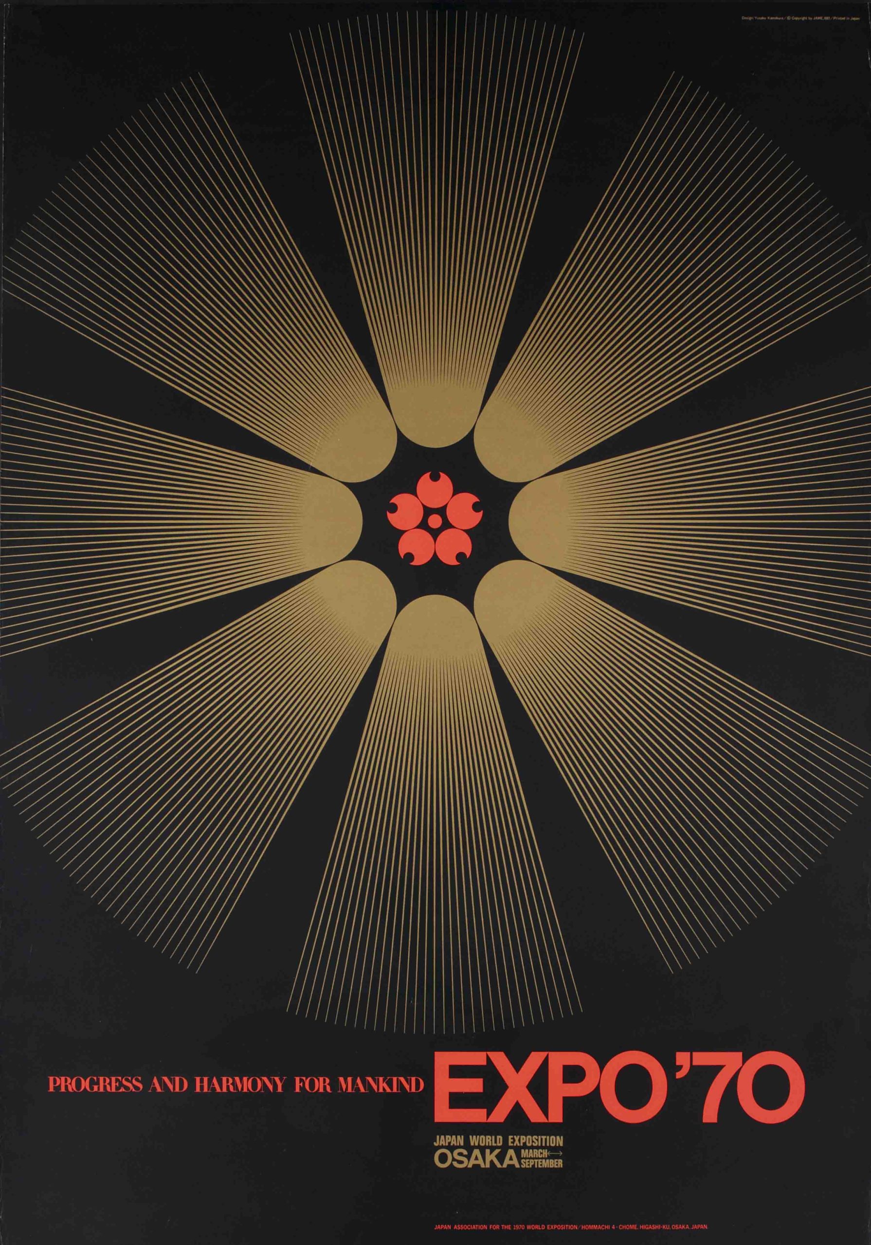
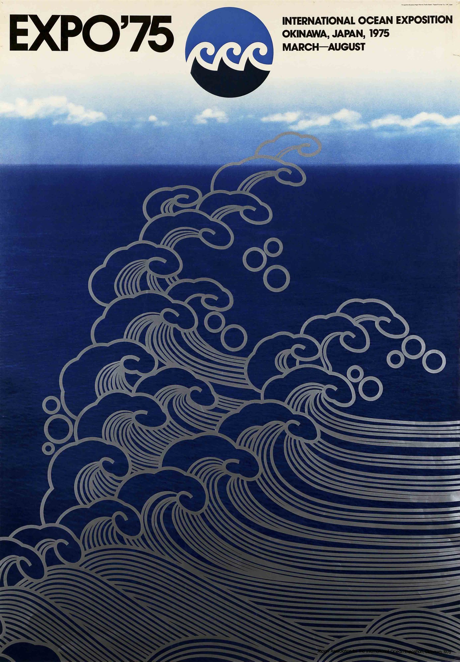
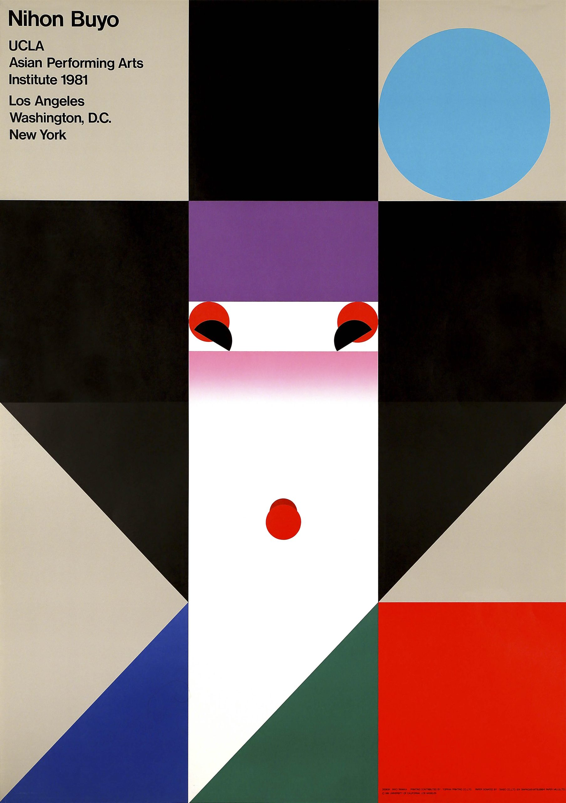
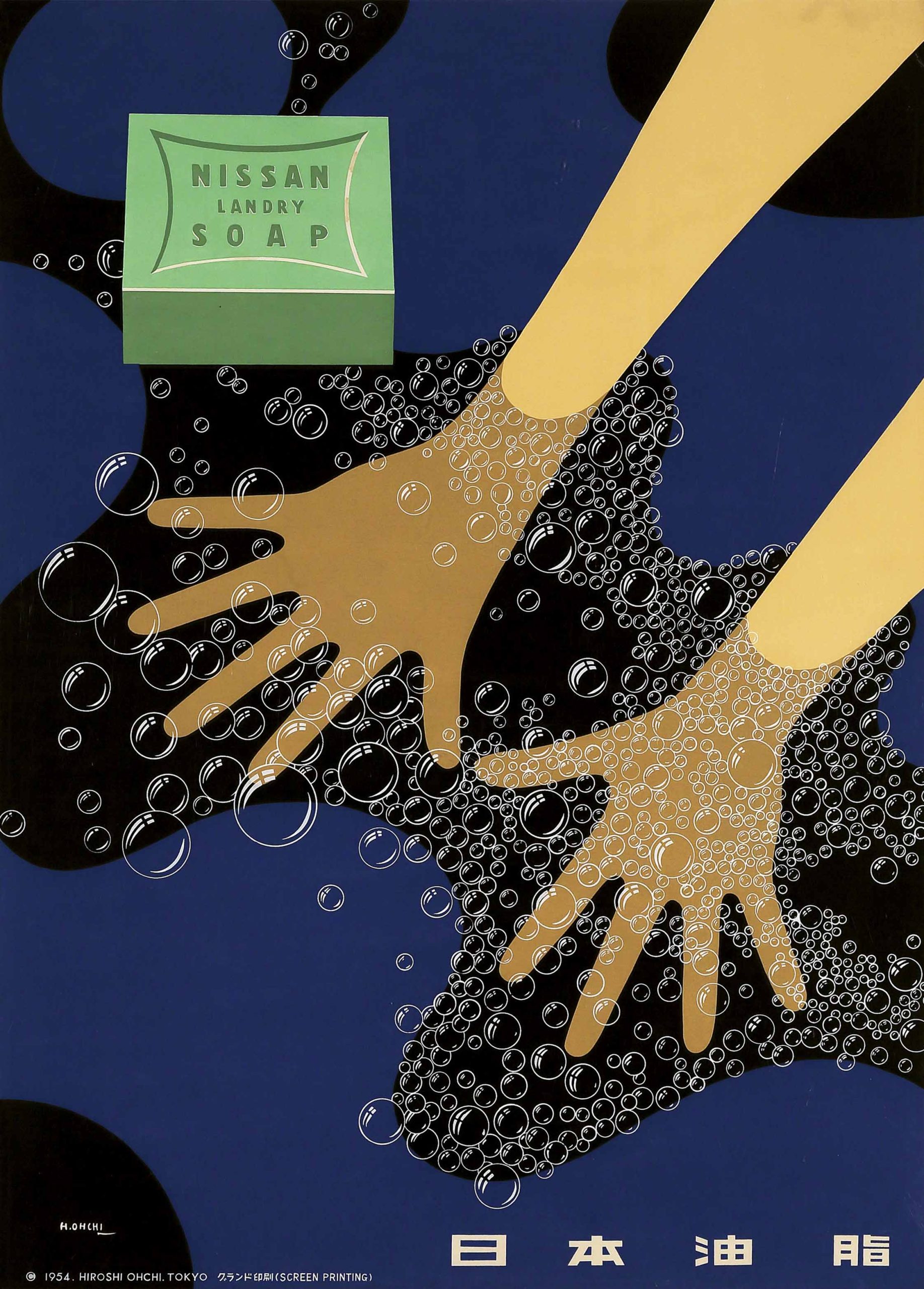
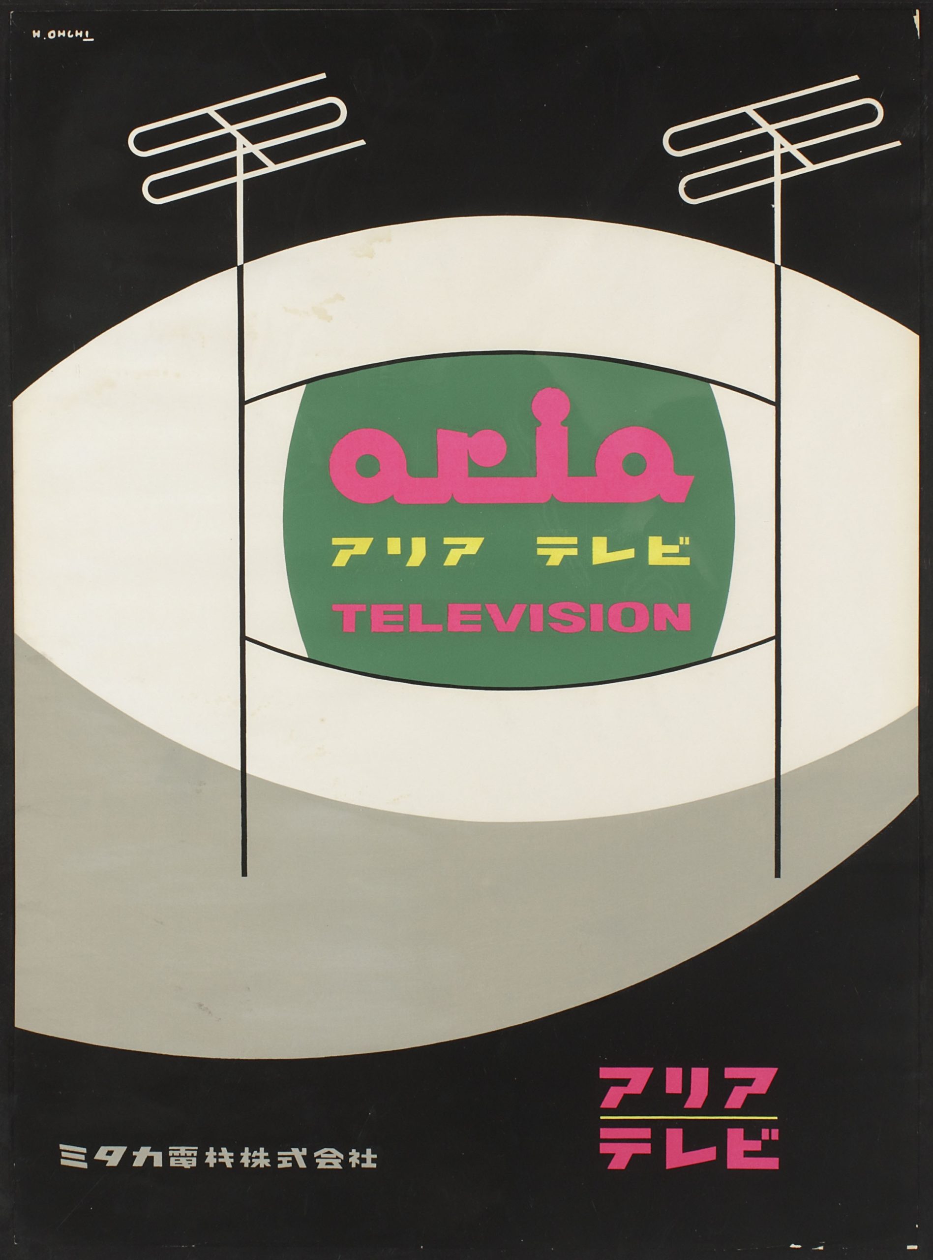
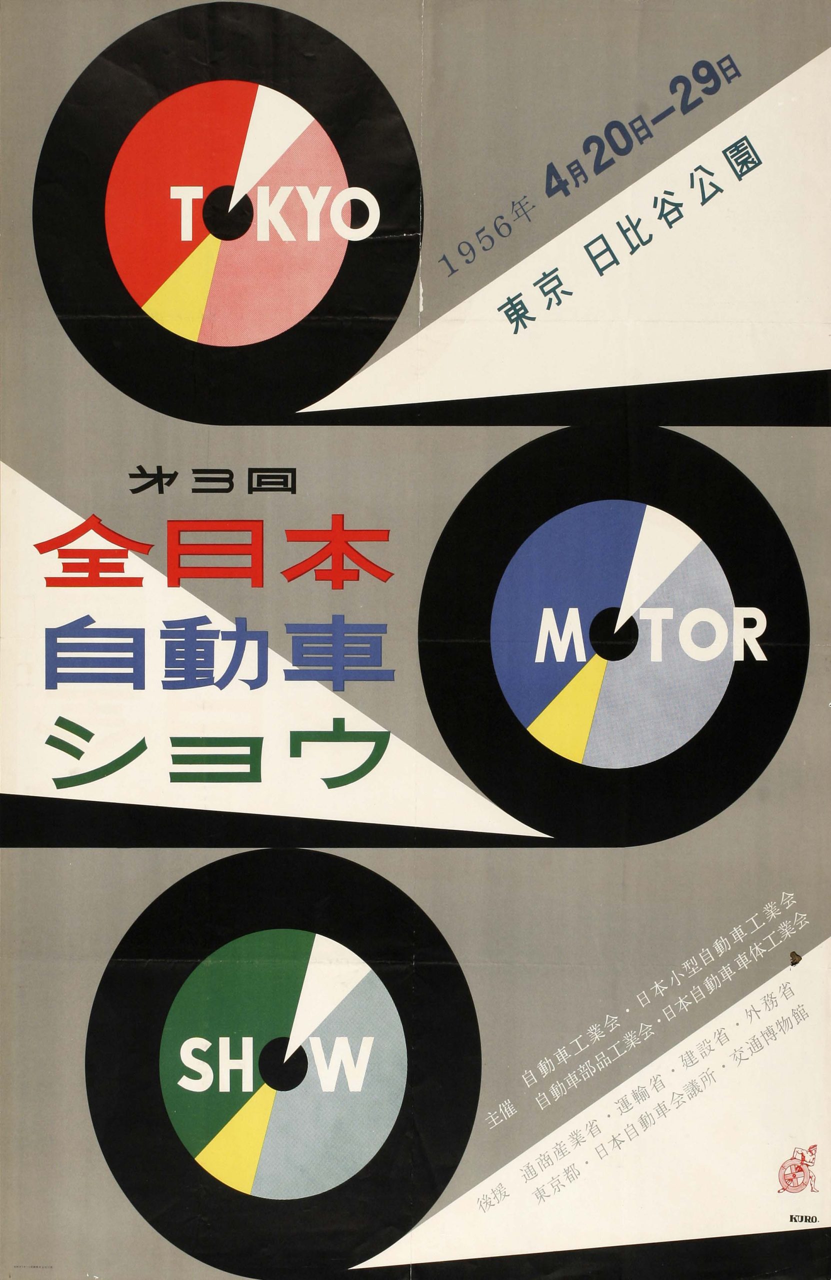
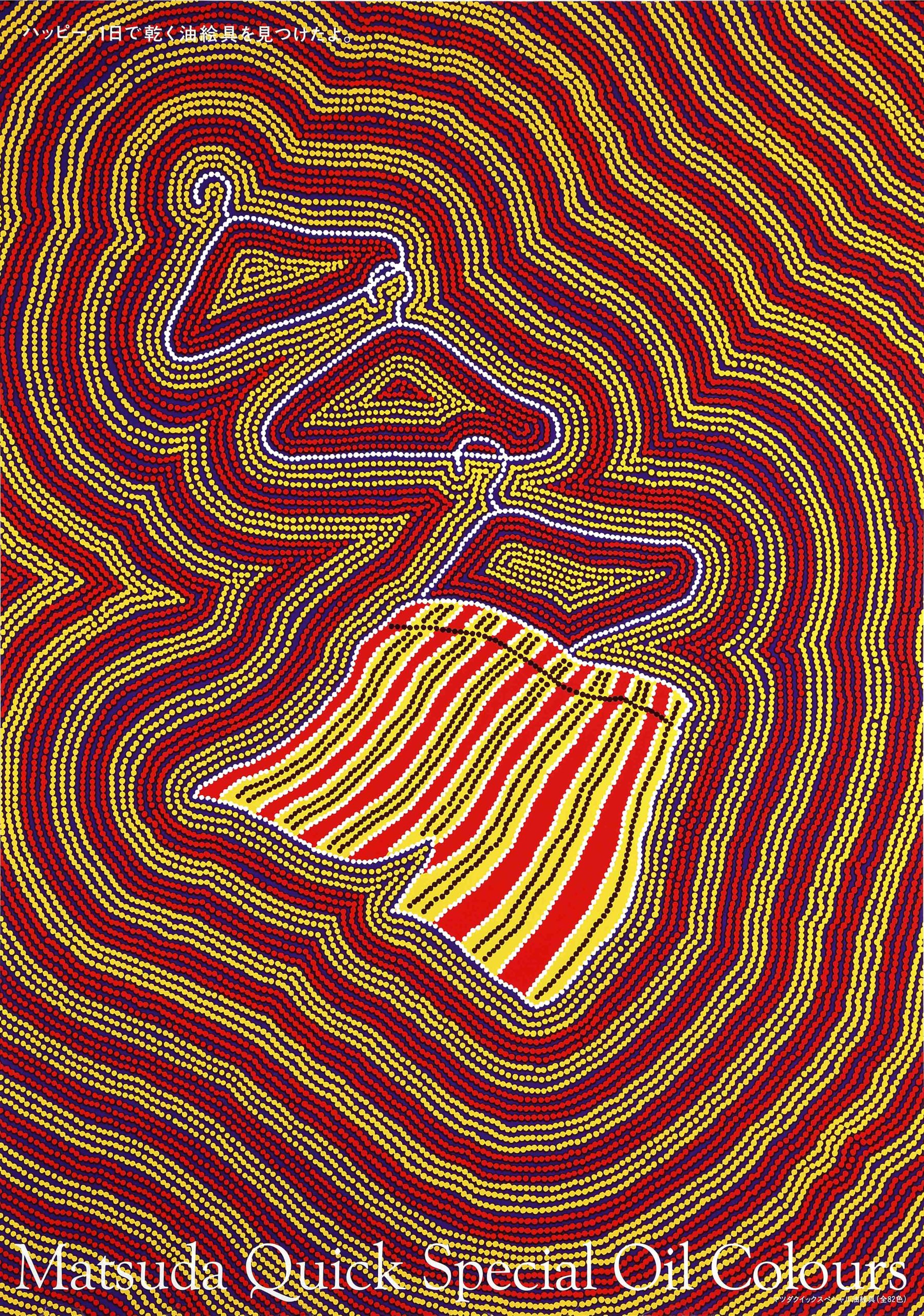
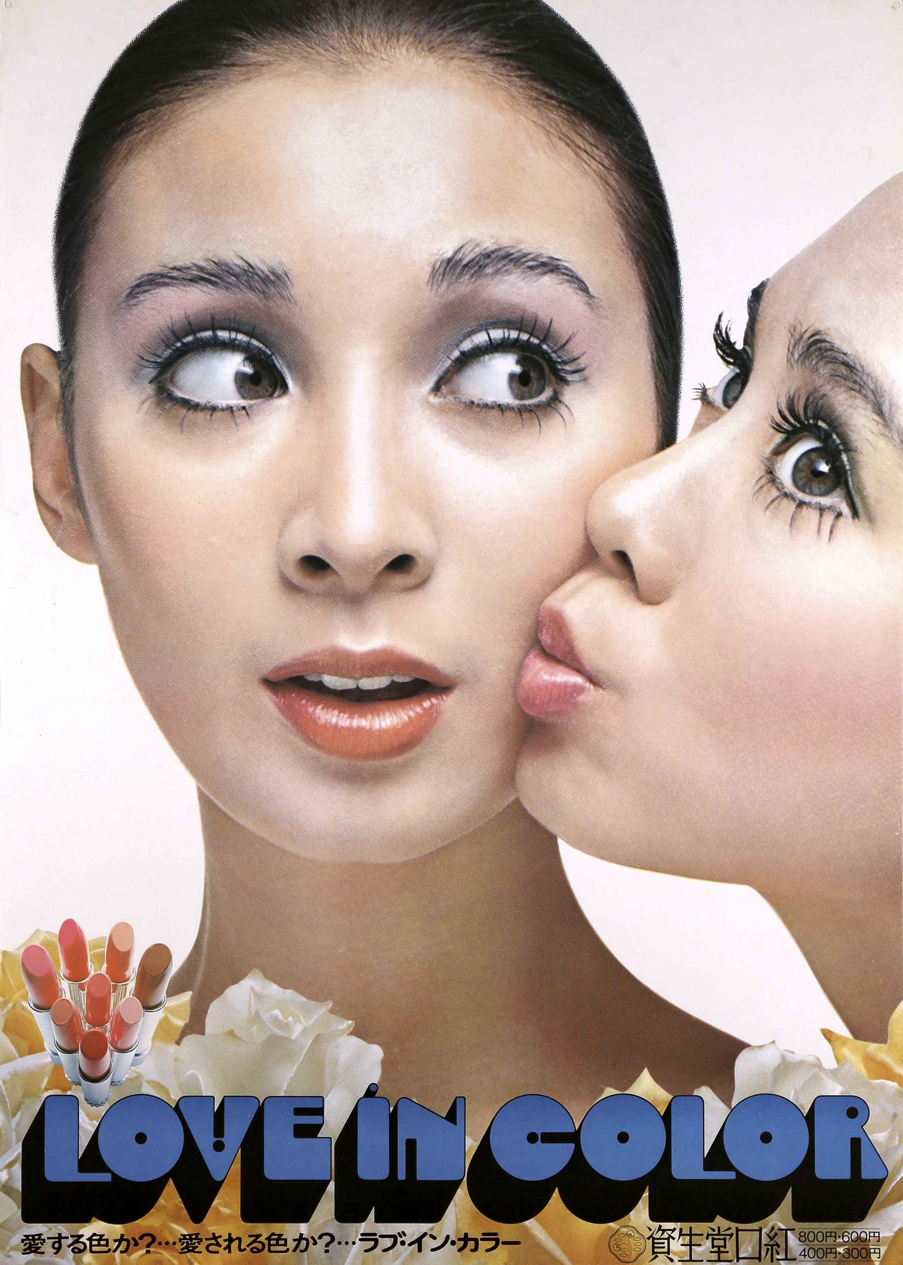
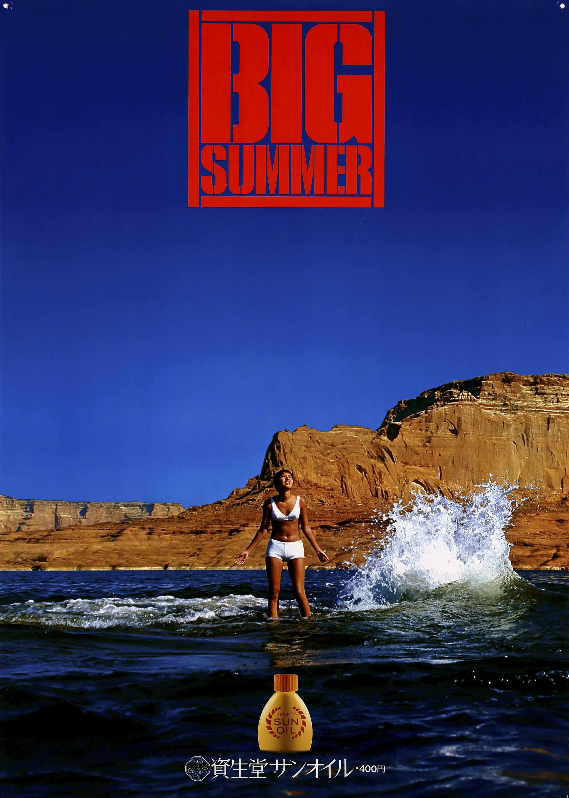
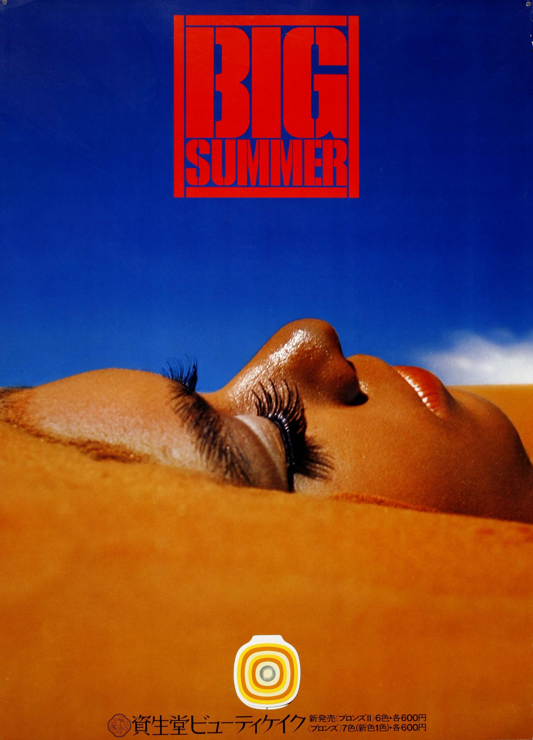
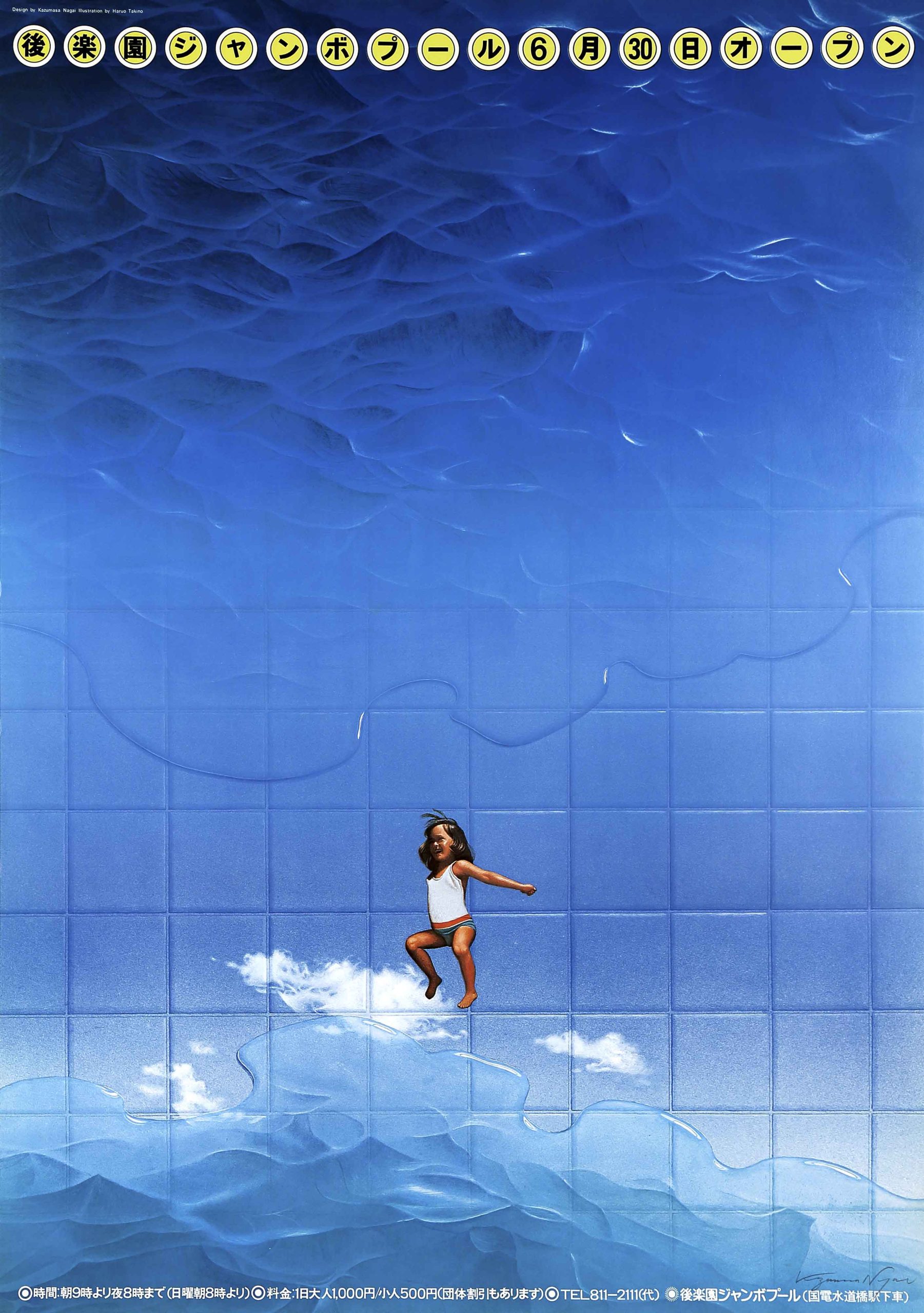
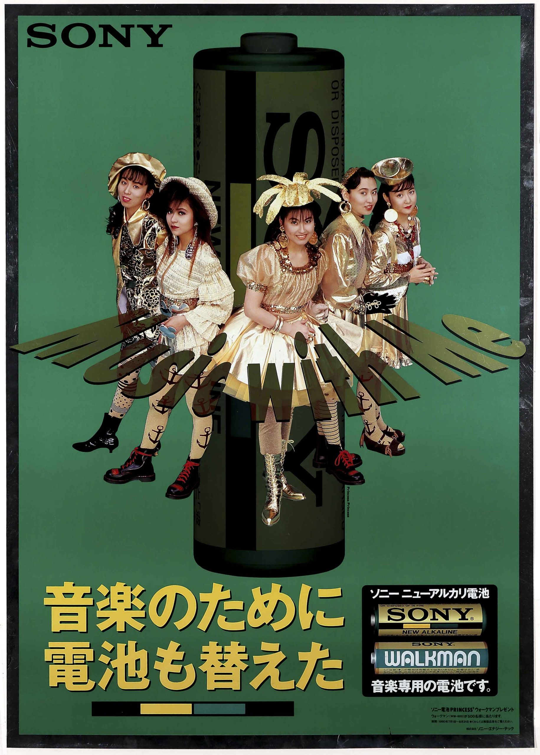
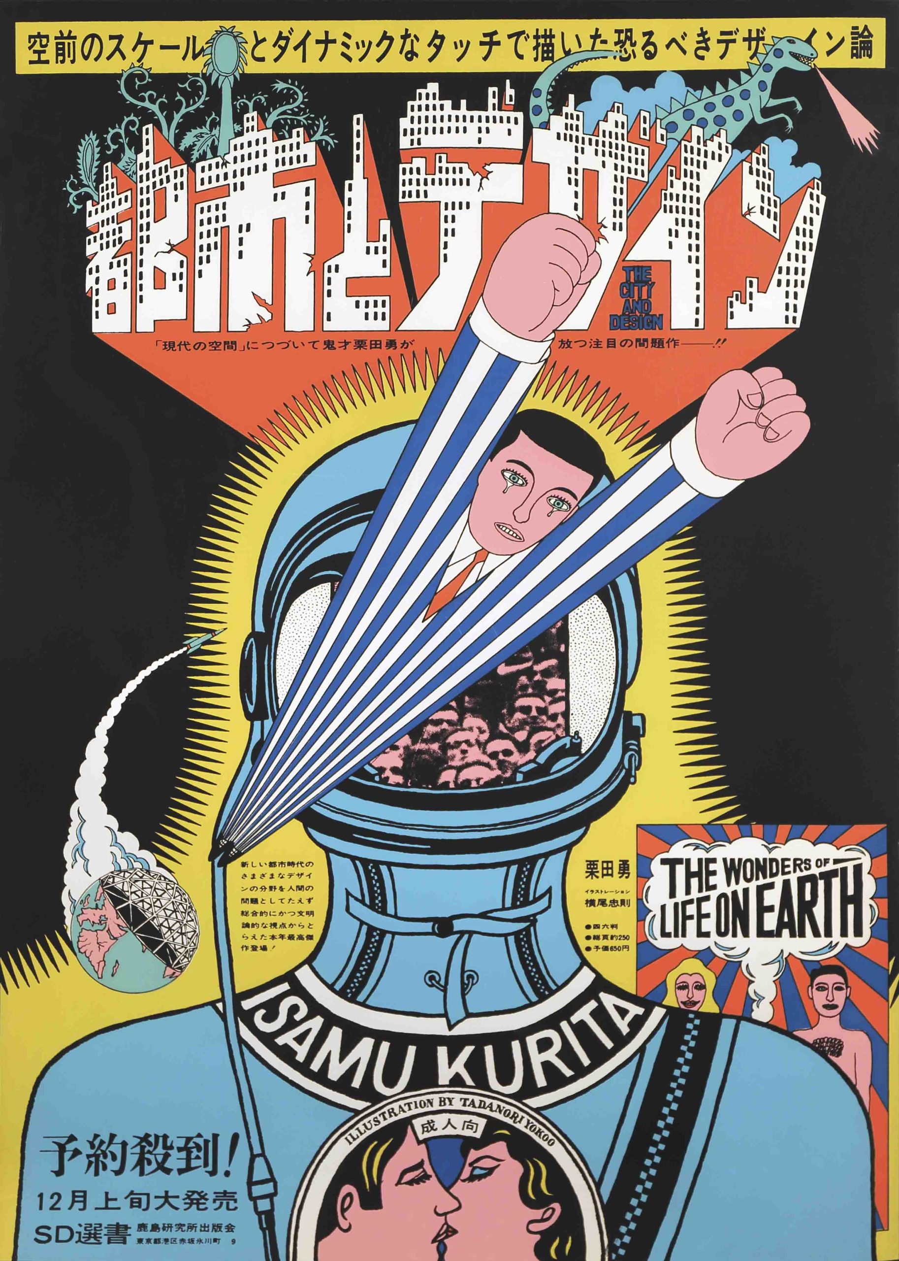
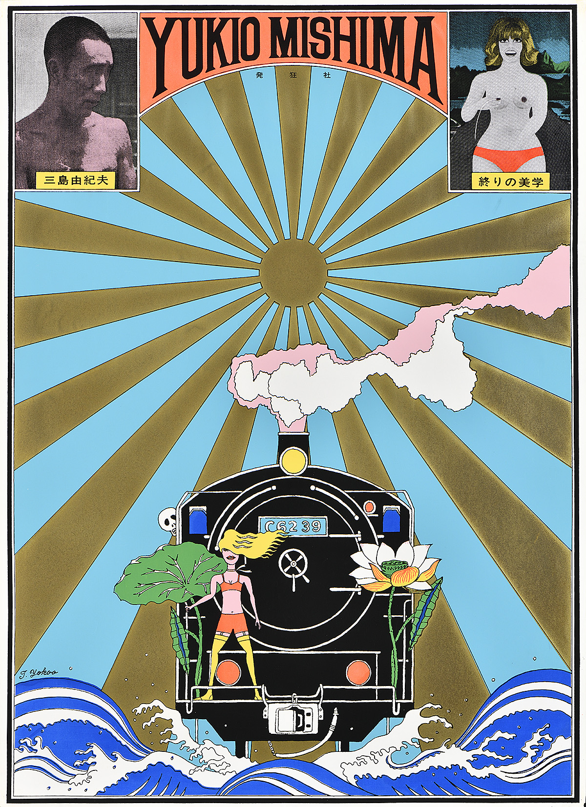
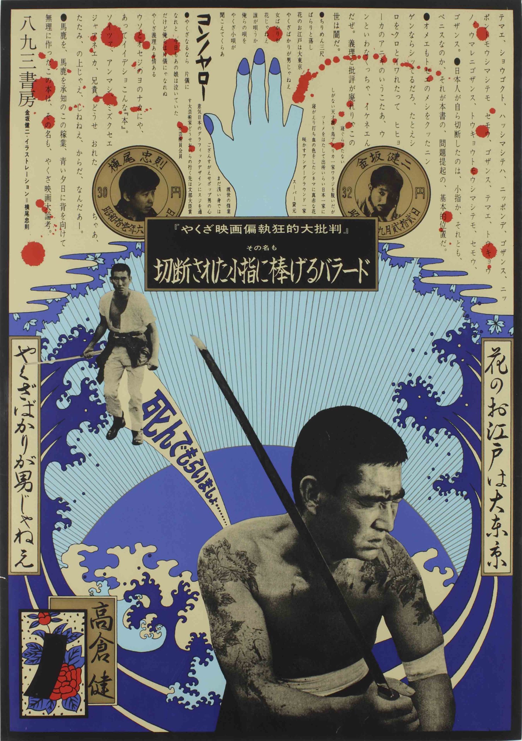
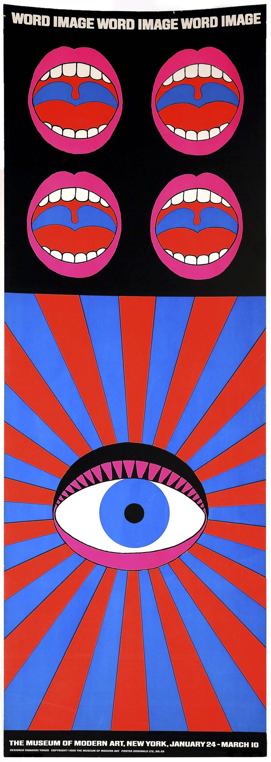
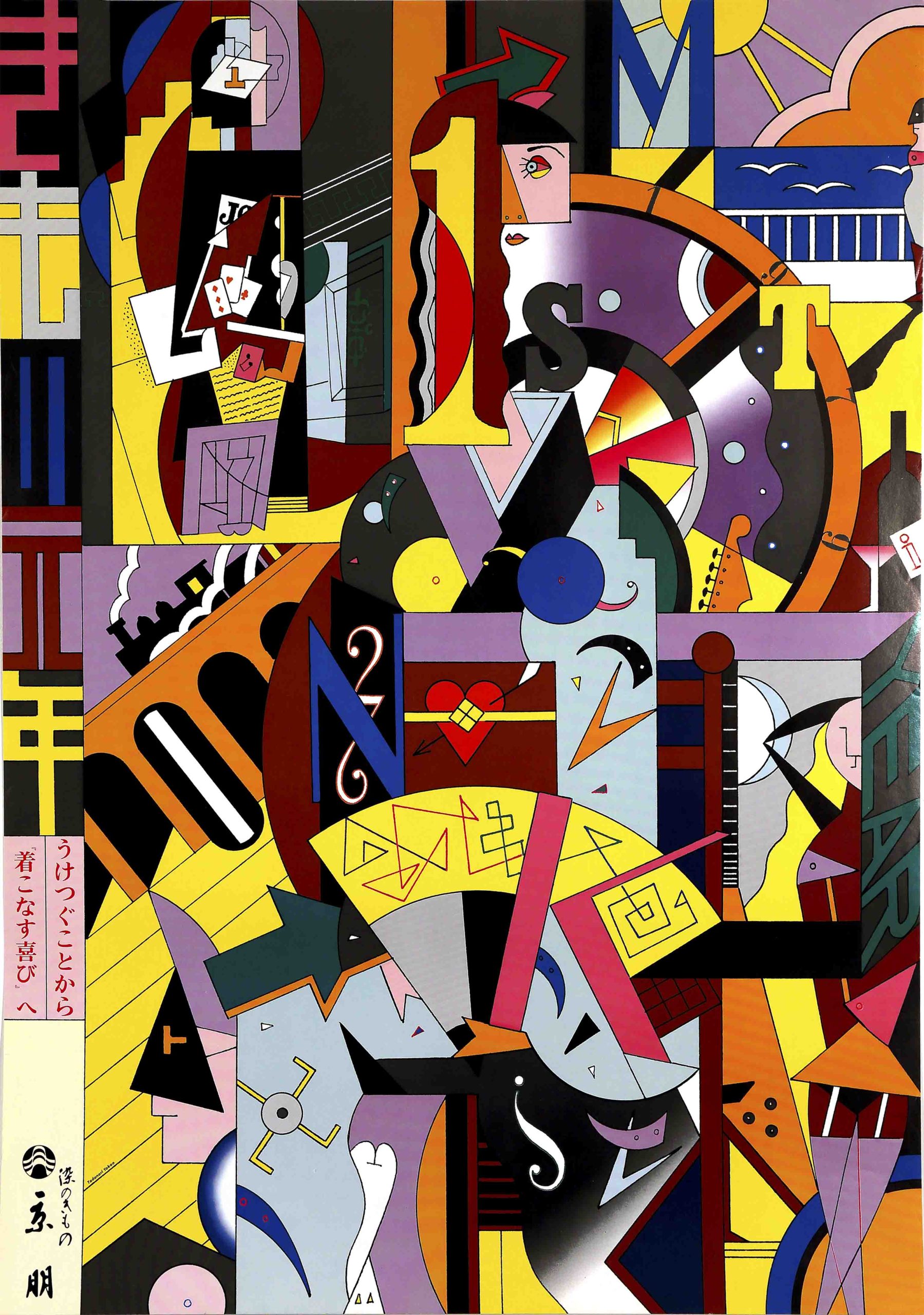
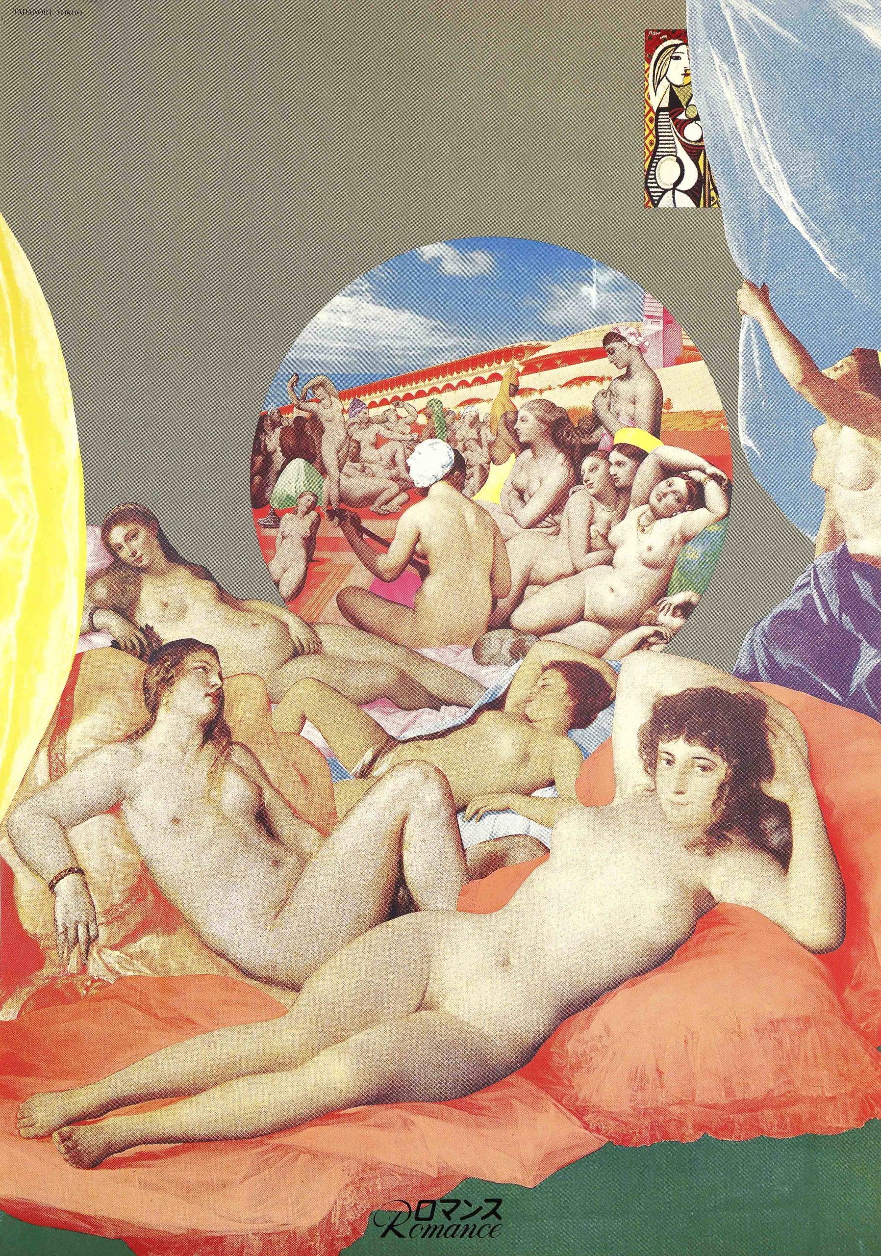
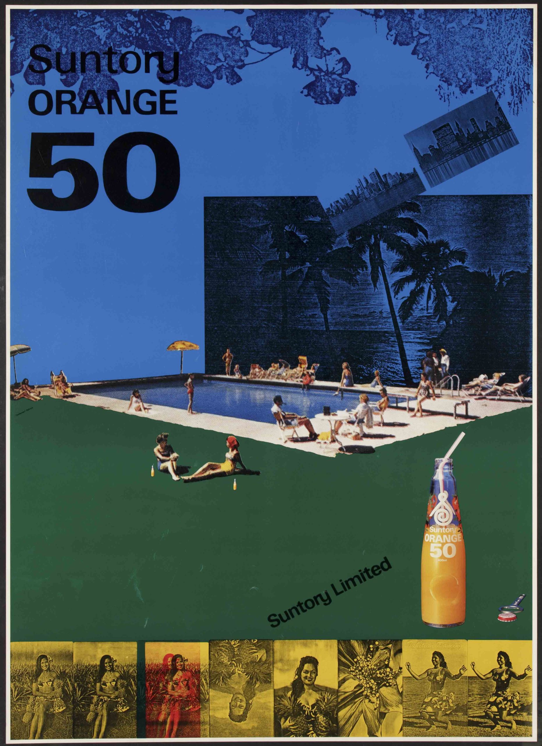
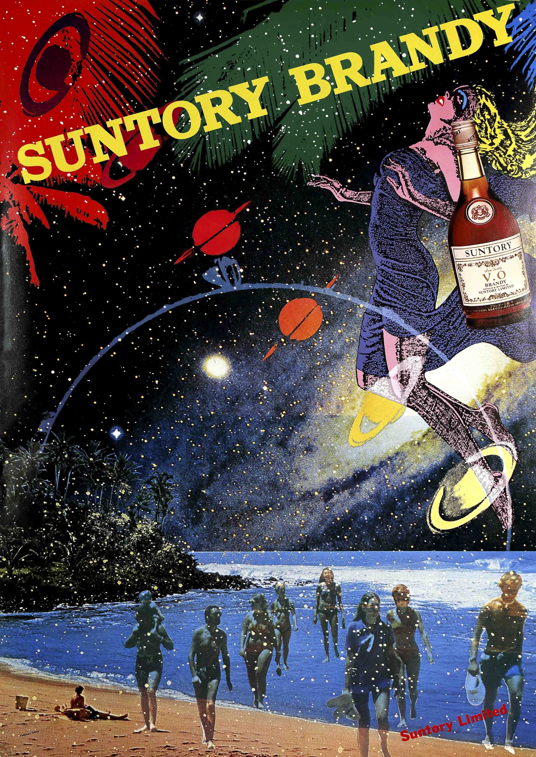
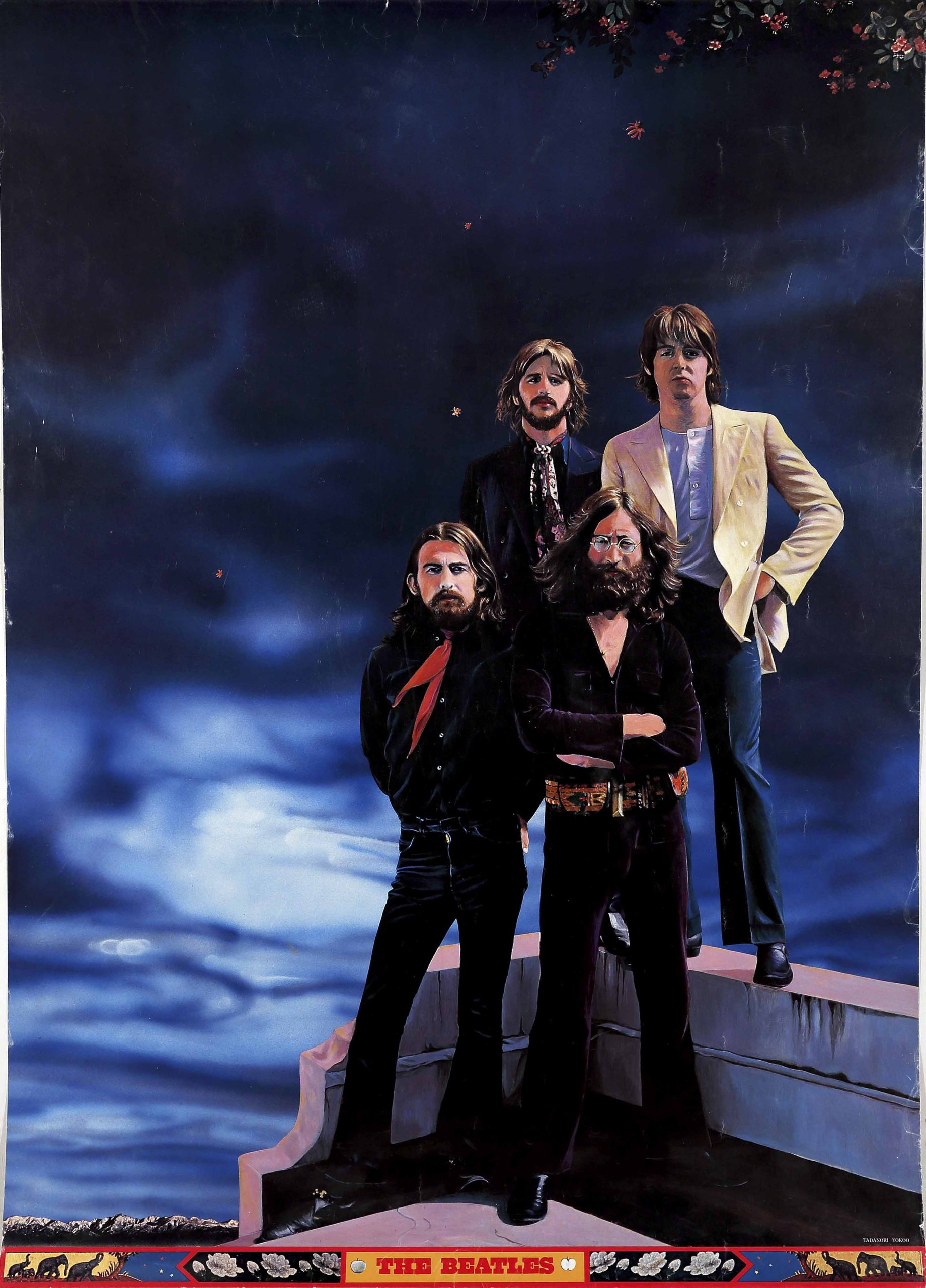
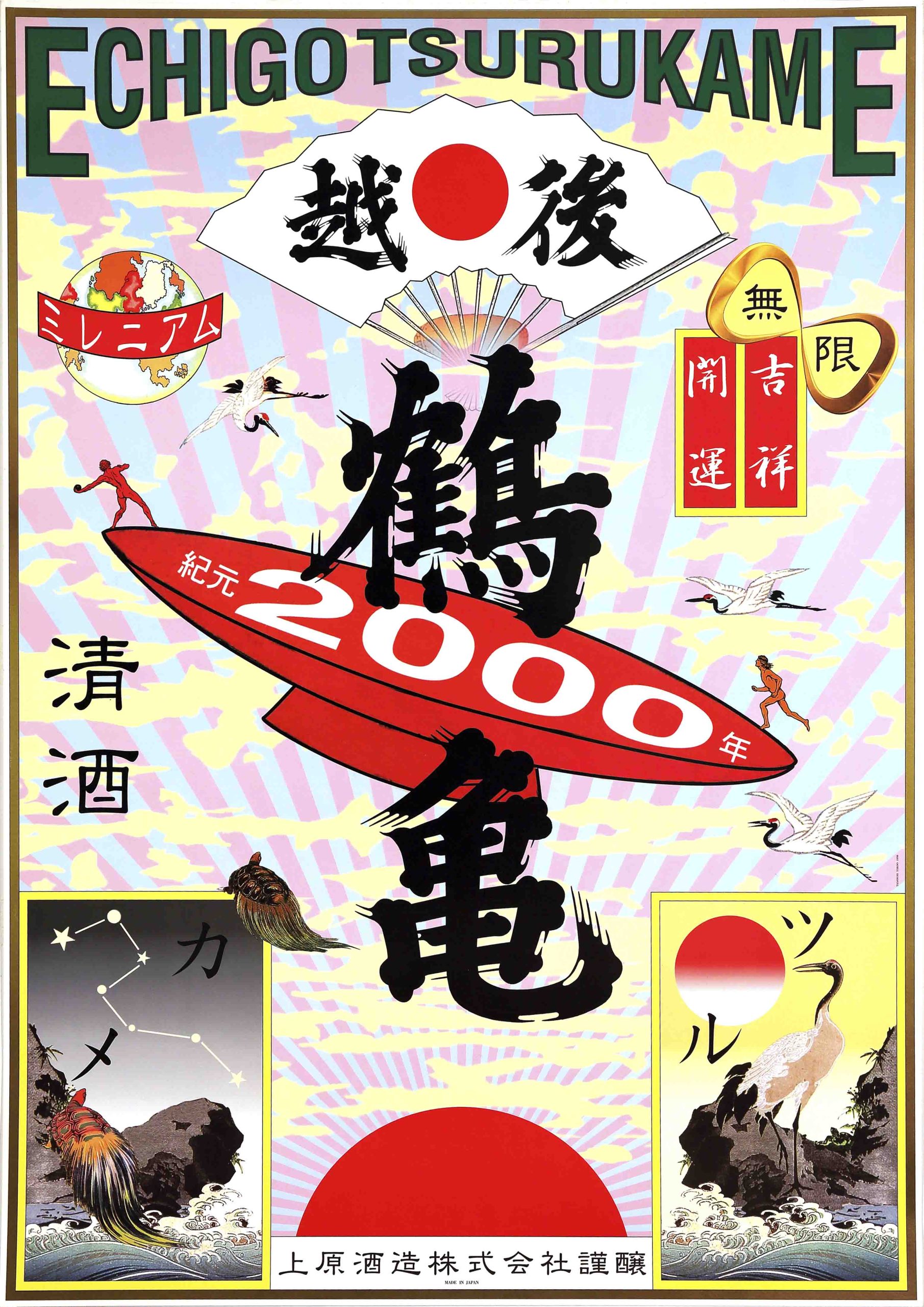
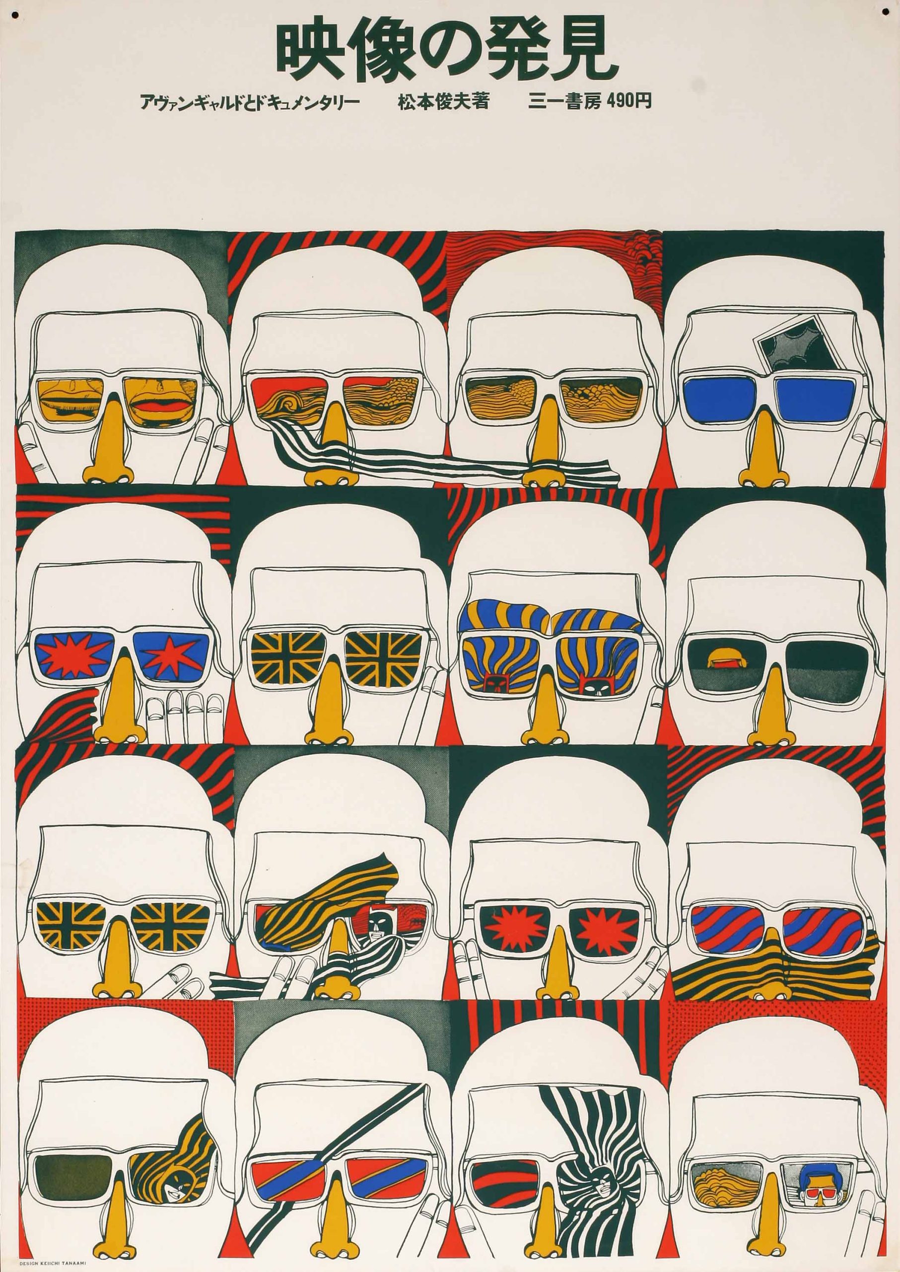
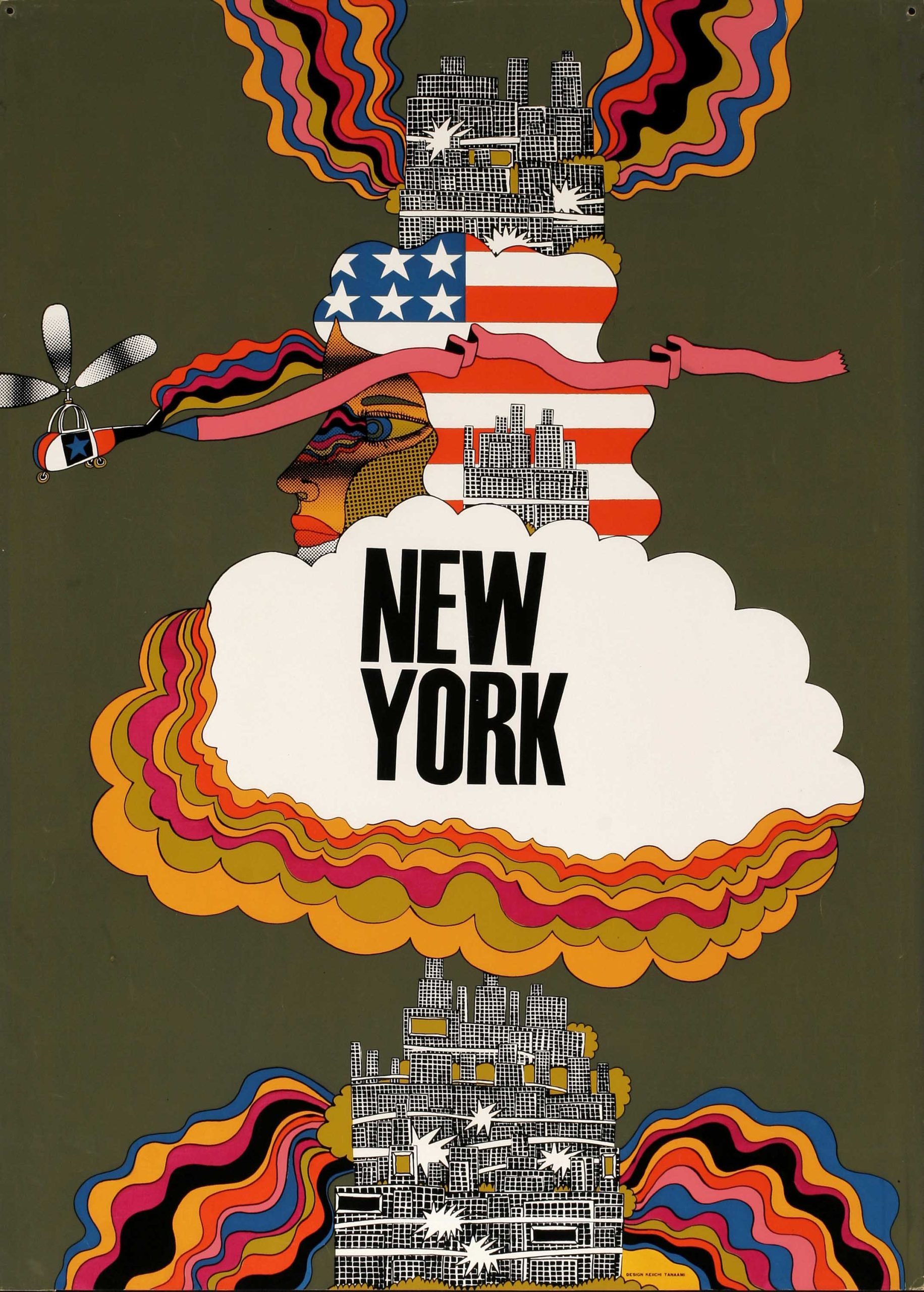
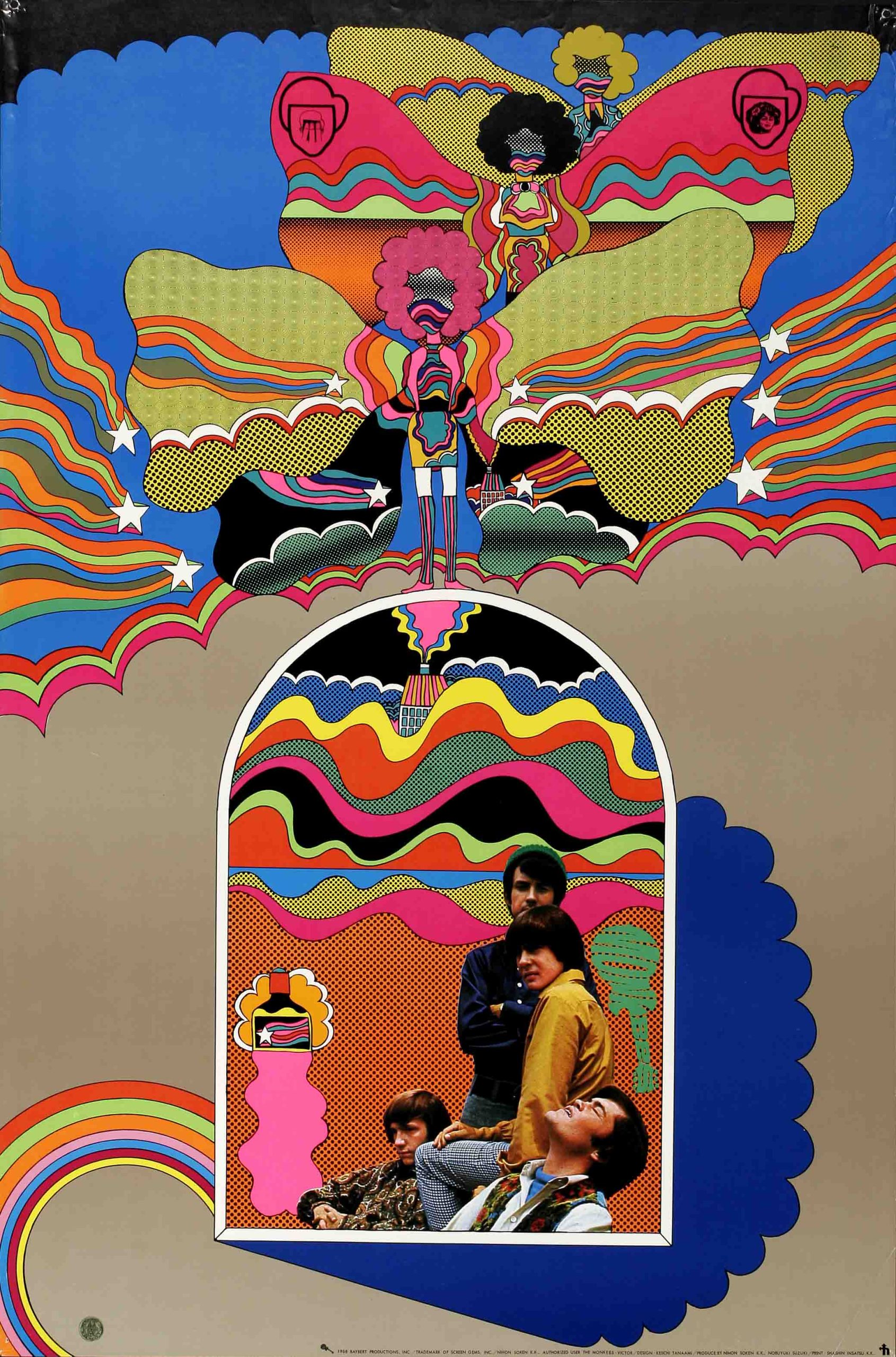
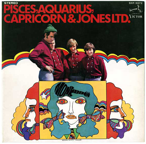
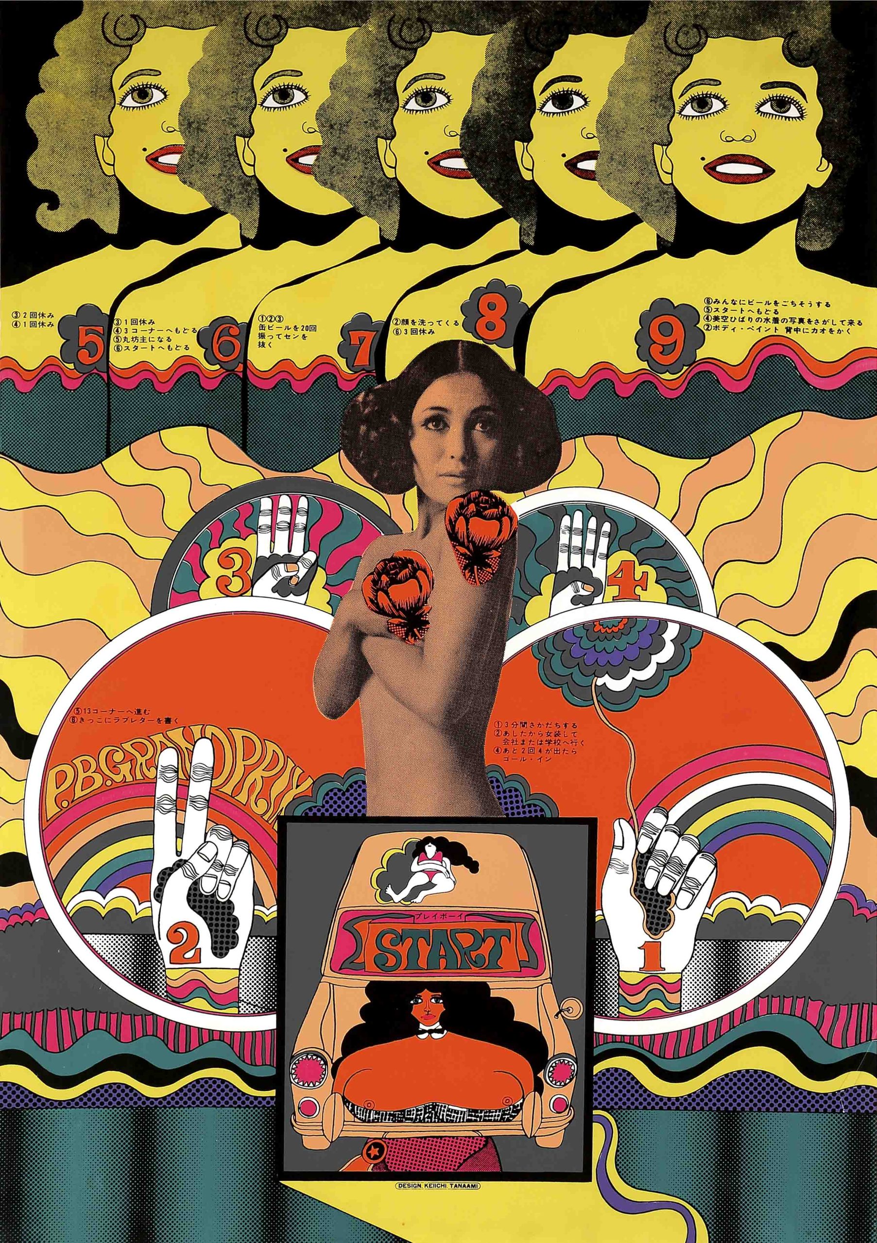
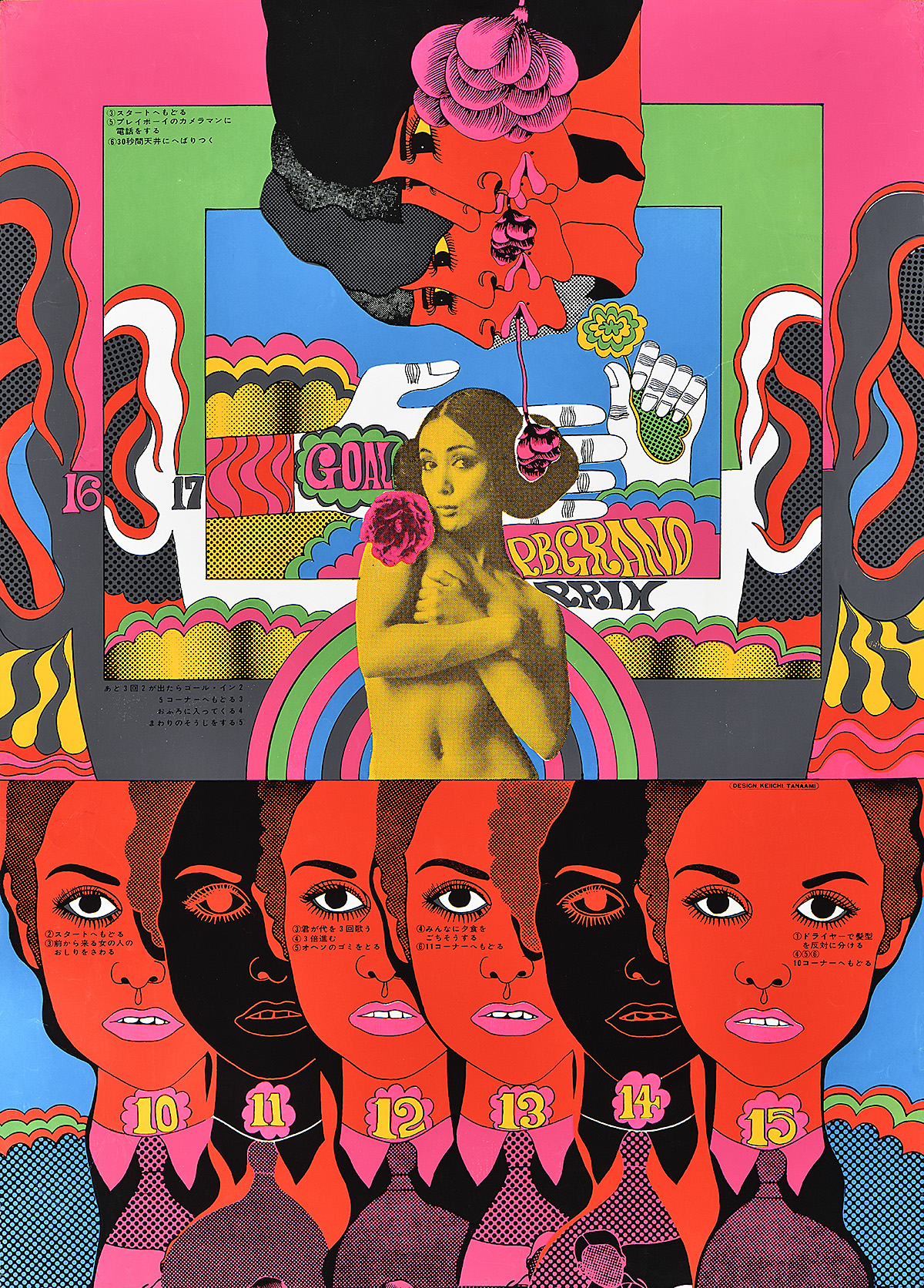
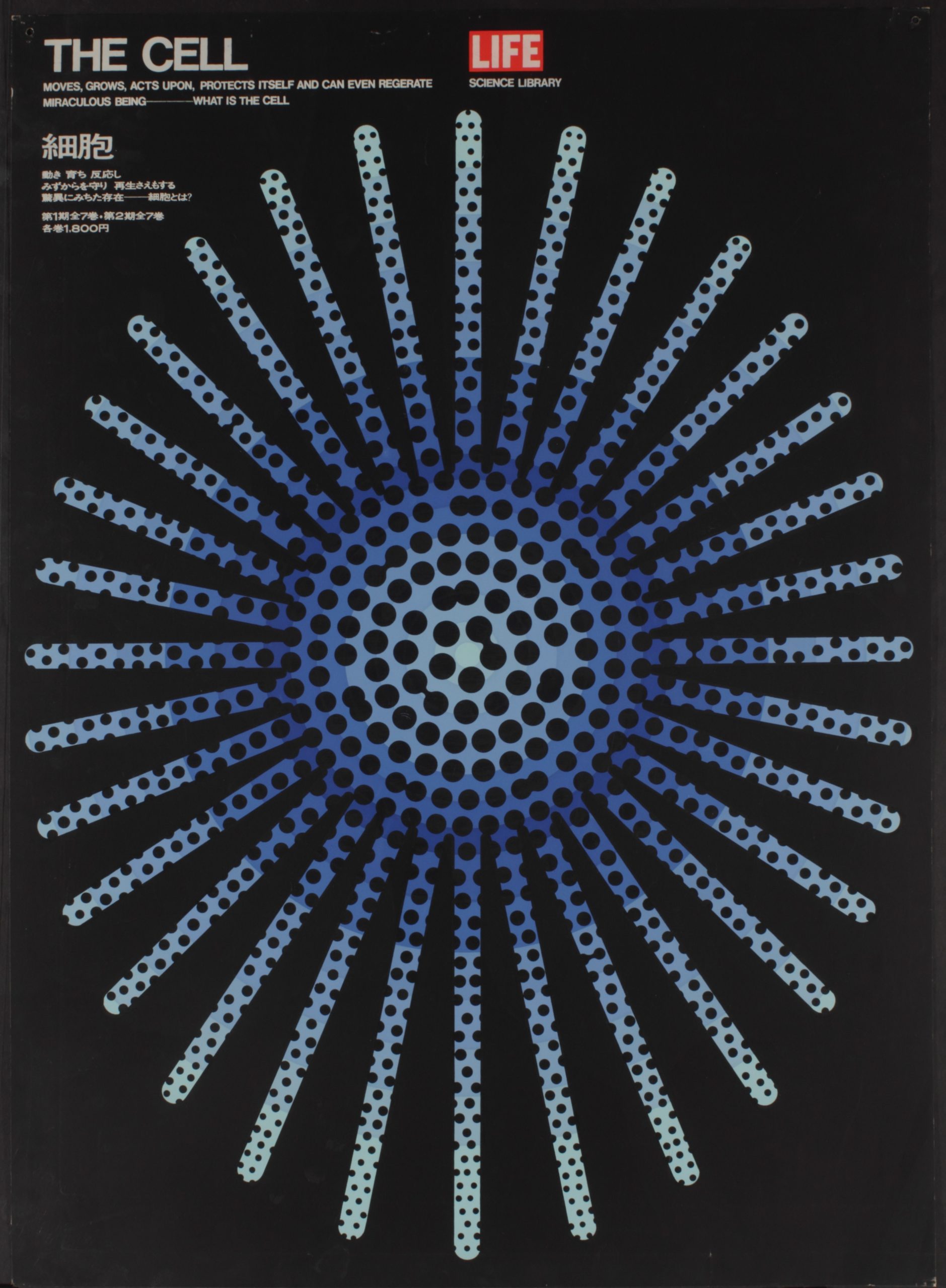
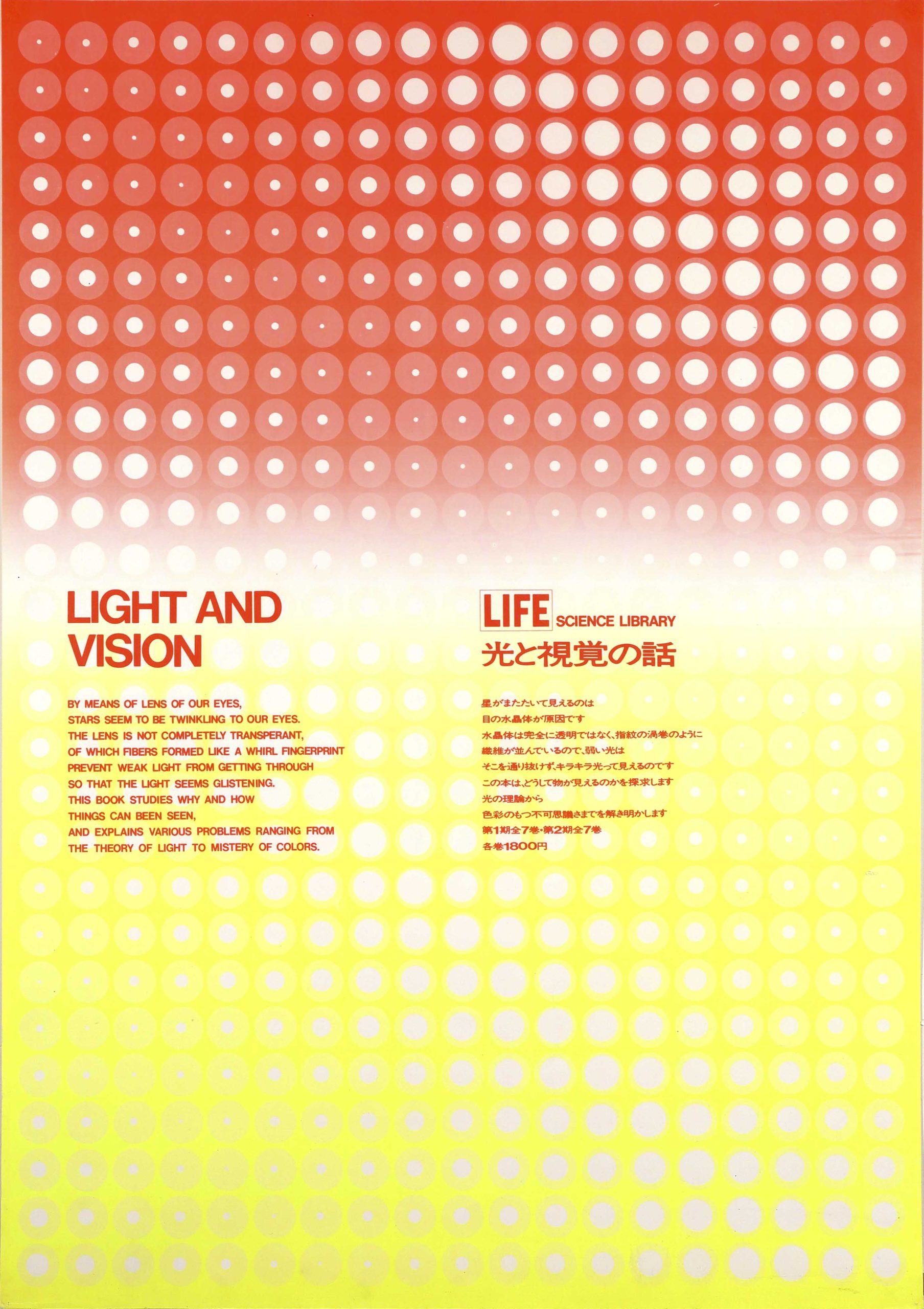
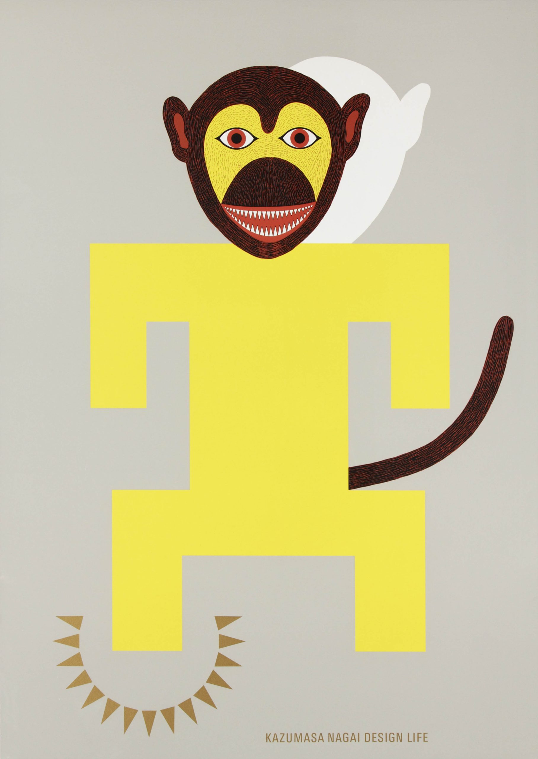
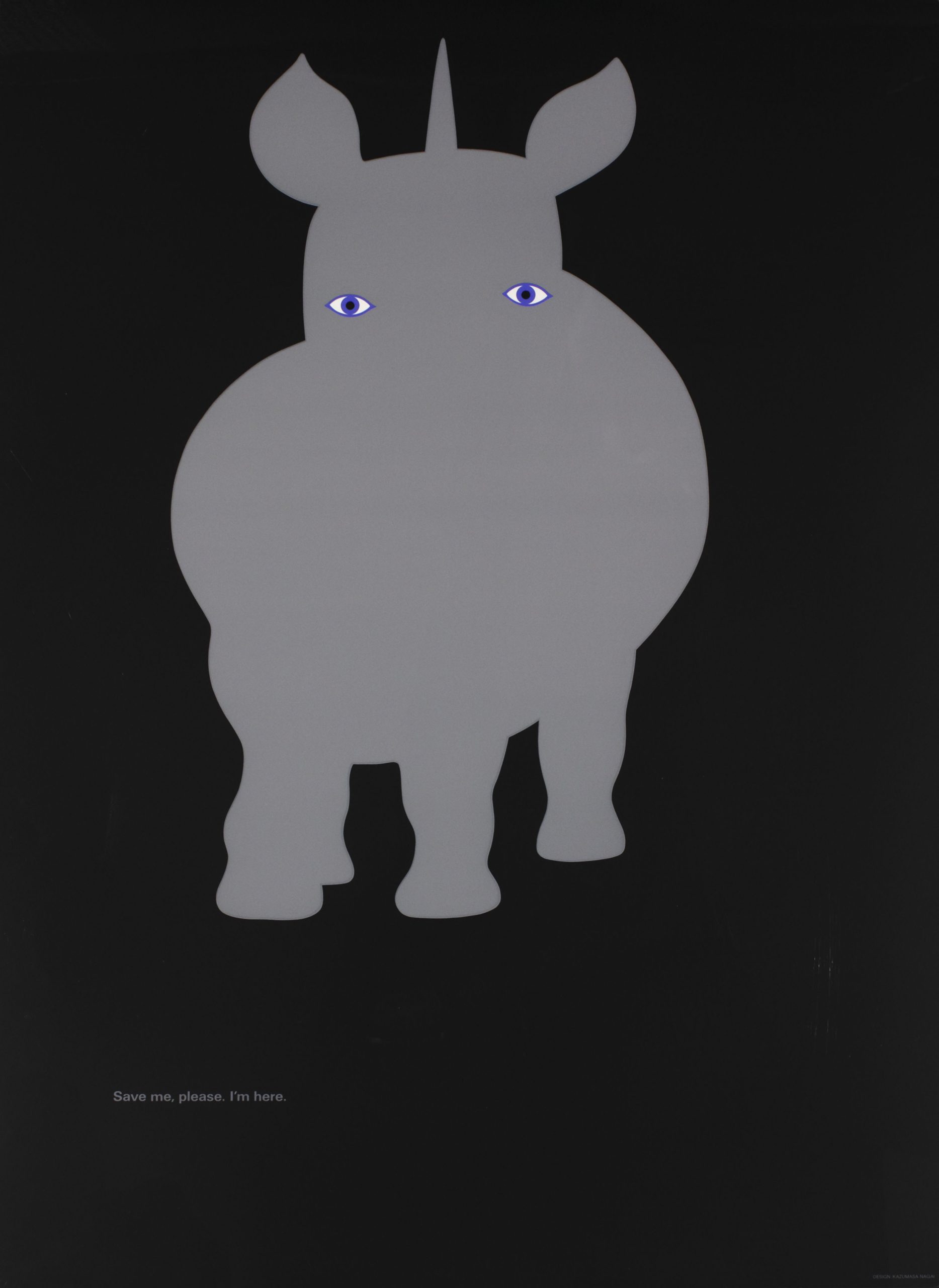
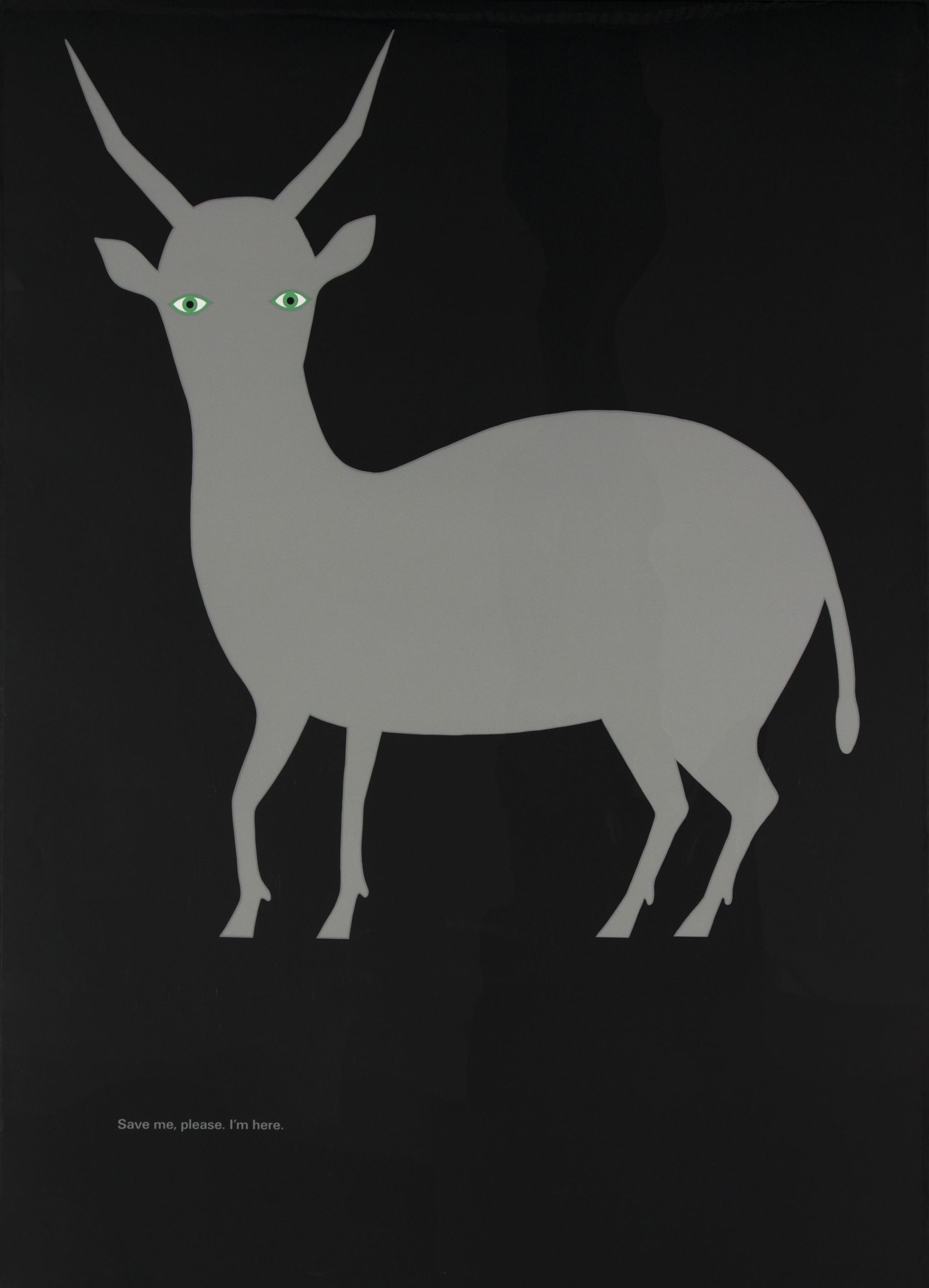
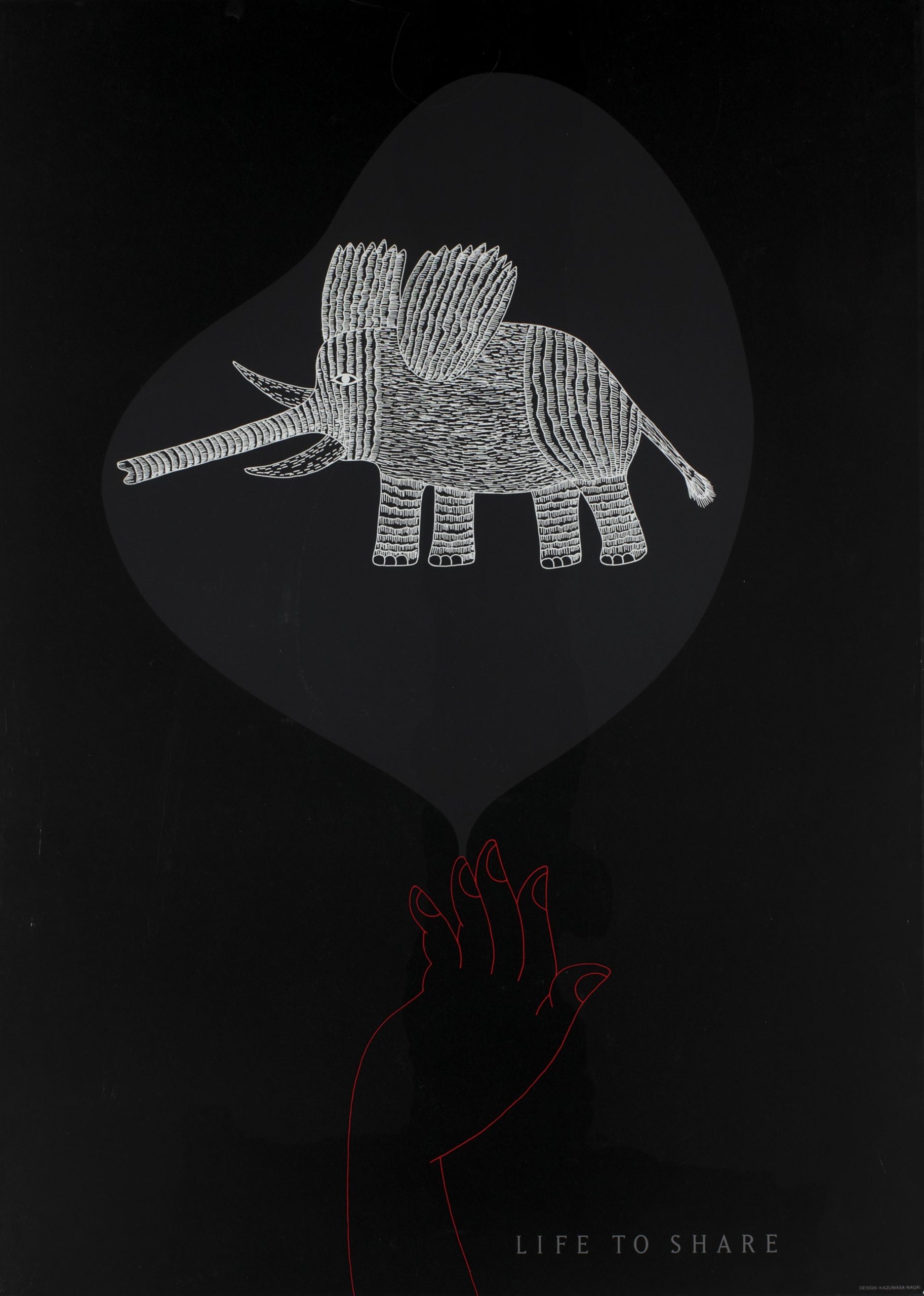
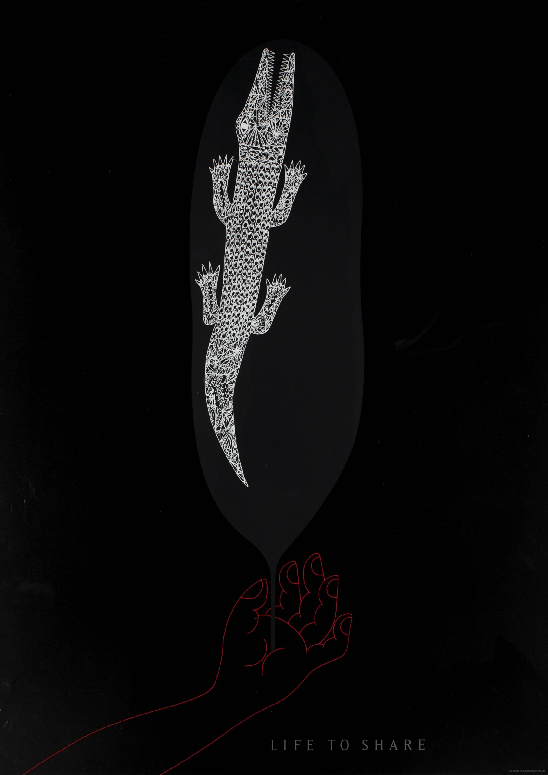
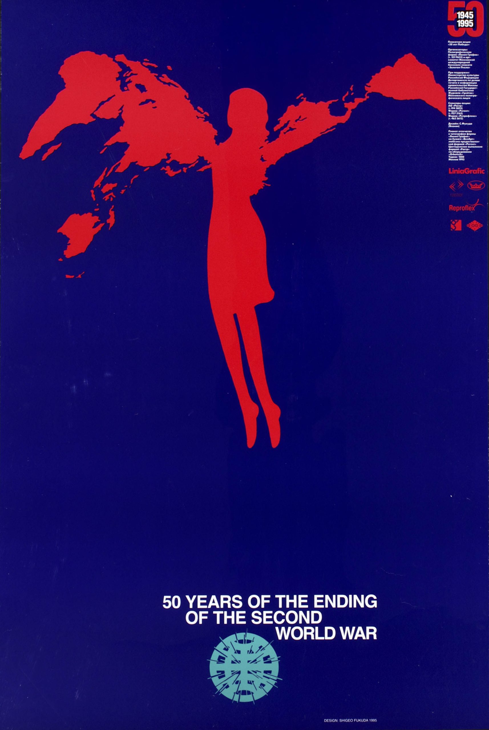
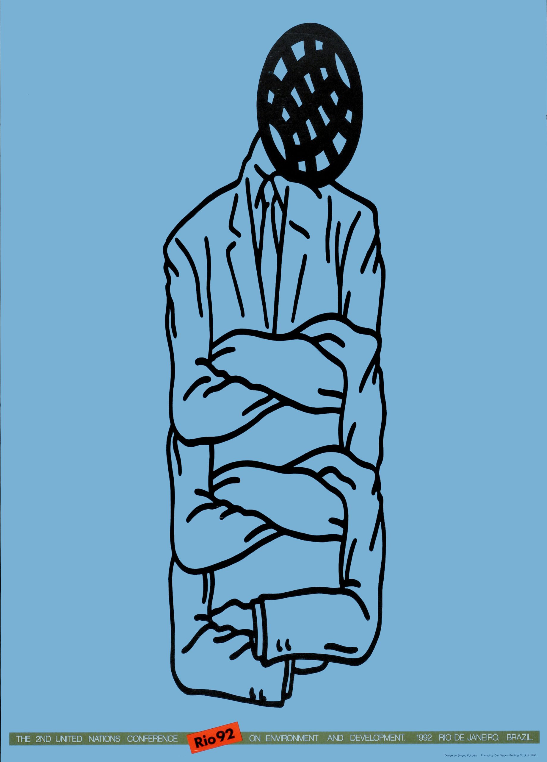
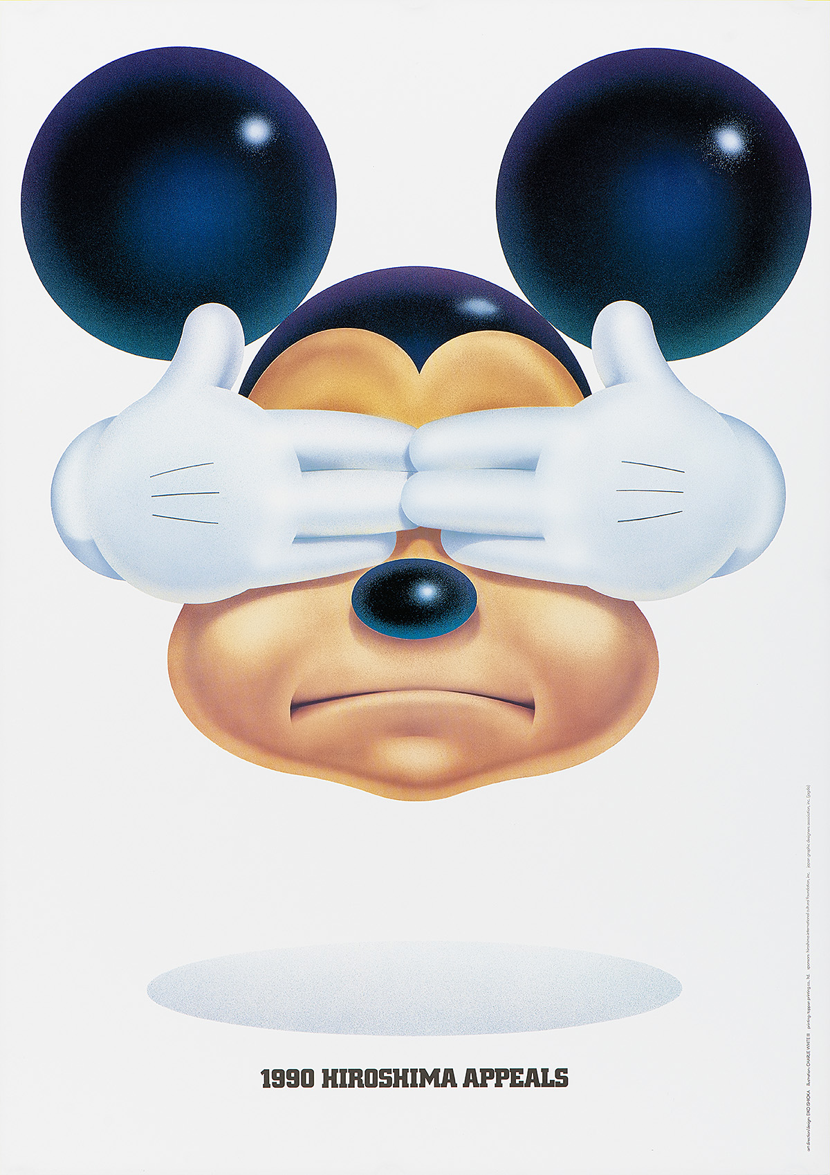
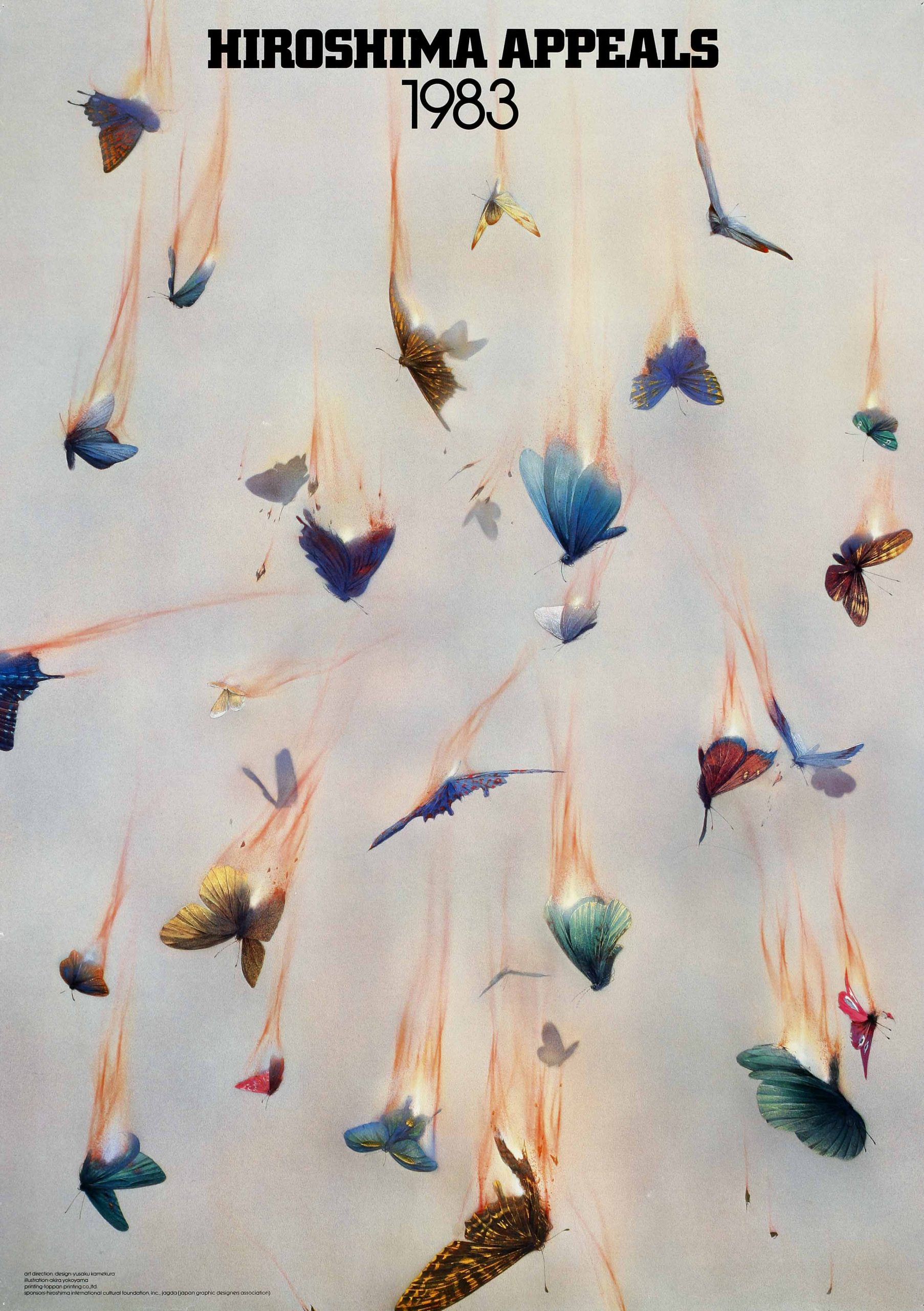
During the Second Sino-Japanese War (1937–45) and World War II (1939–45), posters were intended to inspire patriotism, circulate propaganda, and encourage consumer restraint in support of the war effort. During the postwar period, however, unparalleled growth in the manufacturing sector catapulted the Japanese economy to the position of second largest in the world, creating limitless opportunities for poster advertising as Japanese corporations became both household names and global brands. Following the 1964 Tokyo Olympics and the 1970 Osaka World Expo, Japan’s international standing shifted again, emboldening Japanese artists and designers to conceive new forms of graphic media that combined a traditional Japanese aesthetic with Western design idioms. Between the 1980s and the early 21st century, Japanese posters functioned beyond the realm of the merely commercial, allowing designers to address such social issues as pollution, climate change, sustainability, nuclear disarmament, and global peace and reconciliation. 

This exhibition explores the cultural and political shifts within modern Japan that influenced the functions and messaging of its advertising posters, and the public’s response to them.

Unless otherwise noted, all items come to Poster House through a generous loan from the Merrill C. Berman Collection.

A photo offset poster of a gold background resembling the inside of a computer with text overlay.

Japan, 1988

Kamekura Yūsaku (1915–77)

The Merrill C. Berman Collection

  • This poster was made for the Japan Graphic Designers Association (JAGDA) that played a crucial role in the development of Japanese poster design after the war. Kamekura Yūsaku was instrumental in establishing JAGDA in 1978 and served as its first president until 1994. Many designers featured in this exhibition are part of JAGDA, which today has more than 3,000 members. 
  • The letters spelling “Japan” at the center of this composition reference contemporary technological advances while paying homage to traditional Japanese art forms. The meticulous patterns and shapes resemble the interior of a computer motherboard, reflecting the economic success and rise of Japanese industries during its economic bubble in the 1970s and ’80s, especially electronics companies. At the same time, the gold recalls the backgrounds of the paintings, screens, and maki-e lacquer ware that had flourished in Japan since the 16th century.  
  • Kamekura stated that: “I believe that while tradition may be a burden to the designer it is something which he cannot entirely reject. Our duty is rather to take our tradition apart and then put it together again in a new way.”

A photo offset poster of the Japanese character for

Trees, 1955

Yamashiro Ryūichi (1920–97)

The Merrill C. Berman Collection

  • This poster is considered a masterpiece of Japanese graphic design. The typography plays on the pictographic origins of Chinese characters, incorporating the character for “tree” (木), which, when repeated twice, becomes the character for “woods” (林), and, with the addition of a third character, comes to signify “forest” (森). 
  • Yamashiro dispersed these characters throughout the composition, suggesting a typographic woodland, and varied the font to create an impression of trees of different sizes. 
  • This poster is one of many produced for the numerous tree-planting campaigns and the Forest Protection Movement sponsored by the Japanese government after World War II. The dearth of domestic lumber was a serious concern during the postwar decades, and many Forest Acts were introduced during this period to establish reforestation plans.

A photo offset poster of an shadow figure surrounded by Japanese text and a border of nature photos.

Kara Jūrō’s “John Silver: Love in Shinjuku,1967

Yokoo Tadanori (b. 1936)

The Merrill C. Berman Collection

  • This poster was made for Kara Jūrō’s two-act play, John Silver: Love in Shinjuku. At the upper left is a portrait of the playwright within a red fan, while the rest of the composition is framed by life-size hanafuda (flower cards), a type of Japanese playing card. Advertisements for a variety of businesses are scattered throughout the design, recalling similar promotions within traditional ukiyo-e woodblock prints, produced from the 17th through 20th centuries in Japan and showing a range of popular subjects. 
  • Unfortunately, this design was not completed in time for the event. The lower-right corner shows an apology written by Yokoo Tadanori to the client: “Dear Kara Jūrō, please forgive me for being late with this design.” Many posters for specific events were not actually seen until after the occasion they were intended to promote. Yokoo later described the work as “deviating completely from the function of a poster in that it was completed on the morning of the day of the performance.”
  • This celebrated poster points to the relationship between the functional role of posters as advertising and their independent value as aesthetic objects. Yokoo’s posters were especially admired and collected for their artistic merit.

Homage to Ukiyo-e

Japanese posters are rooted in the ukiyo-e tradition of woodblock printing, in which collaboration and creative vision among artists, designers, publishers, printers, and patrons were especially valued. Many poster designers have acknowledged and paid homage to the artistry and techniques of ukiyo-e and its sources. Gofukuten (kimono-fabric stores), established during the Edo period (1603–1868) and forerunners to the contemporary Japanese department store, were important subjects in Japanese prints and posters, and became important venues for the display of posters during the early 20th century. Theaters also displayed billboards for kabuki plays across their facades.

During the Edo period, businesses commissioned prints of famous kabuki actors and beautiful courtesans that included images of their own shops in the background. Such designs were then distributed to customers so they could appreciate them in a private setting. Other formats such as the e-bira (picture handbill), kōkoku-bira (advertisement handout), and e-kanban (picture signboard) also flourished during this time. The continuation of these practices in the early 20th century suggests the timeless appeal of this kind of printed ephemera, intended for a limited audience and often given to preferred clients. 

During the late 19th and early 20th centuries, Japan embraced such modern, foreign printing technologies as the rotary press, offset printing, and photographic reproduction, leading to a proliferation of printed materials in color. The publishing industry that had previously relied upon woodblock printing also began to incorporate these new printing techniques, helping to establish the style of the modern Japanese poster.

A three part illustrational print of a crowd of people wandering around a theater area.

“Illustration of Thriving Theater District” from the series Famous Places in Edo, 1854

Utagawa Hiroshige (1797–1858)

Loan, The Ronin Gallery, New York City

  • This triptych print shows the thriving theater district in Edo (modern-day Tokyo) and depicts the Nakamura Theater in the central image.
  • The composition features painted e-kanban (billboards) decorating the upper awning and advertising daily kabuki performances. These billboards often showed dramatic images of a play’s main characters to entice the public. 
  • The relationship between kabuki theater and advertising is important, as the names of actual stores and products were frequently mentioned throughout the performance. Along with promotional woodblock prints, this marks an early example of product placement, anticipating such promotional devices in modern marketing. 

A print of three figures on a roof in front of a mountain background.

“The Mitsui Store at Suruga-cho in Edo” from the series 36 Views of Mt. Fuji, 1832

Katsushika Hokusai (1760–1849)

Loan, The Ronin Gallery, New York City

  • This print offers a view of the rooftop of Echigoya (sometimes called Mitsui Clothing Store), a kimono-fabric retailer established in 1673 and the predecessor to the Mitsukoshi department store, founded in 1903. Signs on both sides of the Suruga-cho thoroughfare display the historic Mitsui crest, and this elevated vantage point effectively contrasts the bustle of the vast number of retail businesses with the peaceful solitude of Mt. Fuji. 
  • With its “department store declaration” of 1904, Mitsukoshi transformed itself from a kimono-fabric store into a leading company with an established branding and design strategy. In addition to its cutting-edge advertising, the store had a tremendous impact on new business models and the design of the modern Japanese lifestyle. 
  • Katsushika Hokusai is considered one of the greatest artists in the Japanese print tradition, specializing in many genres, including book illustration, surimono (privately commissioned prints), manga (miscellaneous sketches), and landscape prints. He became especially popular for the series 36 Views of Mt. Fuji, which includes this print. 

Selling the National Image: Defining Modern Japan

Branding

By 1910, the transformation of Japan into a modern nation state was nearly complete. In 1868, the Meiji Restoration of imperial sovereignty ended more than two centuries of relative isolation, ushering in an era of enormous political, economic, social, and cultural change as the country opened to the world. The astonishing speed and scope of Japan’s modernization process meant that within 40 years the country was able to match Western technological and industrial models. With the dramatic expansion of heavy industry and manufacturing during World War I (1914–18), Japan experienced unprecedented economic prosperity. Advances in communication and the publishing industry also created more opportunities for members of the burgeoning urban middle class to engage with and contribute to modern life. Technological innovations in commercial printing and photography increased demand for posters promoting a lifestyle that showcased the latest products, habits, and fads. As part of an effort to shape Japan’s national identity, posters sold an image that fused modern motifs with commercialism. Much of the advertising content of this era incorporated the moga (Modern Girl), shown actively participating in the new culture of consumerism as she perused women’s magazines and shopped in department stores. 

With the rise of Japanese imperialism, posters and magazines also became a tool for government propaganda, selling an image of a country that was culturally and economically superior to other Asian nations. In the late 1930s, the Japanese government exerted editorial control over the content in mass-market advertising and printing, using posters and magazines to promote and justify the war effort and recruit citizens. During World War II, posters encouraged members of the public to increase productivity and conserve resources while instilling a sense of national pride. From sugoroku game boards to Western-style clothing brands, between 1910 and 1945, posters celebrated Japan as an economic and military powerhouse.

“We are responsible for first dissolving our traditions and then creating them anew.”—Kamekura Yūsaku

A woodblock print of a suit, top, and sock arranged in a catalogue format.

Nikke, c. 1935

Attributed to Okuyama Gihachirō (1907–81)

The Merrill C. Berman Collection

  • Okuyama Gihachirō was an artist and commercial designer who worked primarily within the shin-hanga (new prints) and sōsaku hanga (creative prints) movements of woodblock printing. During the 1930s, Okuyama produced advertisements for the Nikke clothing and textile company using woodblock printing techniques. In 1931, he founded the Tokyo Advertisement Art Association, and, in 1946, established Japan Print Institute, a publishing firm.
  • This poster is from a larger design series produced for Nikke to market its Western-style clothing, including woolen suits, knitwear, and socks. It reflects both the Japanese consumer’s taste for Western dress and Okuyama’s training in sōsaku hanga—a movement characterized by personal expression, often involving artists carving and printing their own designs—to create dynamic compositions that blended typography and illustration.

An illustrational collaged poster of many objects marked with numbers.

Shopping Sugoroku, 1914

Kawabata Ryūshi (1885–1966)

The Merrill C. Berman Collection

  • Sugoroku (double sixes) is a popular Japanese board game played with a set of dice. The examples you see here are from a version of the game known as picture sugoroku which consists of illustrated game boards loosely resembling those of Chutes and Ladders. 
  • Many picture sugoroku games of the early 20th century were created as advertisements, printed on poster-size paper and included as supplements to popular women’s magazines. This particular version was an appendix to the New Year issue of Shōjo no tomo (Girl’s Friend), advertising the highly anticipated opening of Mitsukoshi’s incredibly modern department store. The poster supplements could be removed and played as games or hung up as decoration. 
  • Department stores occupied a critical role in modern Japanese consumer culture, and this poster depicts a lavish, five-floor Renaissance-style building equipped with the latest technologies, including elevators and escalators.

An illustrational collaged poster of many objects marked with numbers.

Patriotic Women’s Sugoroku, 1934

Designer Unknown

The Merrill C. Berman Collection

  • Sugoroku game boards also became a popular propaganda tool, promoting Japanese militarism and nationalism in the years leading up to World War II. Published and distributed by the Patriotic Women’s Association of Tokyo, this sugoroku was circulated among its members to encourage Japanese women and girls to support the war effort in various ways.  
  • The Patriotic Women’s Association (1901–42) was overseen by the Ministry of Home Affairs and the Ministry of Health and Welfare, with the primary goal of mobilizing women to support the families of dead and injured soldiers. By the mid-1930s, however, these activities had been extended to educational and social-service projects intended to stimulate wartime industry and encourage frugality in support of the military and the expansion of the Japanese empire.
  • Examples of the Patriotic Women’s Association social-service and advocacy initiatives are represented in the 66 didactic frames of illustrated pictures, text, and photographs that offer lessons and advice on child welfare, education, military relief, and savings—matters for women to attend to in service of the state.

A magazine cover of a smiling baby in a basket. Behind the baby is a figure looking down.

A magazine cover of three soldiers with their heads close together each holding up a cigarette.

A magazine cover of two young girls sitting on grass with their arms held up wearing dresses.

A magazine cover of 6 airplanes flying above dark clouds. Each plane has a red circle on it.

A magazine cover of two soldiers smiling and holding an ax on a blue background.

Photographic Weekly, 1938–45

The Merrill C. Berman Collection

  • In addition to posters, the government used mass-market publications and photography in its efforts to create a national image of wartime Japan. Photographic Weekly was a magazine published by the Japanese Cabinet Information Bureau that not only covered the war in Asia but also harnessed the expressive power of photography to convey individual and collective experiences of war.
  • Photographic Weekly dispatched news of the Second Sino-Japanese War (1937–45) and the Pacific War (the theater of World War II fought in the Asia-Pacific region between 1941 and 1945). Its editors also sought to communicate the intimate and emotional aspects of daily life at home and abroad with a cinematic style of photography influenced by the Russian avant-garde that engaged extreme close-ups, montage, and high and low angles. The magazine thereby presented a dynamic and compelling image of Japan’s military war machine.

Rebranding

Japan’s reemergence after its devastating defeat in World War II was characterized by a series of political and economic shifts that were to radically reshape postwar society. During the Allied Occupation of Japan (1945–52), the U.S. military imposed an agenda of demilitarization and democratization. Japanese wartime propaganda was replaced by themes promoting recovery, peace, and prosperity, and commercial poster design played a crucial role in transforming the popular international image of Japan through the lens of cultural exchange. 

In the following decades, Japan hosted a number of major international events, including the 1964 Tokyo Summer Olympics, the 1970 Osaka Expo, and the 1975 Okinawa Ocean Expo, that celebrated national progress and symbolized a successful return to the global arena. The 1964 Summer Games and the 1970 World Expo were particularly important milestones for the country as they were held in Asia for the first time. They also acted as catalysts for urban renewal; skyscrapers and transport infrastructure were installed, including expressways, railways, and subway systems. 

Posters of this period blended elements of traditional Japanese art with modern graphic design, advertising the recasting of Japan’s global image through international partnerships and transnational cultural exchange. Japanese designers introduced a distinctive, new national identity as they reimagined established Japanese motifs for a contemporary audience.

A black illustrational poster with an outline of a woman kneeling with her face and hair visible.

Japan/Japan Air Lines, 1958

Hayakawa Yoshio (1917–2009)

The Merrill C. Berman Collection

  • Hayakawa Yoshio was a designer, illustrator, and commercial artist who began his career in the 1940s, creating advertisements and window displays for major department-store chains like Mitsukoshi. 
  • In 1951, he cofounded the Japan Advertising Artists Club (JAAC), earning fame and recognition for a design style based on a traditional Japanese aesthetic, including asymmetry, flatness of the picture plane, and an emphasis on pure line and color. These elements are best illustrated in this poster for Japan Air Lines, which won the 8th JAAC Members Prize. 
  • The composition shows a woman kneeling at the lower-left corner, indicated by the partial outline of her face and the elaborate nihongami (traditional Japanese women’s hairstyle) held in place by hairpins and a comb. The negative space of her body is interrupted by a swath of blue from her obi (cloth waist sash), as her left hand gestures toward the company’s name. The text “Japan,” written in both English and Japanese, indicates that the airline aimed to engage both domestic and international clients.

A photo offset poster of an olympian running with a flaming torch in front of a sunset background.

XVIII Olympic Games, 1964

Kamekura Yūsaku (1915–77)

The Merrill C. Berman Collection

  • Kamekura Yūsaku was one of the most famous graphic designers of the postwar  period and is best known for the poster series he created for the 1964 Tokyo Summer Olympics. The Olympics marked a watershed moment for Japan as it reentered the world stage, presenting a new postwar identity of peace, prosperity, and resilience. 
  • Sakai Yoshinori, the official Olympic torchbearer that year, became a symbol of this identity. He was born in Hiroshima on August 6, 1945—the same day the United States dropped the first atomic bomb on Japan in that city.
  • In this poster series, Kamekura incorporated photography into his designs for the first time. Just beneath Yoshinori’s figure is the logo he designed for the Olympic Games, one that became synonymous with the innovative Japanese graphic design of the period.

A photo offset poster of a geometric flower with a red center and gold sun-like petals.

Expo ’70, 1967

Kamekura Yūsaku (1915–77)

The Merrill C. Berman Collection

  • In 1970, after the positive international response to the 1964 Tokyo Olympics, Japan hosted its first World Expo, attracting a record 64 million visitors. In an effort to demonstrate the success of its ongoing economic and social recovery, as well as to promote nuclear disarmament and nonproliferation, the nation embraced the theme of “Progress and Harmony for Mankind.” 
  • Kamekura’s winning design for the official poster for overseas use depicts his minimalist, geometric interpretation of the five petals of a cherry blossom—a culturally resonant symbol of Japan, prized for its ephemeral beauty. 
  • Fellow designer Nagai Kazumasa commented that “this poster is outstanding for its elegance and power. Black and gold immediately suggest old Japanese lacquer, and yet at the same time the design is superbly modern and full of optimism for the forthcoming exhibition.”
  • In 1968, this poster won first prize at the International Poster Biennale in Warsaw, Poland.

A photo offset poster of a photograph of an ocean with illustrated ocean lines over it.

Expo ’75, 1975

Nagai Kazumasa (b. 1929)

The Merrill C. Berman Collection

  • Espo ’75, the International Ocean Exposition in Okinawa, celebrated oceanographic exploration, conservation, and culture. It also commemorated the return of Okinawa Prefecture to Japan after almost three decades under U.S. control. 
  • Official plans for the expo led to significant development in Okinawa’s infrastructure and tourism industry, including the construction of highways and hotels as well as improvements to the water-supply system.
  • Here, the designer references traditional art of the Edo period. The metallic silver outline of a wave in the Rinpa style is superimposed over a photograph of the expansive blue ocean. This style emerged in the early 17th century and is characterized by stylized natural forms and allusions to traditional court literature and poetry, the lavish application of mineral and metallic pigments, and the incorporation of calligraphy. The wave motif is also reminiscent of Hokusai’s famous woodblock print Under the Wave off Kanagawa, also known as The Great Wave (c. 1831), and is repeated in the logo that Nagai created for the event. 

“The poster is, of course, a two dimensional flat surface using paper as its medium. Its message is presented as a concentrated essence from which all superfluities have been shorn, much in the manner of short Japanese literary forms such as the haiku and the tanka.”—Tanaka Ikkō

A photo offset poster of a geometric woman dressed in traditional Japanese clothes and makeup.

Nihon Buyo, 1981

Tanaka Ikkō (1930–2002)

The Merrill C. Berman Collection

  • Tanaka Ikkō was a renowned designer of posters, books, lettering, and packaging. He joined the Nippon Design Center in 1960 as its artistic director. Over the course of his 50-year career, Tanaka developed a commercial style that combined traditional Japanese artistic forms with modernist principles of simplicity, clarity, and minimalism. 
  • He was internationally recognized as a leading force in commercial and corporate branding, especially in his role as the first artistic director of the Japanese retailer Muji, where he introduced his signature minimalist style. 
  • This is Tanaka’s best-known poster, created for the Asian Performing Arts Institute and its celebration of traditional Japanese dance, music, and theater. It depicts the highly stylized head and shoulders of a female dancer with simple geometric forms and colors. Tanaka reinvented traditional motifs through this kind of bold color blocking and abstraction in an effort to package Japanese culture for an international audience.

A photo offset poster of a black airbrushed mountain with a purple wash over it.

A photo offset poster of a white snowy airbrushed mountain with blue and white colors overlaying.

A red photo offset poster of an airbrushed mountain with a yellow halo covering the peak.

A photo offset poster of an upsidedown airbrushed mountain with colorful horizontal lines overlay.

A black and white photo offset poster of an airbrushed mountain with a moon in the background.

Five Seasons, 1988

Satō Kōichi (1944–2016)

The Merrill C. Berman Collection

  • In 1969, Satō Kōichi graduated from Tokyo University of the Arts and began working for Shiseido, the Japanese cosmetics company, before opening his own independent design studio in 1971. When reflecting upon his career, Satō stated that he felt a sense of “responsibility to incorporate traditional Japanese beauty and thoughts into my works” and has often been referred to as the most “Japanese” of the country’s graphic designers.
  • Satō’s Five Seasons was sponsored by the Taiyo Kikai Ltd. printing company and focuses on Mt. Fuji—a sacred site in Japan—as it appears in different seasons. Famous for his infusion of traditional Japanese motifs with modern design concepts, Satō typically incorporates simple organic forms with vivid color, subtle gradation, and hazy auras to create mysterious and poetic images.
  • Reminiscent of Hokusai’s famous ukiyo-e print series Thirty-six Views of Mount Fuji, each of the posters in Five Seasons provides a different “view” of the mountain, beginning in the New Year and spanning spring, summer, autumn, and winter. In each image, Satō uses bold airbrushed color overlaid with metallic embossing to create a radiant and ephemeral seasonal landscape.

“I had a responsibility to incorporate traditional Japanese beauty and thoughts into my works back in those days.”—Satō Kōichi

A photo offset poster of a bowl of tea surrounded by circular gradations of color.

Rikyū, 1988

Satō Kōichi (1944–2016)

The Merrill C. Berman Collection

  • In this poster for the 1989 film Rikyū (about the 16th-century tea master Sen no Rikyū), Satō creates an aura around the central motif of a bowl of tea with gradations of vibrant color.  
  • Rikyū was associated with wabi-cha, a style of tea ceremony characterized by simplicity, restraint, and an austere beauty. Satō’s image of a single raku-ware tea bowl—a highly prized tea-ceremony vessel made from clay fired at a low temperature—is accompanied by a poetic text that translates as “beauty is unwavering.” The words appear to rise like steam from the clay bowl, expressing the deep emotion evoked by such traditional forms.

The Rise of Japanese Industry & the Role of Design

In 1952, at the end of the Allied Occupation, Japan experienced one of the most intense and sustained periods of economic growth in modern history, becoming the world’s second-largest economy in less than 40 years. This “economic miracle” ushered in a new era of manufacturing and trade as well as a burgeoning middle class. The Japanese government shifted away from heavy wartime industry, instead encouraging domestic production of cars, bicycles, and household appliances. During the 1950s, posters and advertisements for home electronics boasted of a new “electronic era.” Sony is one of the most globally recognized Japanese brands to emerge during this period; the company established its international reputation with the release of the transistor radio in 1957, one further enhanced by the introduction of the portable Walkman in 1979.

During the 1960s, Japan shifted to export trade, initiating a leisure boom that resulted in astonishing wealth and prosperity. These years also witnessed the first golden age of graphic design in postwar Japan. Posters reflected an international style yet maintained a distinct Japanese identity. If this decade was defined by intensive national growth, the subsequent one was marked by the promotion of a lifestyle of leisure, comfort, and beauty. Japanese companies sought to build their corporate reputations through posters that reflected the emergence of a new cosmopolitan era.

“Japan at the time [1960–70s] was directly influenced by the consumer culture of American society; therefore I don’t think it would be wrong to say that it was just very natural to use mass-produced icons and symbols as painting motifs.”—Yokoo Tadanori

An illustrational poster of hands in soapy water. Next to the hands is a bar of soap.

Nissan Landry Soap, 1954

Ohchi Hiroshi (1908–74)

The Merrill C. Berman Collection

  • Nippon Oil & Fats was a chemical-manufacturing company established in 1937 when it merged with several other corporations. Precursors to the brand can be traced back to the Meiji period (1868–1912), when it developed as a manufacturer of industrial chemicals, using its oil technologies to produce soap. The increased demand for beauty and cleaning products during the 1950s led many other Japanese manufacturers to enter these markets. 
  • Ohchi Hiroshi, the first art director of IDEA, a graphic design and typography magazine, is known for his simple geometric designs. Here, he uses minimal lines and forms to suggest the sensual pleasure of handwashing. The brand name of the advertised product can only be seen inscribed on the green soap bar at the upper left.

An illustrational poster of an eyeball with antennae as eyelashes and a logo as the iris of the eye.

Aria TV, c. 1954

Ohchi Hiroshi (1908–74)

The Merrill C. Berman Collection

  • The Mitaka Electric Company began producing vacuum-tube radios in the 1930s, branching into radio sets for domestic use right after World War II. 
  • Ohchi Hiroshi produced a similar image for Aria radios in 1954. Here, he has set the brand name inside an eyelike shape, incorporating two antennae in place of lashes. The Aria television in the center draws the eye with its bold, playful colors. 

An illustrational advertisement poster with three wheels with different color palettes.

Tokyo Motor Show, 1956

Kuro (Dates Unknown)

The Merrill C. Berman Collection

  • Global corporations like Toyota and Nissan were established in the early 1930s, mainly producing military and industrial vehicles. Only after 1949, when Allied Occupation General Headquarters lifted its ban on domestic automobile production, did the Japanese automobile industry begin to expand significantly. The global ascent of the industry underscores the importance of technology to the country’s stratospheric economic growth.
  • In 1954, the first All Japan Motor Show was hosted by the Japan Automobile Manufacturers Association (JAMA). While the first two events mainly showcased commercial automobiles, by 1955 the Japanese government had begun to encourage the manufacture of passenger cars for domestic use. This poster advertises the first car show to target the general public. Passenger cars were still quite expensive, however, and the government urged the production of more affordable options. 
  • In 1964, the event was renamed the Tokyo Motor Show and was designed to attract a more international audience. Today, it is one of five international motor shows, along with those in Frankfurt, Paris, Geneva, and Detroit. 

A photo offset advertisement with concentric orange and green circles with chopsticks in the center.

A photo offset advertisement with boxers and coat hangers in the center and red and yellow lines.

Matsuda Quick Special Oil Colours, c. 1961

Designer Unknown

The Merrill C. Berman Collection

  • Matsuda Gaso was established in 1948 by Matsuda Mokuhei and still produces high-quality oil paint and other art materials. Many artists complained that Japanese oil paint was of poor quality, prompting Matsuda to release its Super Oil Paint in 1952, incorporating high-grade poppy oil to prevent discoloration and fading. In 1961, it also released a quick-drying oil paint called Speed Color. 
  • These posters emphasize the brand’s product developments through the use of strong, saturated colors, with small text at the top reading: “Happy. I found oil paint that will dry in one day.”  

A photographic advertisement of two models's faces. One model kisses the other model's cheek.

Love in Color, 1970

Nakamura Makoto (1926–2013)

The Merrill C. Berman Collection

  • As Japanese industry expanded during the postwar years, Shiseido quickly established itself as one of the country’s leading companies. Founded in 1872, it remains a globally recognized cosmetics brand. Under the famous art director Yamana Ayao, who led the company’s design strategy from the 1920s to ’40s, Shiseido produced stunning posters designed to enhance its corporate image.
  • From the mid-1950s to the 1980s, Nakamura Makoto was the art director at Shiseido. In the 1970s, he began employing Japanese models in the brand’s advertisements—a reaction to the trend for using Western women only. This reflected a wider interest in representing Japanese beauty in the tradition of bijin-ga (images of beautiful women) posters from the early 20th century. 
  • In the late 1960s, incorporating English words into Japanese advertising also became popular. The smaller and less flashy text in Japanese reads: “A Color to be in Love? A Color to be Loved? Love in Color.” In the bottom right is a camellia flower, the brand’s logo since the early 20th century.
  • The main model facing the camera is missing her left ear. Nakamura had the photograph retouched, as he felt this detail distracted the viewer from the features of the second model.

A photographic poster of a woman wearing a bikini in the water of a scenic beach.

A photographic poster of a woman wearing a bikini laying on a dune.

A photographic poster of a woman's face blending in to a dune landscape.

Big Summer, 1973

Matsunaga Shin (b. 1941)

The Merrill C. Berman Collection

  • Matsunaga Shin created these posters for Shiseido’s bronze suntan oil and powder foundation, and used the tanned curves of the female form to mimic sand dunes. The Tokyo Art Directors Club (ADC) awarded him its prize for this annual campaign three years running (1969–71).
  • As in other Shiseido posters, a small photograph of the product only appears above the brand’s logo. The text below two of the posters notes the name of the foundation, Shiseido Beauty Cake, and, in the third, Shiseido Sun Oil.
  • Like many advertising campaigns of the time, Shiseido’s posters did not focus on the actual products it was promoting. Instead, they suggest that individual identity can be established through consumption.

A photo offset advertisement of a little girl jumping on a tile texture and water and sky overlay.

Kōrakuen Jumbo Pool, 1973

Designer: Nagai Kazumasa (b. 1929)
Illustrator: Takino Haruo (Dates Unknown)

The Merrill C. Berman Collection

  • In 1973, the Kōrakuen Jumbo Pool opened in Tokyo. It would soon be joined by the Tokyo Dome, the country’s first indoor baseball stadium; both were representative of the country’s new boom in leisure activities.
  • The site for the pool was originally used as a keirin-jō (velodrome) and hosted bicycle races until 1972, when the mayor of Tokyo banned gambling institutions within the city. It was renovated as the Kōrakuen Jumbo Pool, which remained in operation until 1986.

A photo offset advertisement of a colorful swirl silhouette drinking from a triangular cup.

Bireley’s, 1981

Tsukamoto Akihiko (b. 1952)

The Merrill C. Berman Collection

  • Bireley’s is a popular orange-flavored soft drink that has been distributed since 1951 by the Japanese company Asahi Soft Drinks Co., Ltd., a subsidiary of Asahi Breweries.
  • The iconic Bireley’s logo featuring an orange-headed figure drinking from a triangular cup was designed by Bireley’s California Orange Limited. In this poster, Tsukamoto Akihiko has retained the mascot’s silhouette but filled it with multicolored, modern swirls. 
  • Bireley’s orange drink gained widespread fame through frequent product placement in films produced by the Japanese company Toho Co., Ltd. It most often appeared in movies from the Godzilla franchise, especially during the 1960s.

A photo offset poster filled with boxes with lines in them from the center of the page to the edge.

Onkyo/Artistry in Sound, 1982

Kamekura Yūsaku (1915–77)

The Merrill C. Berman Collection

  • Established in 1946 as Osaka Denki Onkyo K.K, the Onkyo Corporation is an electronics company that manufactures automotive speaker systems and other audio products. Today, it specializes in premium home-audio equipment, speakers, and portable devices. 
  • ”Onkyo” is a combination of the word “on” (meaning “sound”) and “kyo” (meaning “to resound or echo”). While Kamekura Yūsaku uses simple abstract shapes in the poster, his careful placement of the variously sized characters is meant to represent the range of different sounds and volumes emanating from a speaker. 

A photographic poster of 5 women wearing golden outfits with their backs against a large battery.

Sony/Music With Me, 1990

Designer Unknown

The Merrill C. Berman Collection

  • The first model of the Walkman was released in 1979, sparking a global boom and paving the path for portable music. As Sony’s Walkman and video cameras became increasingly popular, battery sales accelerated. 
  • An enlarged battery serves as a vertical pillar around which the five members of the Japanese rock band Princess Princess stand alongside the text “Music with Me.” This band was active during the 1980s and ’90s, and is considered one of the most successful all-female rock bands in the country. 
  • In bold yellow type, the poster states: “For Music, Batteries Change.”

Bridging Art & Design 

The postwar era in Japan was partially defined by the “Americanization” of modern life, a condition accelerated by the Allied Occupation (1945–52). Even after the end of the Occupation, there continued to be a sustained influx of American commercial products and fads, in addition to a rising awareness of the political and social protests of the American counterculture movement. All this was assisted by the dramatic evolution of electronic media during this period, including television, film, radio, and music. Within this atmosphere of change, Japanese artists began to rethink hierarchies within the art world, questioning definitions of art-making and exhibition practices by blurring the boundaries between commercial and fine art. Many artists moved their creative work out of museums and galleries and into city streets, parks, playgrounds, and underground theaters. 

Avant-garde collectives such as Jikken Kōbō (Experimental Workshop, 1951–57) played an integral role in these developments, working across various media and eschewing conventional fine-art materials as they embraced new technologies and everyday objects. Such activities anticipated the anti-art, Conceptual art, and Pop art movements of the 1960s and ’70s that not only sought to reconceive the relationship between art and society, but also represented a response to the political turmoil of the postwar era. 

In this milieu, the work of Yokoo Tadanori and Tanaami Keiichi—two of Japan’s most famous artists and commercial designers—inhabits the fluid space between art and advertising. Throughout his professional life, Yokoo experimented with a range of media and modes of representation, engaging with both traditional Japanese imagery and American pop culture. While he is most celebrated for his bold and colorful posters from the 1960s, in which fragmented images drawn from Pop art, kitsch, commercial photography, and ukiyo-e motifs are transposed into dynamic screen-printed collages, his commercial work with such major brands as Suntory, Toshiba, and Asahi Broadcasting integrates the graphic and the painterly as well as motifs taken from advertising, avant-garde art, and everyday objects. 

Similarly, Tanaami Keiichi’s artistic output spans painting, illustration, graphic design, animation, and sculpture. Although he began his career as a commercial art director, his exposure to the avant-garde Neo-Dada groups of the early 1960s as well as his participation in the Animation Festival at the Sōgetsu Art Center inspired him to embrace a variety of new visual styles. Tanaami is most famous for his colorful psychedelic designs that incorporate pop-culture iconography with silkscreen and collage; his album covers for Western bands, including Jefferson Airplane and The Monkees; his posters for avant-garde films; and his magazine inserts for the Japanese edition of Weekly Playboy.

“I have never really been influenced by other commercial art. The influence of Japanese ukiyo-e woodblock prints, illustrations in old Japanese novel books and American as well as European contemporary art was a lot stronger.”—Yokoo Tadanori

A silkscreen poster of a couple over graphic images such as water, text, and a skydiver.

Petticoat Osen: A Tale of Forgetfulness, 1966

Yokoo Tadanori (b. 1936)

The Merrill C. Berman Collection

  • Throughout his career, Yokoo aspired to eliminate the barriers between art and daily life. His early graphic style was informed by Japanese textile labels, menko playing cards, and ukiyo-e prints. In 1964, after spending four years at the Nippon Design Center, Yokoo left the prestigious advertising firm to collaborate with avant-garde underground theater groups, including Kara Juro’s Jōkyō Gekijō (Situation Theater) and Terayama Shūji’s Tenjō Sajiki (The Gallery). He also worked with choreographer Hijikata Tatsumi (founder of a dance style known as Ankoku Butoh, meaning “Dance of Darkness”) and Japanese New Wave filmmaker Oshima Nagisa. These projects emboldened him to develop the colorful, psychedelic Pop art style for which he is best known. 
  • This poster for Jōkyō Gekijō’s performance of Petticoat Osen is emblematic of Yokoo’s playful and subversive approach to design. The bright hues and dynamic composition not only channel the powerful emotions, energy, and bravado of Edo-period kabuki theater, but are also representative of an experimental artistic style that combines Western imagery with Japanese motifs, symbols, and photography, creating a synthesis between avant-garde happenings, consumer culture, and everyday objects.

A silkscreen poster of a spacesuit with a crowd in its helmet. A crying man flies around its head.

The City and Design, 1965

Yokoo Tadanori (b. 1936)

The Merrill C. Berman Collection

  • This poster promotes the book The City and Design by the literary critic Kurita Isamu. In it, he offers a new concept of urban space and architectural planning in the context of increasing internationalism and the evolution of the modern city, one defined by what Kurita referred to as “sensitive” design. The text at the top notes that it is “a terrifying design theory drawn with unprecedented scale and dynamic touch.”
  • Yokoo also collaborated with Kurita on the illustrations for the book, establishing the style by which it would be promoted to the public. He combines imagery inspired by comic books with embellished typographic elements and such pop-cultural motifs as the figure of Godzilla. Meanwhile, a globe at lower left signifies the possibilities of a new internationalism. 

A silkscreen poster of a woman standing on a train on water over a sun with extending rays.

Yukio Mishima/The Aesthetics of End, 1966

Yokoo Tadanori (b. 1936)

Collection of Peter Kahane

  • Yokoo designed this poster to promote The Aesthetics of End by novelist Mishima Yukio, published serially in the women’s magazine Josei Jishin (Women’s Own) between February and August 1966.
  • Mishima was a famous author and intellectual, and a controversial political figure whose writings explore the tension between traditional culture and modernity in postwar Japan. During the 1960s, Yokoo developed a close friendship with Mishima, creating a number of book jackets and posters for his novels and plays that represented their themes of death, sexuality, violence, and patriotism. 
  • This poster’s dreamlike narrative quality combines the rising-sun motif from the Japanese imperial flag with the central motif of a black steam engine riding across waves in the style of those in traditional ukiyo-e prints. Both the rising sun and speeding train recur in Yokoo’s work.
  • A photograph of Mishima in the upper-left corner shows him apparently staring across at a half-naked woman expressing milk from her right breast. This references a scene in the author’s 1956 book The Temple of the Golden Pavilion, in which a woman offers her lover her own breast milk in a tea bowl.

A silkscreen poster a yakuza holding a sword with a hand with a severed finger are above him.

Ballad to a Severed Little Finger, 1966

Yokoo Tadanori (b. 1936)

The Merrill C. Berman Collection

  • During the 1960s, Yokoo designed posters for a series of yakuza (gangster) films starring Takakura Ken, one of the biggest stars of postwar Japanese cinema. He is shown in a warrior-like pose at the lower center of the composition, covered with irezumi (tattoos) and wielding a sword. While Takakura’s film career spanned decades, he first became known for his tough-guy roles in gangster movies, establishing himself as an archetypal male role model for the Shōwa (1926–89) generation. 
  • At the top of the poster, Yokoo includes the image of a hand with a freshly severed finger, explicitly suggesting that he would engage in the ritual act of yubitsume (finger foreshortening typically enacted by a gang member as atonement for offenses) as a means of conveying his utmost respect for the movie star. This articulation of aggressive masculinity is further underscored by the phrases “Let’s die!” and “Yakuza are not the only men.” 
  • This poster features several motifs that appear frequently in Yokoo’s work of this period, including Hokusai’s The Great Wave and the rising sun as well as a small self-portrait of the artist on a 30-yen coin. 

A photo offset poster of 4 screaming mouths. Underneath is an eyeball with rays coming from it.

Word Image, 1968

Yokoo Tadanori (b. 1936)

The Merrill C. Berman Collection

  • This poster was commissioned by the Museum of Modern Art in New York to advertise its exhibition Word and Image, featuring important 20th-century posters from its permanent collection. The museum first acquired Yokoo’s work in 1966, and this groundbreaking exhibition helped him gain international acclaim. The New York Times described the show as “a landmark presentation that helped define the medium for scholars, graphics specialists and collectors.” 
  • Yokoo specifically designed this poster with an emphasis on sign and symbol rather than on text and typography. To convey the titular “image,” a large, all-seeing eye emits 18 rays of light, while “word” is represented by four mouths.

A purse of an eyeball in the center with colorful rays coming from it.

A purse of 4 screaming mouths under the words

Olympia Le-Tan Purses, 2017

Private Collection, NYC

  • Olympia Le-Tan is a self-taught French fashion designer best known for her fanciful felt clutch bags that incorporate familiar images from pop culture and literature. 
  • These two numbered purses were part of the 2017 Spring/Summer collection and feature parts of Yokoo Tadanori’s Word Image poster. Other items in the collection, including a skirt, dress, and additional bags, also show details from his graphic work.

A photo offset poster of a variety of elegant couples dancing while one woman plays a piano.

Dance Party, 1973

Yokoo Tadanori (b. 1936)

The Merrill C. Berman Collection

  • This poster advertises the Asahi Broadcasting Corporation (ABC)’s television drama Dance Party, a period piece set during the Meiji era (1868–1912) and adapted from the mystery novel Meiji Enlightenment Ango Detective Story by Sakaguchi Ango; it was published serially in the literary magazine Shinchō (New Tide) between October 1950 and August 1952.
  • The image is taken directly from the middle section of the ukiyo-e triptych Illustration of Dignitaries Dancing (1888) by Toyoharu Chikanobu. The original woodblock print depicts the interior of the famed Rokumeikan (Dear Cry Pavilion) built by British architect Josiah Conder in 1883. Conder was commissioned by the Japanese government to design a Western-style building to host foreign dignitaries and diplomatic functions. Many lavish European-style balls were held at the Rokumeikan, with Japanese attendees wearing ball gowns and tailcoats. Such extreme mimicry of Western practices was not fully embraced by the Japanese public, many of whom were wary of the increasingly Western inflection of the country’s modernization. The building thus became a provocative symbol of modern Japan.

A photo offset poster of a Noh mask of a young woman with graphics on a gold and blue background.

Noh/Mayu no kai, 1969

Yokoo Tadanori (b. 1936)

The Merrill C. Berman Collection

  • Yokoo designed many posters for the traditional Noh theater that originated during the 14th century and combined drama with music and dance. During the postwar period, many foreigners visiting Japan became avid patrons of Noh, and, in 1957, the Japanese government designated it an Essential Intangible Cultural Property.
  • This poster advertises a series of four Noh dramas performed by the Mayu no kai theatrical troupe between May and November 1969. The image focuses on a waka onna (young woman) Noh mask. Slightly smaller than a human face, Noh masks have a restrained beauty that is distinctly Japanese and represent a range of subtle expressions. 
  • In 1974, this poster won the Gold Prize at the Fifth International Poster Biennale in Warsaw, Poland.

A technicolor photo offset poster of Issey Miyake smiling. Outlines of shapes overlay the portrait.

Issey Miyake, 1978

Yokoo Tadanori (b. 1936)

The Merrill C. Berman Collection

  • Yokoo’s irreverent approach to design and his adoption of the rebellious energy of the 1960s led to many fashion collaborations during the subsequent decade. His longtime friendship with Issey Miyake began in 1971 when they met at Miyake’s first international fashion show, held at the Japan Society in New York. In 1977, Yokoo began designing the invitations for all of Miyake’s Paris Fashion Week shows, as well as numerous prints and posters for the designer’s collections. 
  • This poster is a variation on Yokoo’s original design for the October 21, 1978, Issey Miyake Paris Fashion Week invitation introducing the 1979 Spring/Summer collection. Yokoo mixed elements of photography, painting, and linear illustration with flat colors, presenting a dynamic, technicolor portrait of the fashion designer.
  • In 2020, Yokoo and Miyake sought to integrate the playful subversiveness of Yokoo’s artwork with the fluid ease of Miyake’s clothing in the Tadanori Yokoo Issey Miyake capsule collection.

A photo offset poster of colorful geometric typography and shapes.

Kimono/The First Year, 1978

Yokoo Tadanori (b. 1936)

The Merrill C. Berman Collection

  • Founded in 1955, the Kyoho Kimono Company is a Kyoto-based textile manufacturer that has been producing woven and dyed cloth since the end of World War II. Recognized for its beautiful designs and dyeing techniques, it revolutionized the textile industry by developing an easily mass-produced pattern system from which affordable kimonos could be made using less expensive materials. 
  • This poster for Kyoho shows a kaleidoscopic collision of colors, shapes, signs, and symbols that reads like a complicated textile pattern. Much like his 1978 design for Issey Miyake, this image demonstrates a playful awareness of modern artistic movements, infusing a Cubist-inspired composition with Eastern and Western motifs. A cupid’s heart hovers above a Japanese ogi (folding fan) and Buddhist symbols are interspersed among collaged images that include a steam locomotive, a deck of playing cards, a bottle of red wine, and vinyl records. 
  • On the left side of the poster, Yokoo uses geometric typography for the title Kimono/The First Year, with the corresponding translation in Roman letters and numbers scattered throughout the rest of the image. Below, the text reads “inherit the joy of dressing up,” referencing the custom of passing down kimonos from one generation to the next.

A photo offset poster of naked European women lounging on bed linens.

Romance, 1978

Yokoo Tadanori (b. 1936)

The Merrill C. Berman Collection

  • Kyoto-based bedding manufacturer Romance Kosugi Inc. was founded in 1947 under the name Kosugi Shoji Corporation. The company gradually expanded, opening branches in Fukuoka, Osaka, and Tokyo. In 1955, it rebranded itself as Romance Kosugi, marketing sheets and blankets that were typically given as wedding gifts. In 1960, Romance also began to produce nightwear and remains a leading manufacturer of bedclothes.
  • Yokoo’s poster cleverly embraces the promotional theme of “Romance” by  referencing famous European paintings of nudes. Here, he combines languid female bodies from Ingres’s Turkish Bath (1852–59), Titian’s Venus of Urbino (1538), Goya’s La Maja Desnuda (1797–1800), and Picasso’s Girl Before a Mirror (1932) into a suggestive advertisement for bed linens.

A photo offset poster of many people lounging around a pool with orange juice on the bottom.

Suntory Orange 50, 1978

Yokoo Tadanori (b. 1936)

The Merrill C. Berman Collection

  • Originally founded in 1899, Suntory is famous for developing the Japanese taste for Western-style alcohol like wine and whiskey. It also offered its own domestically produced brands of whiskey and beer. 
  • In addition to alcoholic beverages, Suntory is a leading manufacturer of food and soft drinks, including Orange 50—an orange-flavored drink that was made between 1974 and the mid-1980s (the “50” denoting 50% orange juice). Orange-flavored juice drinks gained popularity during the postwar period, with other leading beverage companies marketing their own versions. For example, Asahi formed a partnership with Bireley’s juice (also featured in this exhibition) and Kirin’s Orangeade.

A photo offset poster of a woman floating in space next to brandy above people in an ocean.

Suntory Brandy, 1978

Yokoo Tadanori (b. 1936)

The Merrill C. Berman Collection

  • Like the company’s whiskies and beers, Suntory’s brandy played an important role in normalizing Western alcohol in Japan’s postwar drinking culture. This poster builds upon Yokoo’s design for Orange 50 and introduces a similar association between alcohol and recreational travel. 
  • This shift in Yokoo’s design style was related to a 1974 trip to India, where he immersed himself in the spiritual practices of Hinduism. Yokoo commented that, “one of my motives for becoming a graphic designer was to make tourist posters. As a result, all my pieces end up looking like tourist posters. The only thing is that these posters are about places that don’t exist on earth. They may be about a lost paradise.”

A photo offset poster of the band the Beatles: 4 serious men in front of a galaxy background.

The Beatles, 1972

Yokoo Tadanori (b. 1936)

The Merrill C. Berman Collection

  • Yokoo designed numerous album covers, commercial images, and publicity posters for famous musicians, including Miles Davis, Carlos Santana, and The Beatles, many of them using photomontage. 
  • This poster was created for Toshiba Records, a major distributor of foreign music labels in Japan, most notably those represented by EMI Records. 
  • In 1972, Yokoo was commissioned to create a publicity image of The Beatles, one of his favorite bands. In this poster, he represents them as philosophers inspired by their formative and highly publicized 1968 trip to India, where they studied transcendental meditation under Maharishi Mahesh Yogi.

A photo offset poster of two people on a blimp. At the bottom are a crane and tortoise.

Echigo Tsurukame, 1999

Yokoo Tadanori (b. 1936)

The Merrill C. Berman Collection

  • Yokoo’s poster for the Echigo Tsurukame brewery advertises a refined sake ideally suited to celebrating the start of the new millenium. The drinking of sake is an important New Year ritual believed to promote good health and longevity. The name “Tsurukame” combines tsuru (crane) and kame (tortoise), both of which are auspicious symbols of longevity; together they promote prosperity and eternal good fortune to those who drink this sake.
  • At the center of the poster, “Echigo” is written across a Japanese folding fan decorated with the national flag; under it, “Tsurukame” is written in kanji (Chinese script). At the lower corners of the poster are images of a crane and tortoise with the Japanese kana (syllabic Japanese script) spelling “Tsurukame” yet again. 

“Warhol’s sole existence was selling his works to the art market. I was shocked by this, and at the same time I embraced him as the perfect role model for myself.”—Tanaami Keiichi

A photo offset poster of rows of similar faces with different sunglasses and background designs.

Discovery of the Image, 1966

Tanaami Keiichi (b. 1936)

The Merrill C. Berman Collection

  • Matsumoto Toshio was a pioneering video artist and filmmaker who made a great number of experimental documentaries; he also collaborated with avant-garde artists, including members of the Jikken Kōbō collective. In 1963, he published the book Eizō no hakken: Abangyarudo to dokyumentari (Discovery of the Image: Avant-Garde and Documentary) in which he argues for connecting documentary and fiction work.
  • In 1975, Tanaami again collaborated with Matsumoto, making experimental films and animations for Far From Cinema, a film exhibition at the Seibu Theater in Tokyo.

A silkscreen poster of a cloud under a woman's profile with U.S. flag hair and a helicopter.

New York, 1967

Tanaami Keiichi (b. 1936)

The Merrill C. Berman Collection

  • Tanaami designed this screenprinted poster after his first trip to New York, where he was introduced to the work of Andy Warhol. He was inspired by the Pop artist’s apparently seamless career transition from the role of commercial illustrator to that of fine artist and returned to Japan determined not to limit himself to one medium or technique.
  • Tanaami later recalled: “Pop Art was the new global art movement, and Warhol’s and Lichtenstein’s work had both caught my eye. This was the very first time I saw art like this. And immediately, I realized art didn’t have to be just still lifes or figures. It was possible to bring parts of commercial culture into art.”
  • During the late 1960s, Tanaami’s work was significant to the introduction of Pop art and psychedelic culture to Japan.

A psychedelic colorful photo offset poster of a band, The Monkees. 4 men sitting and standing.

The Monkees, 1968

Tanaami Keiichi (b. 1936)

The Merrill C. Berman Collection

  • The Monkees was a pop-rock band formed in Los Angeles in 1966. The same year, the group began starring in a popular eponymous television show and went on tour for the first time. 
  • In October 1968, The Monkees performed a series of concerts in Japan for which Tanaami created the promotional materials. He also designed album covers and inserts for the Japanese release of their 1967 album Pisces, Aquarius, Capricorn & Jones, Ltd. as well as The Monkees’ Golden Story, a compilation double album released in 1968 and only available in Japan. 
  • The poster’s kaleidoscopic mutating shapes and figures rendered in mirrored patterns and vivid saturated colors underscore Tanaami’s surrender to Pop art. They were repeated on the album cover of Pisces, Aquarius, Capricorn & Jones, Ltd

A psychedelic album cover of a band, The Monkees: 4 men smiling on top of an illustration.

The Monkees/Pisces, Aquarius, Capricorn & Jones, Ltd., 1968

Tanaami Keiichi (b. 1936)

Private Collection, NYC

  • This is the original album cover for the 1968 Japanese release of The Monkees’ Pisces, Aquarius, Capricorn & Jones, Ltd
  • Inspired by his initial trip to New York in 1967, Tanaami began to experiment with a Pop-art style that fused his advertising work with his fine-art practice. The most exemplary results of these efforts were album covers like the two he created for The Monkees as well as for Jefferson Airplane’s After Bathing at Baxter’s (1967).

A psychedelic photo offset poster of a woman over a background of colorful swirling illustrations.

A psychedelic photo offset poster of a woman over a background of illustrated figures' faces.

PB Grand Prix, 1968

Tanaami Keiichi (b. 1936)

Left: The Merrill C. Berman Collection
Right: Collection of Peter Kahane

  • These two posters are higher-quality screenprint versions of a sugoroku game board that Tanaami designed as a supplement to the Japanese edition of Weekly Playboy of July 9, 1968.
  • Sugoroku is a popular Japanese game played with a set of dice (see also Shopping Sugoroku and Patriotic Women’s Sugoroku in the first section of this exhibition).
  • The “PB” in the title stands for Playboy, and the winner of the game is the first to reach the actress Matsuoka Kikko. At each numbered position, players are instructed to perform various humorous tasks such as “call Playboy’s photographer,” “treat everyone to supper,” or “remove your belly-button lint.”
  • Matsuoka Kikko was featured in the July 9, 1968, edition of the magazine. She starred in many films and hosted the late-night adult television show Eleven P.M.
  • In 1975, Tanaami was hired as the first art director for the Japanese edition of the monthly American Playboy magazine and was invited to visit its U.S. headquarters.

The Future of Japanese Poster Design: Environment & Climate

While Japan’s rapid economic recovery and growth after the war were much celebrated, they also brought new environmental concerns, including pollution, water quality, deforestation, and animal extinction. Numerous environmental and social-justice groups were formed during the 1970s and ’80s in response to such issues. The impact of corporate industrial practices on human health and the environment was well known by this point, especially after 1969, when the Chisso Corporation was sued for dumping wastewater into Minamata Bay, causing widespread mercury poisoning—known there as Minamata disease. Industrial pollution, mainly smog and lead poisoning resulting from car exhausts, had also started to affect major urban areas like Tokyo. 

During the 1990s, global awareness of the importance of environmental sustainability increased radically. In 1992, the United Nations Framework Convention on Climate Change (UNFCCC) was signed, introducing an international effort to reduce the emission of greenhouse gasses. Five years later, Japan became a leading diplomatic force in the fight against climate disaster when it established the Kyoto Protocol, an extension of the UNFCCC.

Japanese poster designers responded to environmental crises in commissioned work as well as through designs created specifically for exhibition and non-commercial purposes. As they became active agents of positive change, they also contributed to peacemaking efforts that addressed the memories of World War II. Poster campaigns from recent years highlight the significant role these images continue to play in promoting environmental issues, nuclear disarmament, and world peace. 

The posters in this final section demonstrate the interrelatedness of environmental, economic, and social concerns that were inescapable for artists and designers of this period and remain so for us.

“Design is created on an equal balance of three areas: economy, sociology and culture. It cannot favor one over the others.”—Nagai Kazumasa

A photo offset poster of a blue sun shape with long rays filled with many holes.

The Cell, 1966

Nagai Kazumasa (b. 1929)

The Merrill C. Berman Collection

A photo offset poster of an orange to yellow ombré with circles filled to make diagonal lines.

Light and Vision, 1969

Nagai Kazumasa (b. 1929)

The Merrill C. Berman Collection

  • Nagai Kazumasa produced posters for the Japanese editions of the Life Science Library book series, originally published between 1963 and 1967 by Time Life. The 26 volumes were available by subscription from Life magazine and introduced natural-science topics to a broad audience. 
  • The poster on the left promotes the 1966 Japanese edition of The Cell, written by John E. Pfeiffer, and reflects Nagai’s interest in abstraction and psychedelic colors.
  • The poster on the right was made for the 1966 Japanese edition of Light and Vision. The white dots represent the two types of photoreceptors in the human retina—cones and rods—that assist in the perception of light and color. 
  • Another Nagai poster in this series won the 1966 Member Award from the Japan Advertising Artists Club, established in 1951 as the country’s first graphic-design organization. During the 1950s, it did much to establish Japanese graphic design, as did the Nippon Design Center (also cofounded by Nagai in 1960).

A photo offset poster of a beast's head on a red stick figure's body. The figure runs.

A photo offset poster of an elephant's head on a blue stick figure's body turned to the side.

A photo offset poster of a monkey's head on a yellow stick figure's body.

Kazumasa Nagai Design Life, 1993

Nagai Kazumasa (b. 1929)

The Merrill C. Berman Collection

  • Nagai began producing his Life series in 1987, and is still designing it today. It consists of more than 1,000 posters, all featuring animals and plants as their central motifs and with minimal text. 
  • These posters do not advertise or promote a specific corporation or client, and were created by Nagai as artworks intended to encourage viewers to reflect upon the relationship between human beings and nature. His abstracted and two-dimensional representations of animals are almost comical, and neither cute nor ferocious. 
  • Nagai designed the motifs for this series by hand and usually printed them using silkscreen. Occasionally, he emphasized textures by working with copperplate etchings. His masterful use of such printmaking techniques demonstrates his effective blurring of the boundaries of fine and commercial art.

A dress featuring the design of a beast's head on a red stick figure's body.

Pleats Please Tunic, 2014

Issey Miyake (1938–2022)

Private Collection, NYC

  • In 2014, the fashion designer Issey Miyake created a line of clothing and accessories for his Pleats Please brand inspired by images from Nagai Kazumasa’s 1993 Life series, printing an image of one of each of the stylized animals on five different garments.
  • The fashion designer’s team commented that “in this latest experiment, Miyake’s goal was to instill LIFE into the clothes, rather than simply treating Nagai’s artwork as static graphics…The clothes which appear flat until worn, take on three-dimensional forms making the animals on the clothes come to life through the movements of the wearer.”

A silkscreen poster of a grey rhino. The only features shown are its purple eyes.

A silkscreen poster of a grey antelope. The only features shown are its green eyes.

Save me, please. I’m here, 1993

Nagai Kazumasa (b. 1929)

The Merrill C. Berman Collection

  • These posters were created for the 1993 JAGDA (Japan Graphic Designers Association) Peace and Environment Poster exhibition, an annual event since 1983. 
  • In 1987, this exhibition expanded internationally and displayed the work of designers from more than 31 nations. By 1992, it began to include posters covering a wider range of environmental issues, and the exhibition was renamed “The JAGDA Peace and Environment Poster Exhibition: I’m here.” The show toured throughout Japan and attracted international attention, especially after the Rio de Janeiro exhibition coincided with the United Nations Conference on Environment and Development in 1992, also known as the Earth Summit.

A silkscreen poster of an elephant in a bubble with an outline of a hand underneath.

A silkscreen poster of a crocodile in a bubble with an outline of a hand underneath.

Life to Share, 1996

Nagai Kazumasa (b. 1929)

The Merrill C. Berman Collection

  • In these two posters, thin red lines delineate a schematized hand connected to a gray bubble that encapsulates a floating animal. When combined with the title, these images highlight the important but fragile relationship between humans and nature.
  • In 1994, Nagai received the Mainichi Design Prize, the most prestigious Japanese design award, and in 1996 was given the Tokyo Art Directors Club Grand Prize. In June 1994, he also became president of JAGDA, a position he held until June 2000​​.
  • The Life series was given further prominence when solo exhibitions of Nagai’s work were held at the National Museum of Modern Art in Tokyo in 1998 and at the International Design Center in Nagoya in 1999. These posters point to a new concern with environmental issues that had largely been ignored during the previous period of rapid economic growth.

A photo offset poster of a female figure with her arms out. The figure's arms are the continents.

50 Years of the Ending of the Second World War, 1995

Fukuda Shigeo (1932–2009)

The Merrill C. Berman Collection

  • This poster was produced in conjunction with the official commemoration by the General Assembly of the United Nations of the 50th anniversary of the end of World War II in 1995. 
  • Fukuda turns the outlines of each continent into the wings of a figure taking flight in a characteristically fanciful manner.

A photo offset poster of a torso dressed in a suit with three sets of folded arms with a globe head.

The Second United Nations Conference on Environment and Development, 1992

Fukuda Shigeo (1932–2009)

The Merrill C. Berman Collection

  • This poster was created for the United Nations Conference on Environment and Development held in Rio de Janeiro in 1992.
  • Fukuda Shigeo was known as a designer of optical illusions. Here, he shows a torso dressed in jacket and tie, with three sets of arms folded consecutively down the body. It is surmounted by a head in the form of a globe with black lines representing longitude and latitude—a simplified version of the United Nations emblem and the 1992 summit logo in which the blue-and-white color scheme references the official colors of the United Nations.
  • The tipped head of the figure suggests it might be deep in thought, representing people of the world coming together to ponder environmental issues.

“No matter how much money I am offered, I will not do work that I am not convinced is right.”—Kamekura Yūsaku

A photo offset poster of a frowning Micky Mouse with his hands covering his eyes.

Hiroshima Appeals, 1990

Ishioka Eiko (1938–2012)

Collection of Peter Kahane

  • This is the final poster in the original Hiroshima Appeals series. Ishioka Eiko, its designer, was one of very few female art directors in Japan. She went on to receive an Academy Award for costume design in 1992 and continued to work with such stars as Bjork.
  • Ishioka’s use of Mickey Mouse in this design is intentionally subversive. The cartoon character, a universal icon of upbeat American commercialism, is shown frowning with his hands covering his eyes. This gesture could be interpreted either as a gesture of shame or as a sign of deliberate ignorance of world issues. In response to this poster, Disney sent Ishioka a cease-and-desist order, prohibiting her from distributing it.
  • The series was resumed in 2005 to commemorate the 60th anniversary of the end of World War II. In 2013, the Hiroshima Peace Creation Fund became a sponsor. Today, the posters receive international acclaim and are presented to the mayor of Hiroshima. Activities relating to Hiroshima Appeals were also introduced during the G7 Ise-Shima Summit in 2016, and in 2023 Japan is scheduled to host the G7 summit again in Hiroshima.

A photo offset poster of many colorful butterflies falling and being burned by fire.

Hiroshima Appeals, 1983

Kamekura Yūsaku (1915–97)

The Merrill C. Berman Collection

  • This is the groundbreaking first poster from the series Hiroshima Appeals, a collaborative poster campaign created by JAGDA and the Hiroshima International Cultural Foundation. It was intended to convey hope for peace after the devastating bombing of Hiroshima during World War II. This series continued until 1990, resulting in a total of 21 posters. 
  • Through the use of vividly colored, burning wings, Kamekura Yūsaku—the president of JAGDA at the time and the most important Japanese graphic designer of the postwar period—captures the moment of catching fire, alluding to the sudden blast that enveloped Hiroshima on August 6, 1945, one of two atomic bombings at the end of the war (the other was inflicted on Nagasaki three days later). The coexistence of beauty with violence highlights the need for peace. 
  • This series was recognized internationally, eventually touring in 1985 as the traveling exhibition “Images for Survival: Exhibition of American and Japanese Peace Posters.” This included posters from more than 31 countries and was hosted at the Hiroshima Museum of Art as well as at many locations in the United States.

Acknowledgments

Curation
Nozomi Naoi
Erin Schoneveld 

Exhibition Design
KASA Collective 

Production & Installation
Ola Baldych
John F. Lynch
Rob Leonardi

Graphic Installation
Keith Immediato

Special Thanks
Ory Bartal, Bezalel Academy of Arts and Design
Wayne Crothers, Senior Curator Asian Art, National Gallery of Victoria
Chie Matsudaira, printing historian
Koo Wei-Yen Marc, research assistant

Woodwork
Henry Pedestals

Metalwork
Nikki Romanello

Printers
Full Point Graphics
XDFour
The Standard Group