With My Little Eye: Warnings for the Homefront

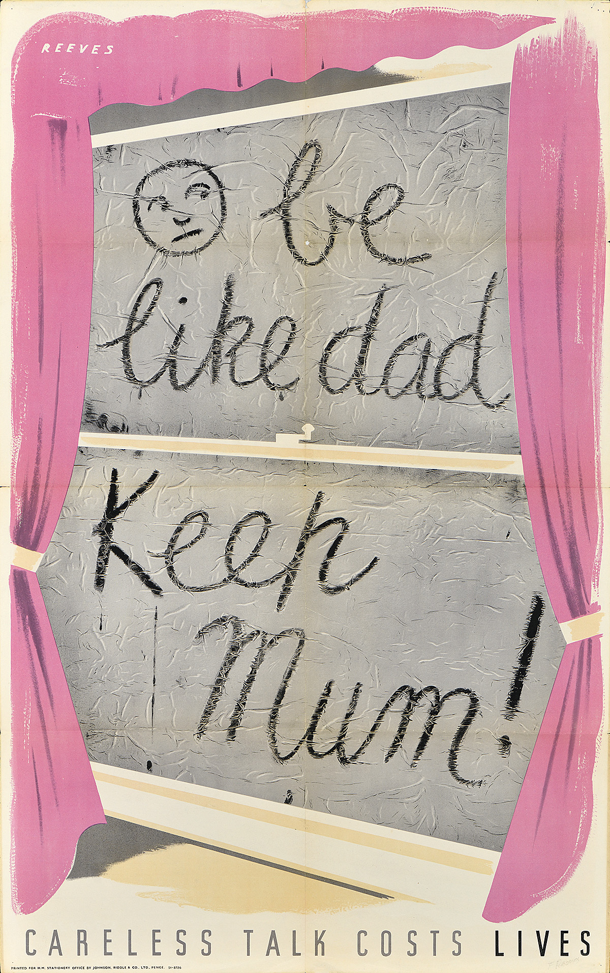
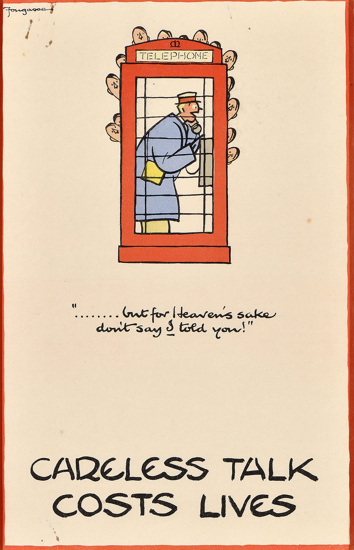
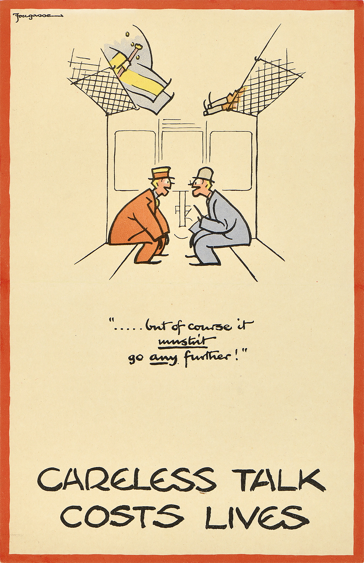
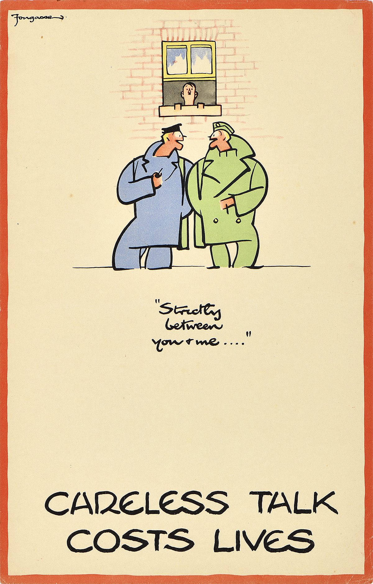
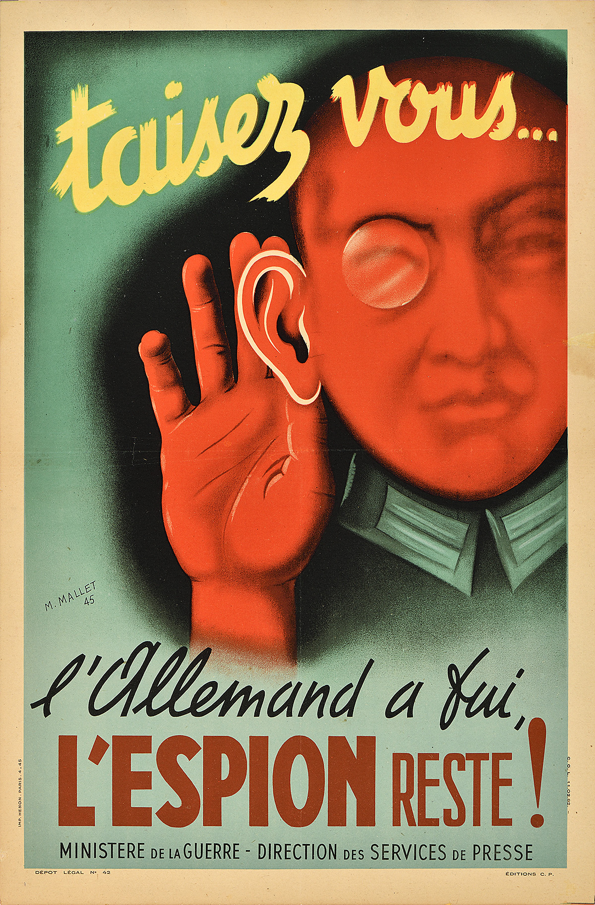
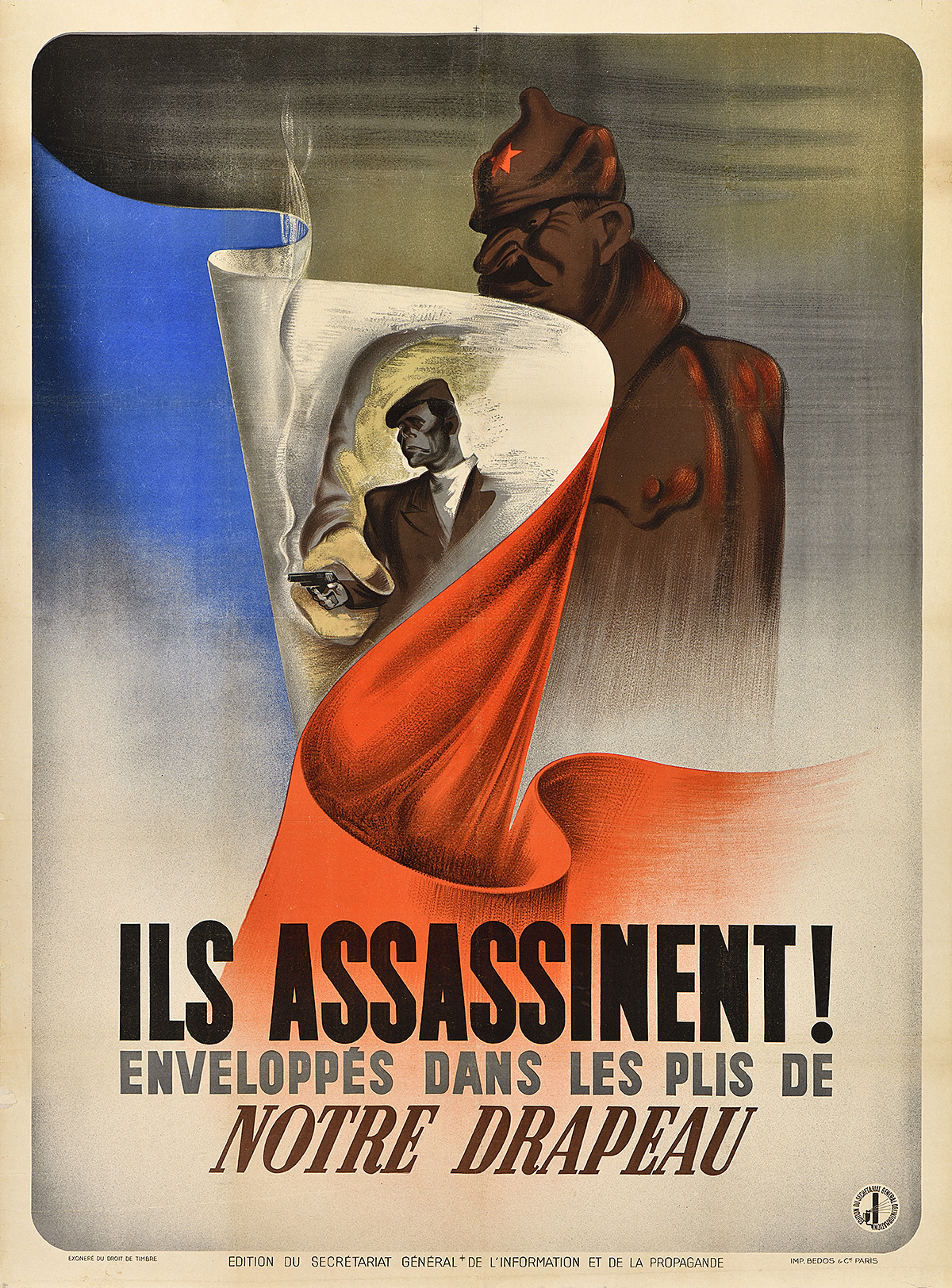
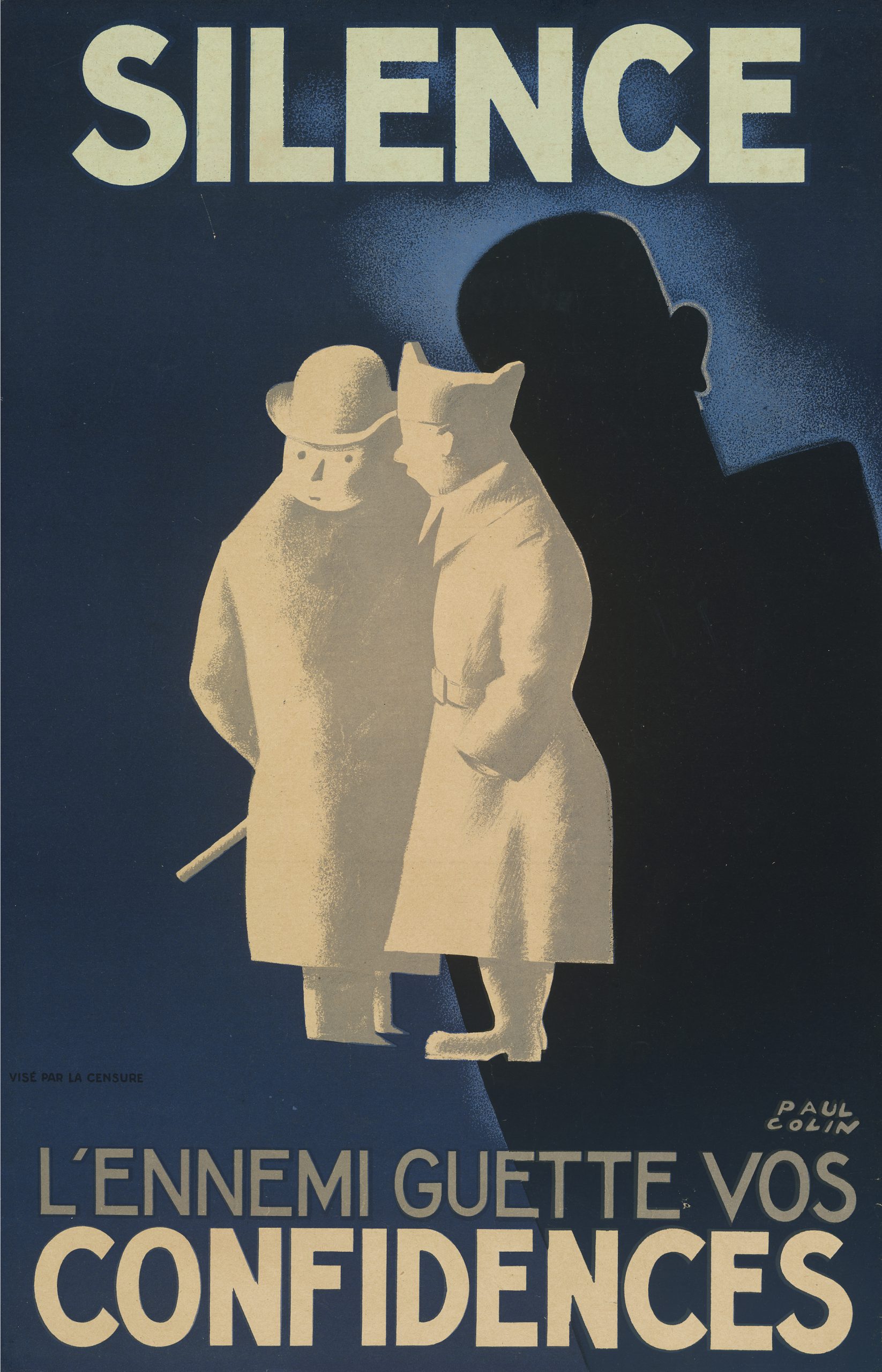
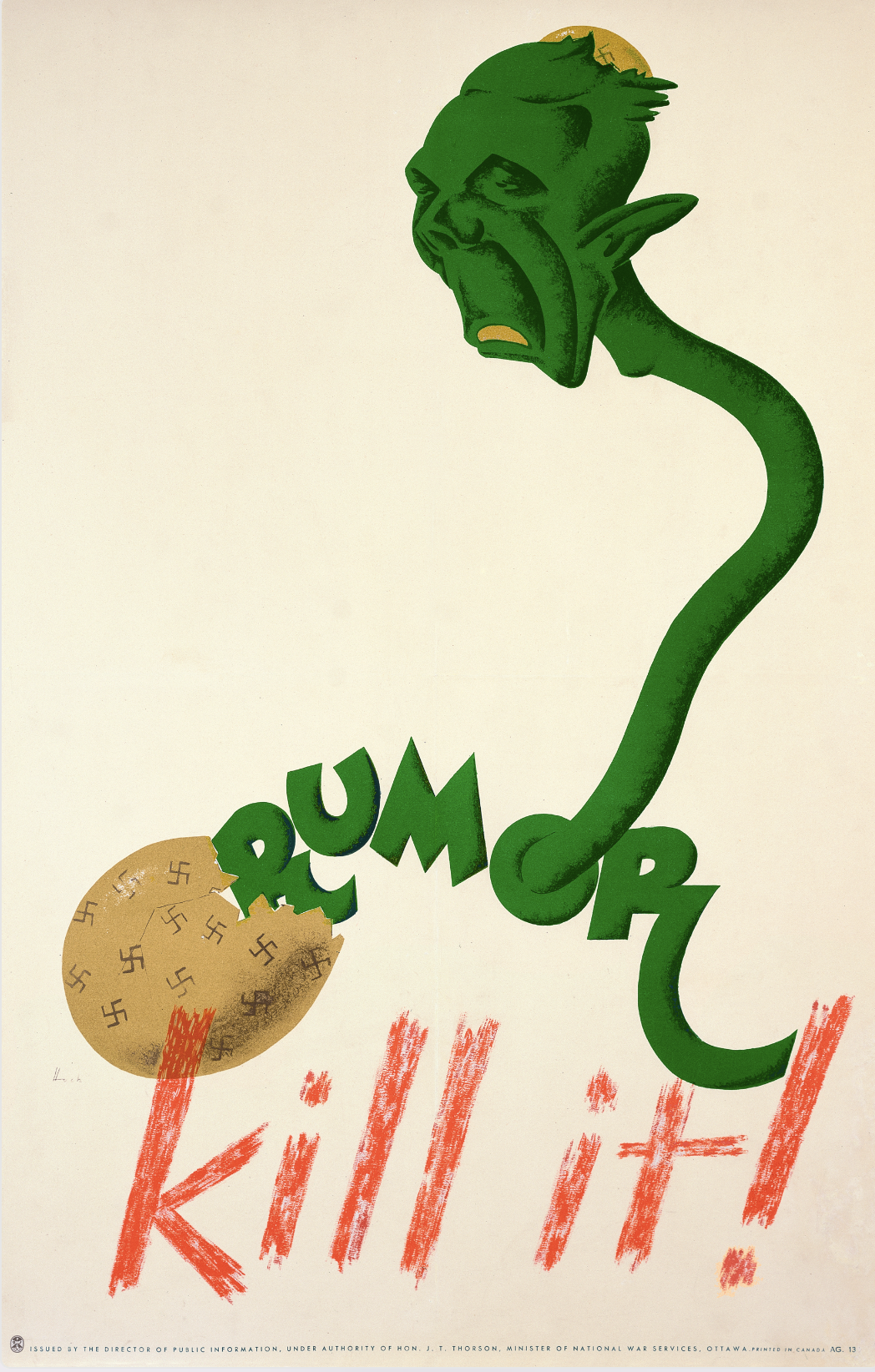
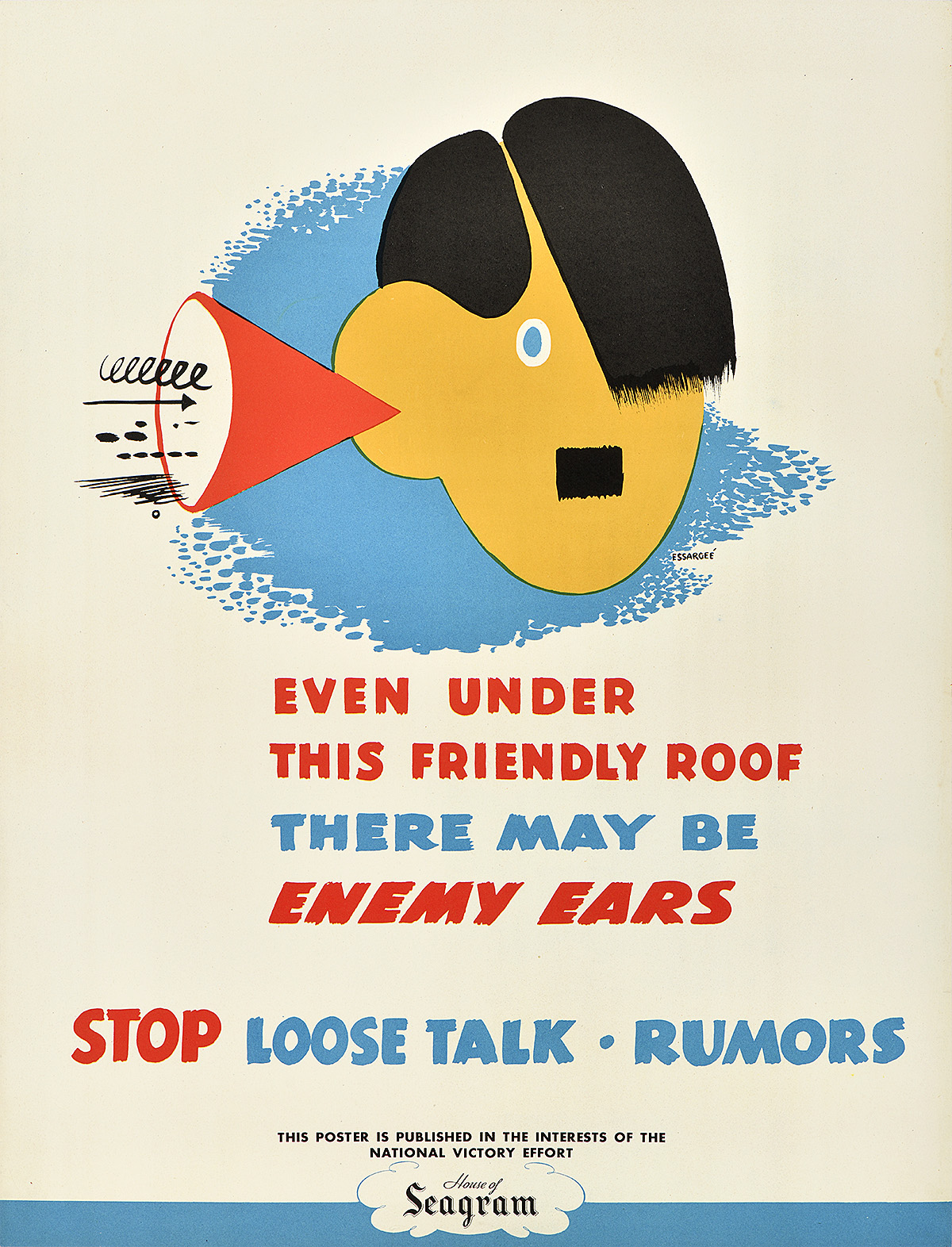
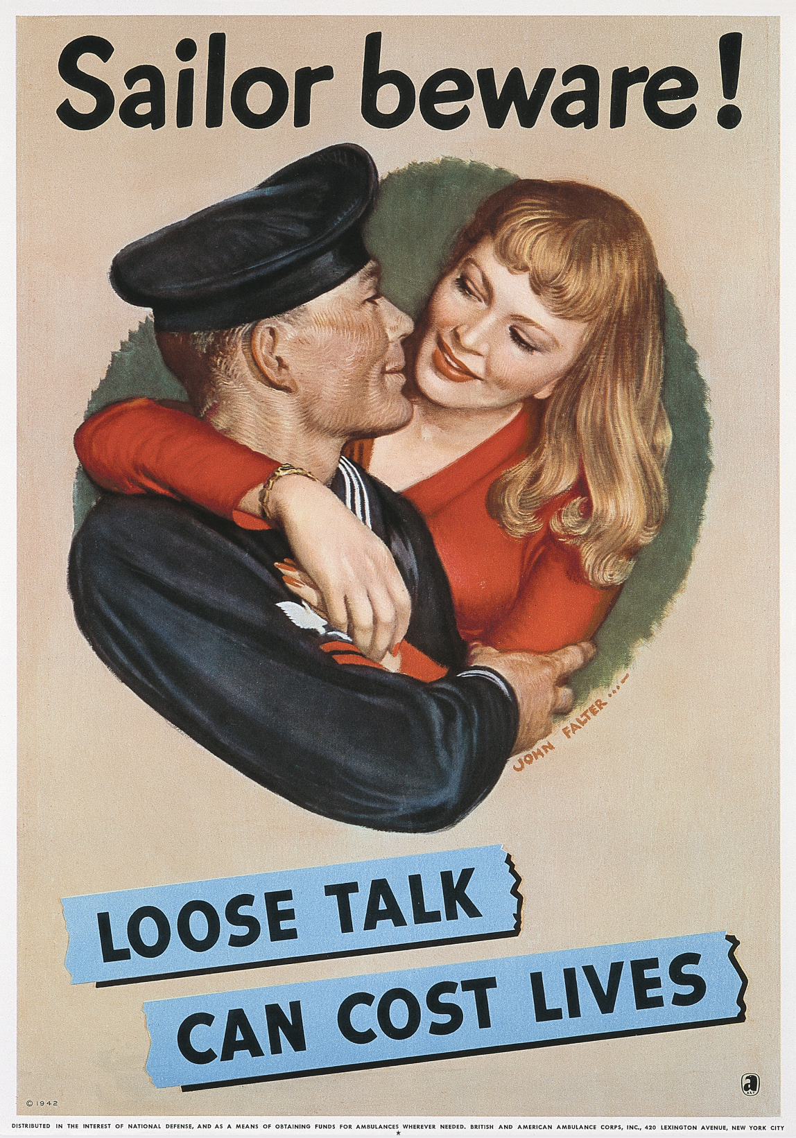
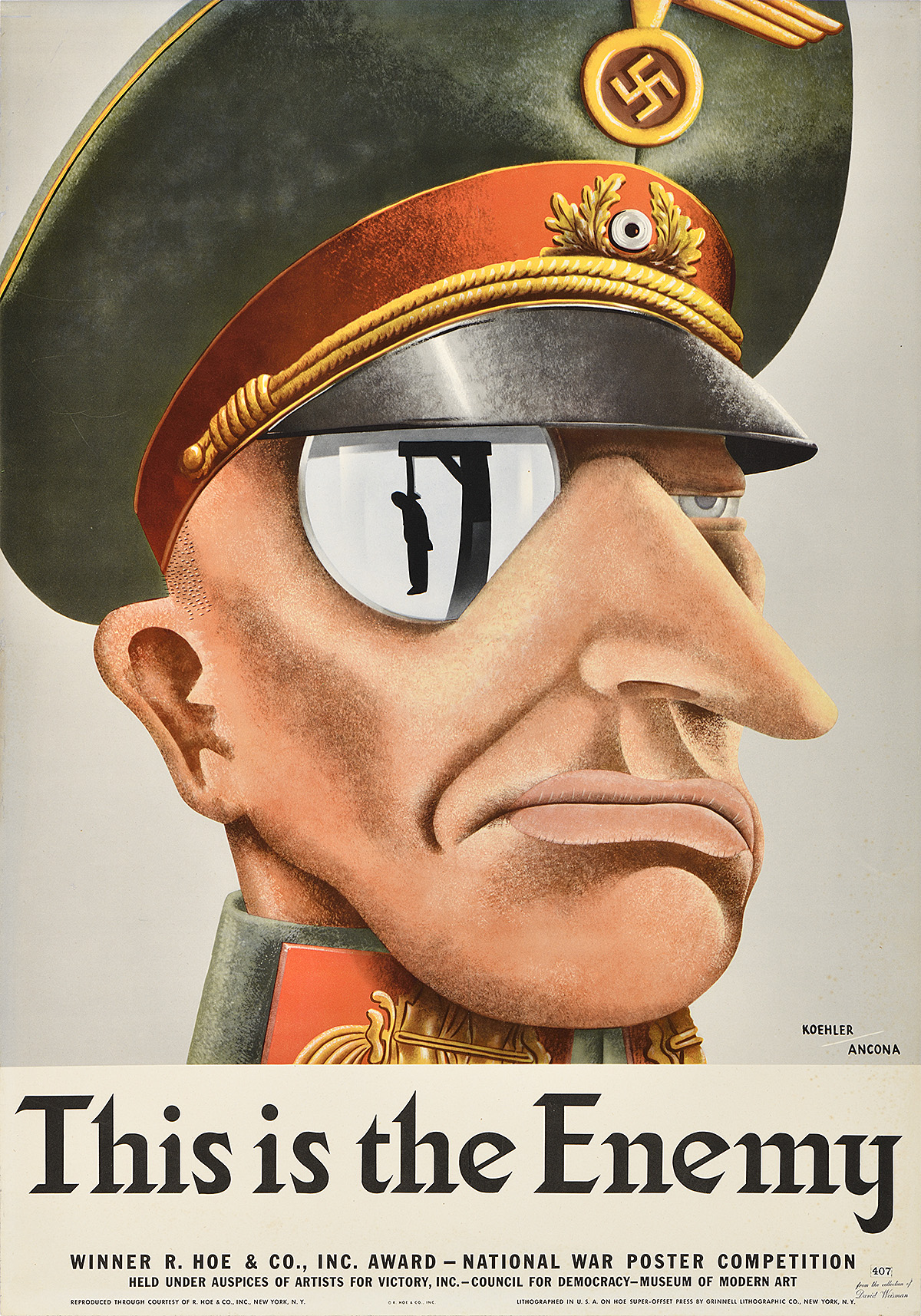
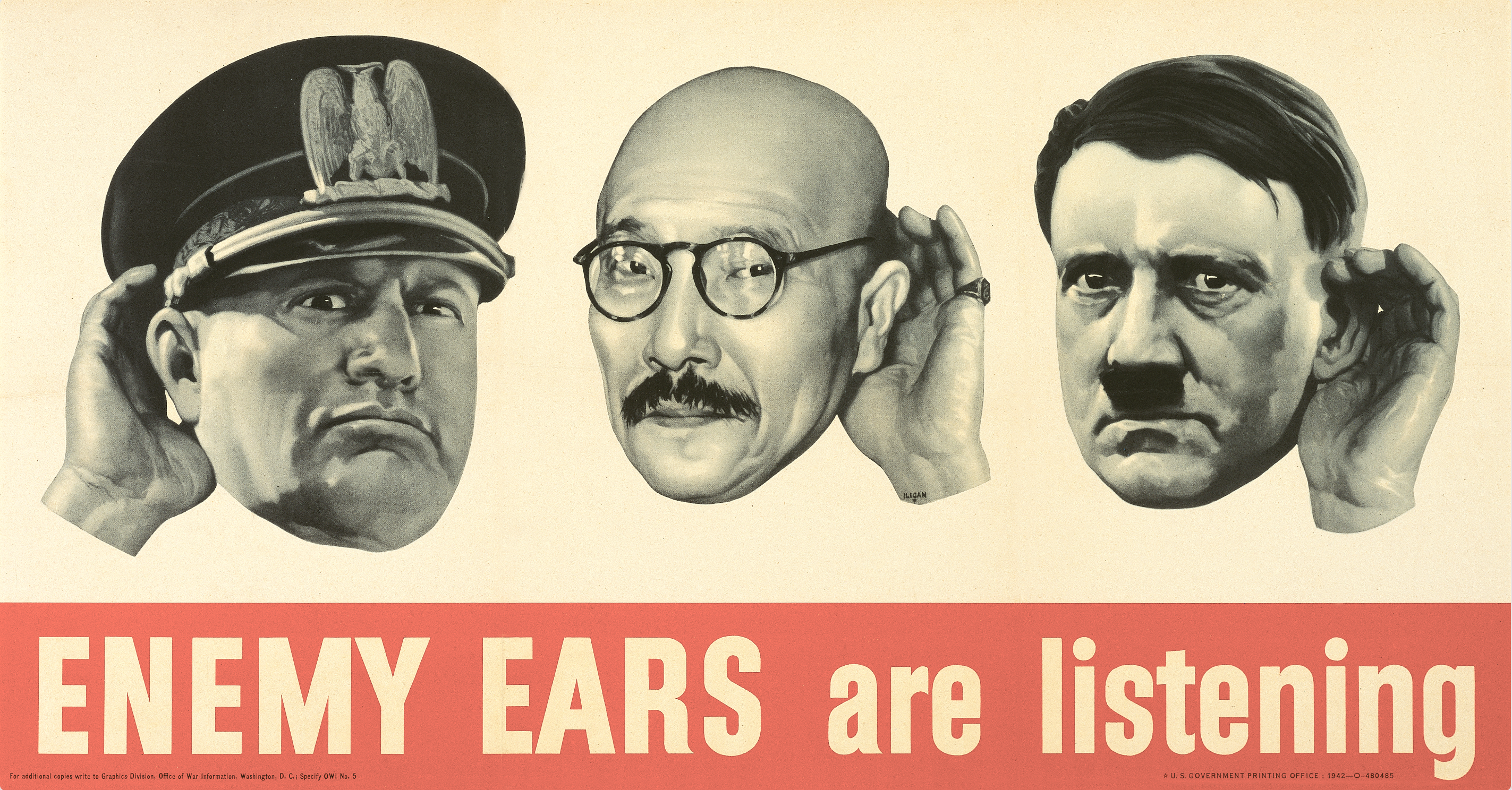
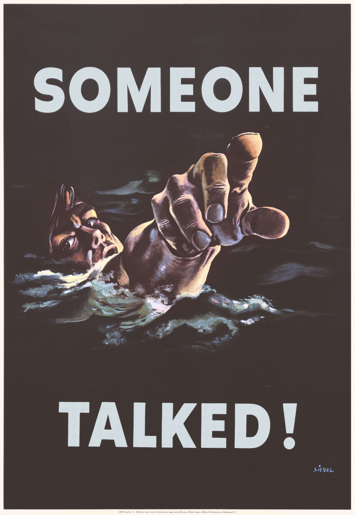
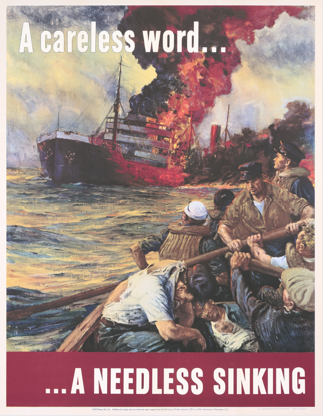
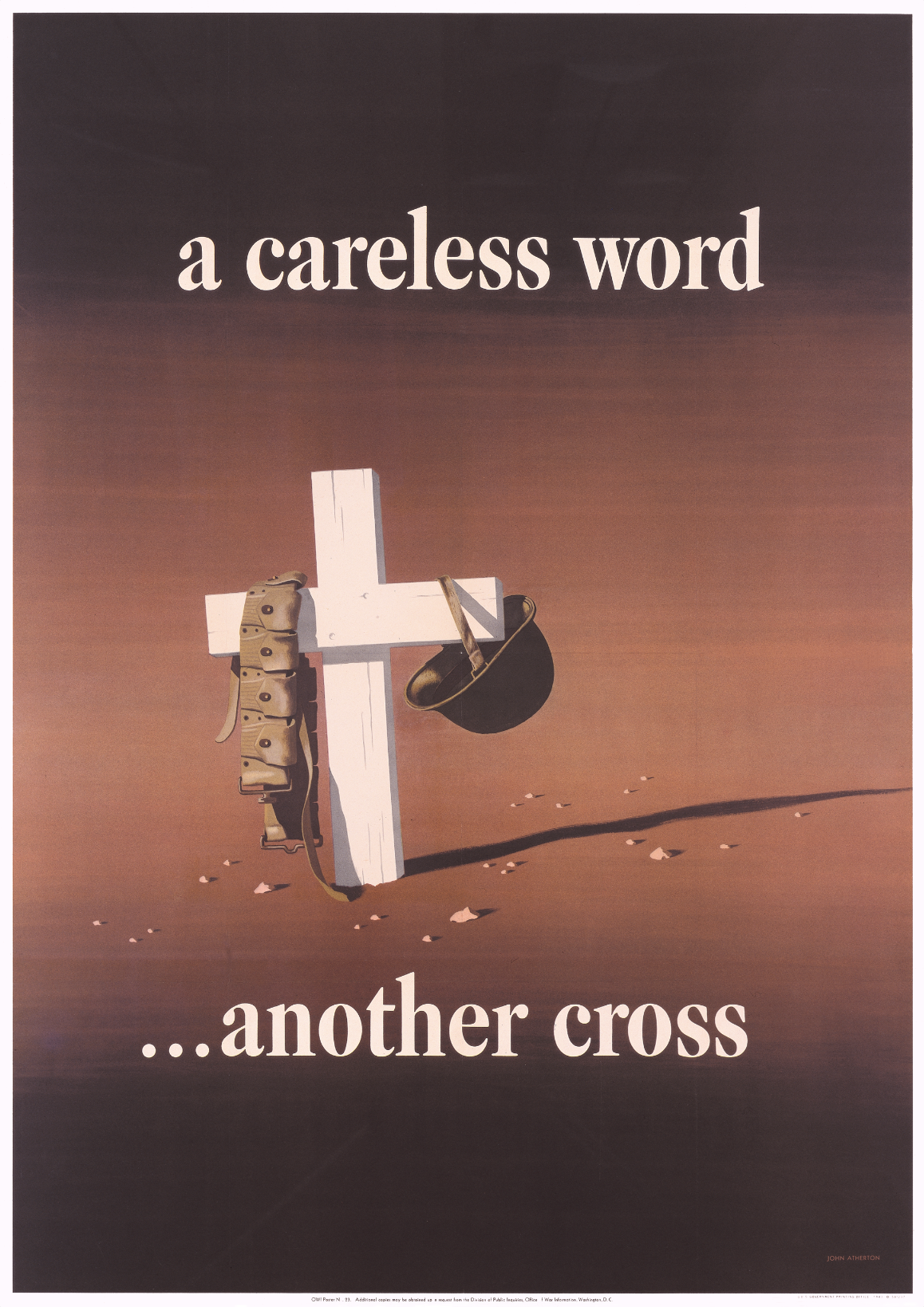
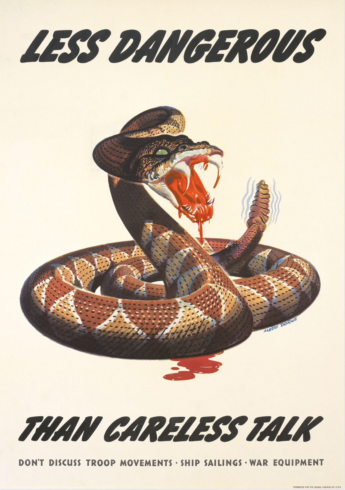
While World War II was global in scope, each country involved experienced it differently and therefore developed localized rules and mechanisms for communicating with its own population. Posters played an essential role in encouraging individuals to regulate their own behavior in the face of potential espionage. With their emotional appeals to patriotic duty, posters served both to define and reinforce national identities and characteristics at a time of crisis. They almost universally incorporated an acknowledgment of the human cost of war, inspiring citizens to “do their bit.” However this mass of posters warning of espionage presented a somewhat distorted version of reality. The popular spy-novel genre, a garrulous press, and the otherwise admirable wish of many members of the public to “get involved” contributed to a popular preoccupation with watching out for spies who were not there. 

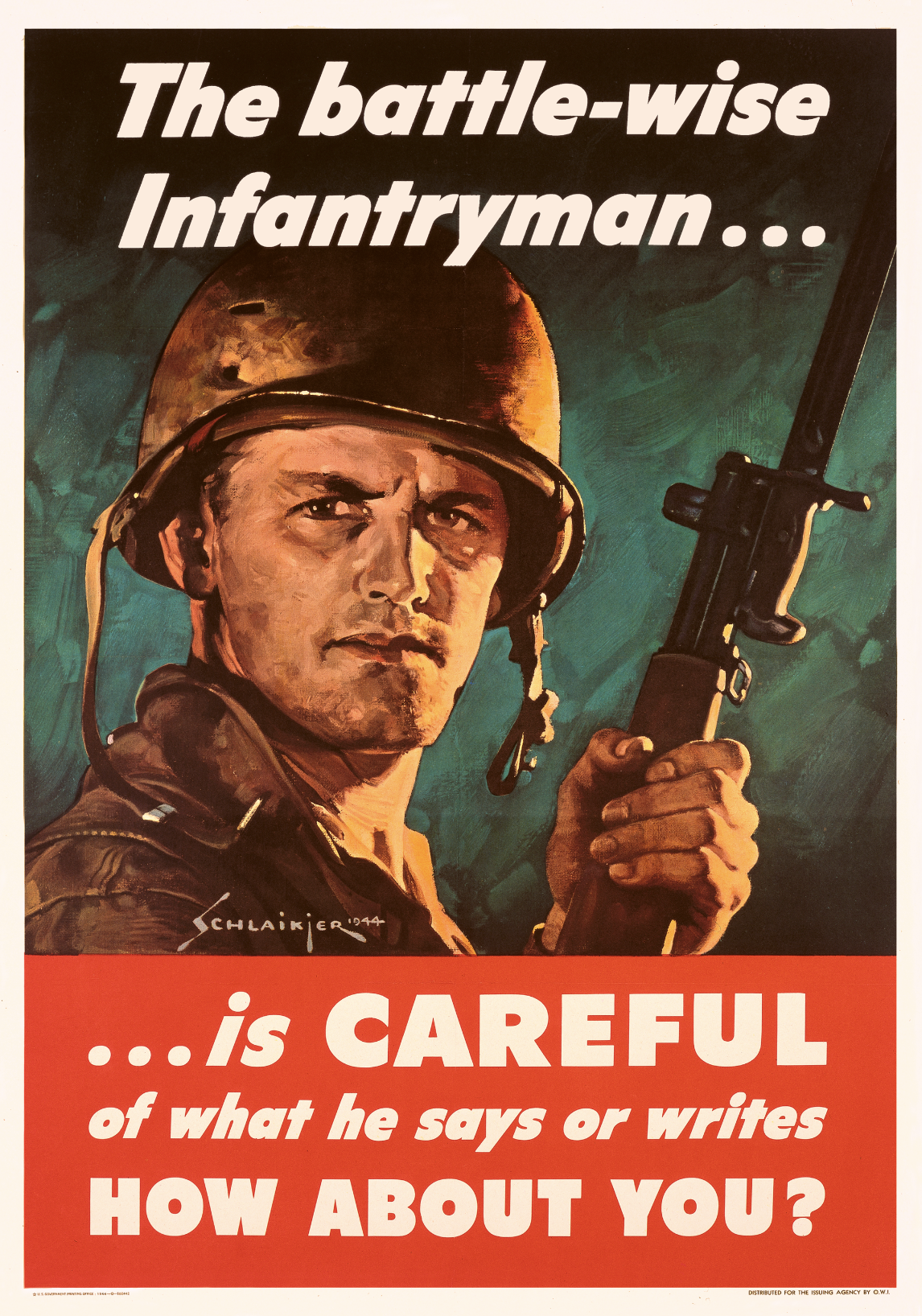
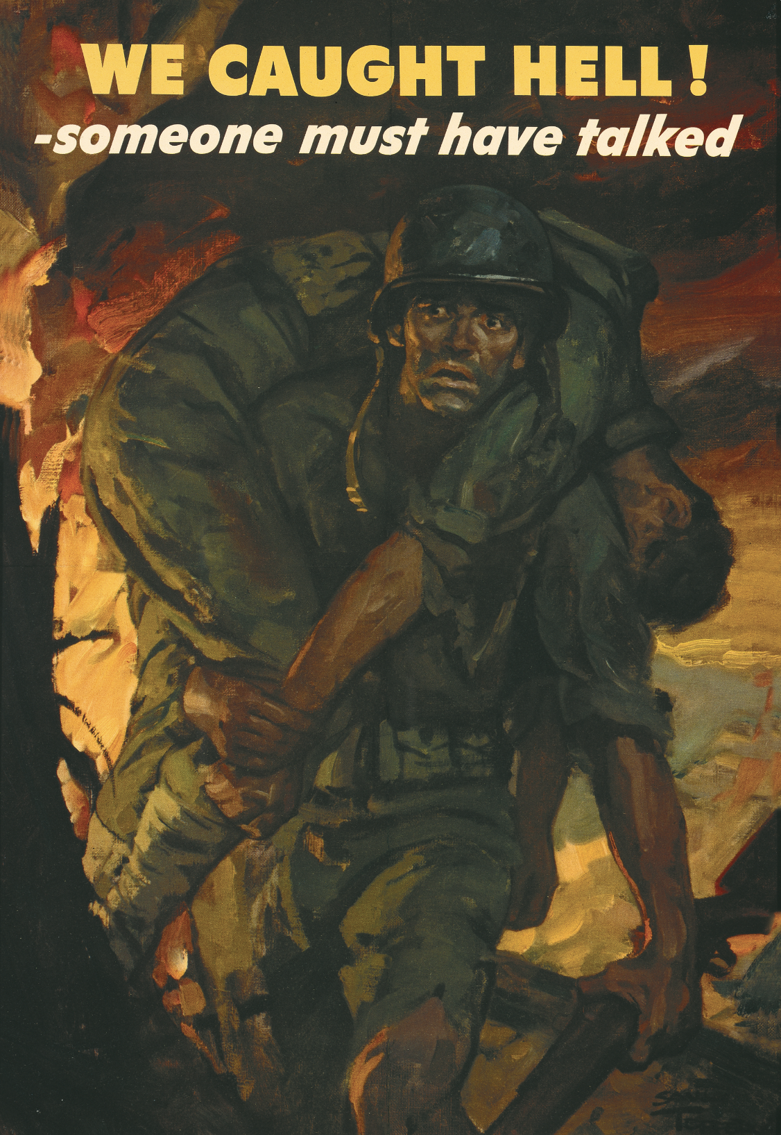
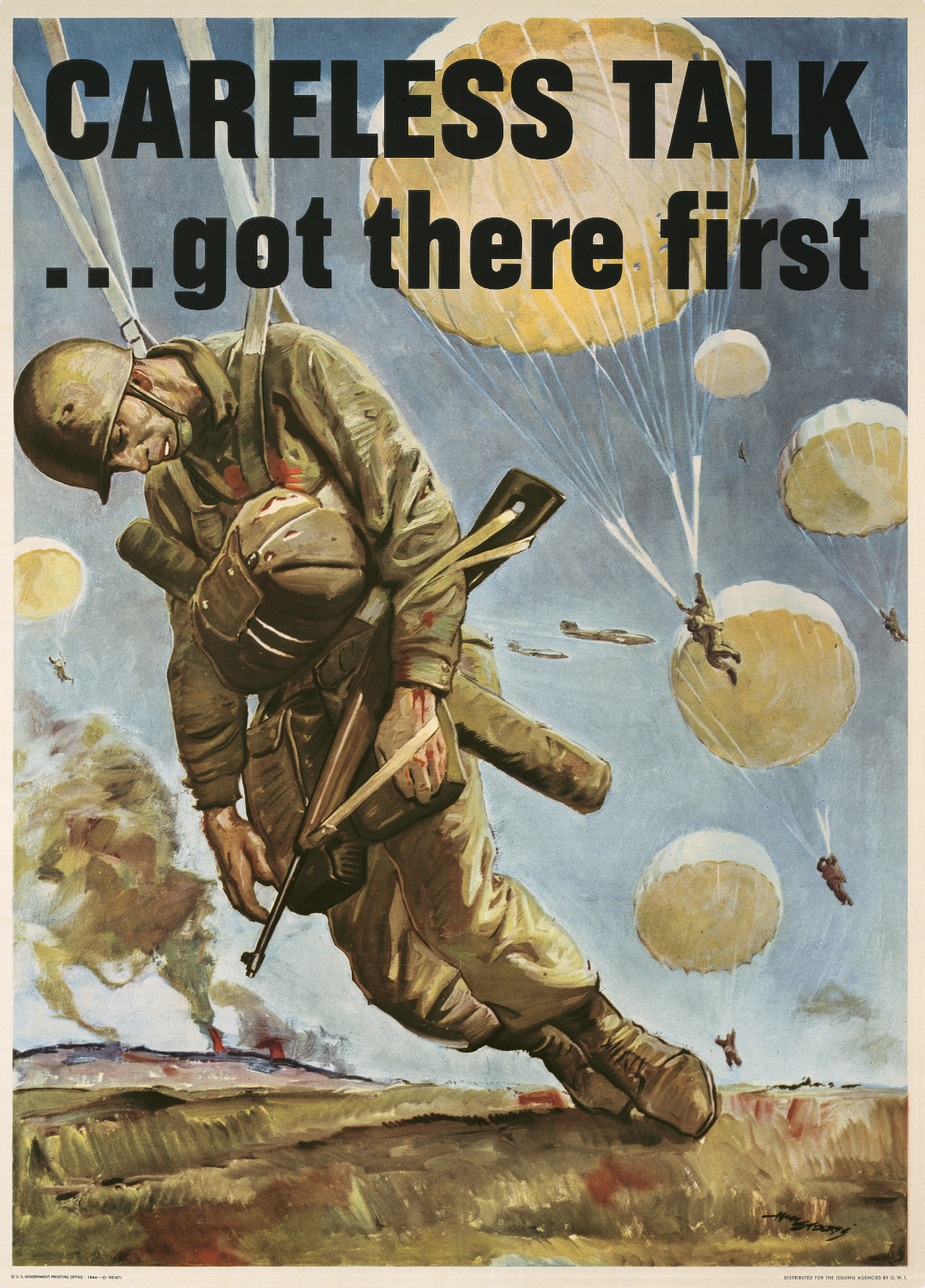
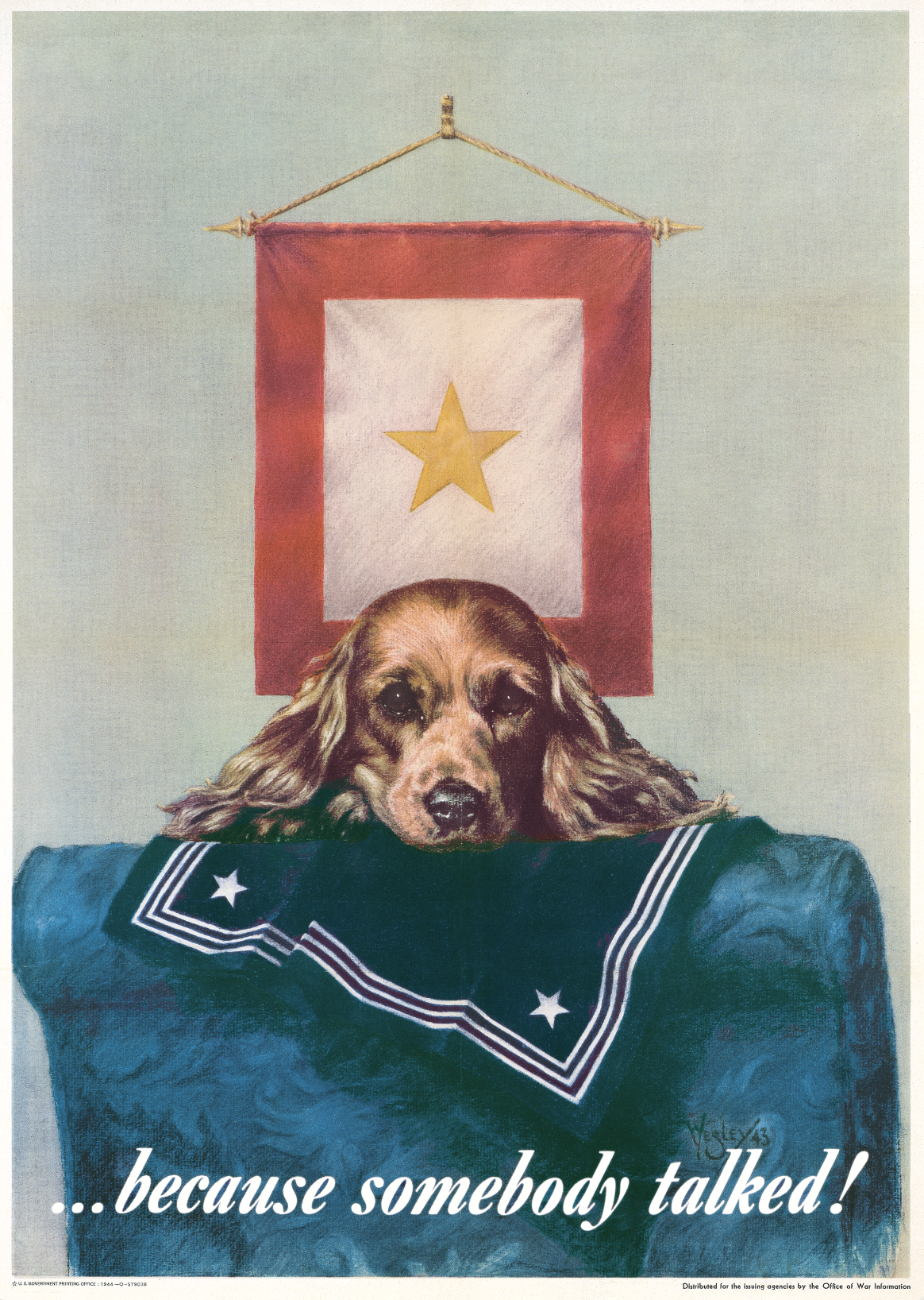
This exhibition includes posters from Great Britain, France, the United States, and Canada. The stylistic differences among them inevitably reflect each country’s individual artistic and cultural traditions, specific government directives, and its direct experience of the war. France, which was occupied by Germany in June 1940, and Great Britain, which was subject to German bombing raids from July of that year, both sustained massive civilian casualties. Their respective posters therefore focused on cheering humor and morale boosting, and, in the case of France, adapting the public to the country’s shifting political allegiances. For the United States and Canada, on the other hand, the war was a distant military conflict far from their civilian populations. Posters from these countries focused more directly on messaging that reminded the public that death was the ultimate outcome of war. In all instances, civilians were exhorted to fulfill part of their wartime social contract: vigilance against indiscretions and lurking spies.

Please be advised that this exhibition contains racist imagery.

“There is a well-defined class of people prone to ‘spy mania’…the War was the heyday of these worthy folk in every country.”—Winston Churchill 


British Posters

In World War II, British propaganda was overseen by the Ministry of Information, a government agency that had existed briefly in 1918, but was officially re-formed on September 4, 1939—the day after Britain had declared war on Germany. In October 1935, secret planning for the organization had already started, and by the time war broke out, posters had been designated to promote what the agency had officially established as the three pillars of British identity: humor (particularly as a coping mechanism), pragmatism, and resilience. Interestingly, by June 1943, the head of British counterintelligence believed that every active German agent within Britain was actually under his control; however, the MOI continued to produce posters warning of dangerous spies, both to unify the domestic population and to avoid alerting the Nazis to the reality of the situation. 

A photo-offset poster depicting a fogged up window with pink curtains and text of the title.

Be Like Dad, Keep Mum, 1940

Frederick Reeves (Dates Unknown)

Poster House Permanent Collection

  • This is one of several posters designed by Frederick Reeves as part of the “Be Like Dad, Keep Mum” subsection of the larger “Careless Talk Costs Lives” campaign. It plays upon traditional gender roles in Britain (“mum” is the British equivalent of the American “mom”) and references an idealized domestic life that had been left behind by many soldiers.   
  • While the series was effective, the misogynistic catchphrase was met with some pushback from the public and was even debated in the Houses of Parliament. On May 7, 1941, Labour MP Dr. Edith Summerskill asked the Minister for Information “whether he is aware that the poster ‘Be Like Dad, Keep Mum’ is offensive to women, and is a source of irritation to housewives, whose work in the home if paid for at current rates would make a substantial addition to the family income; and whether he will have this poster withdrawn from the hoardings?”
  • The phrase “Keep Mum” had a dual meaning, implying that women were both prone to gossip and therefore needed to keep quiet, as well as “kept” by their husbands as unpaid “support staff.” In reality, in many wartime British households women became the primary breadwinners and parents while their husbands fought abroad.  

“How carelessly we should have talked during the war but for Fougasse.”—Queen Elizabeth II

An illustrational poster of a figure talking in a red phone booth with heads looking from the top.

An illustrational poster of two figures in a train car leaning in and talking to each other.

An illustrational poster of two figures talking to each other under a figure in a window.

Careless Talk Costs Lives, 1940

Fougasse (Cyril Kenneth Bird, 1887–1965)

Poster House Permanent Collection

  • Fougasse was a renowned British cartoonist and the art director of Punch, a long-running satirical magazine. 
  • These three posters are from a set of eight that he designed for the Ministry of Information, donating his services and trademark style of pithy messaging leavened with humor. This new approach to poster design was welcomed by the ministry; more serious, traditional posters seemed to have resulted in information overload in an increasingly disaffected public. 
  • These images show average British citizens going about their everyday business while being monitored by Hitler(s) or the corpulent figure of Hermann Göring, the Commander in Chief of the Luftwaffe (German air force) that was attempting to bomb Britain into submission. 
  • Minutes taken during a British cabinet meeting on March 13, 1940, noted that Fougasse’s designs were the most popular pictorial posters, with 734,200 in circulation and a reprint order of 435,200 already placed.

French Posters

France experienced three distinct phases during World War II: war with Germany and Italy between September 1939 and June 1940; the German occupation (between June 1940 and September 1944) when the country was run by the German military in the North and, by the collaborationist, Christian, right-wing Vichy regime based in the French city of the same name; and finally, liberation as the Allied forces pushed back the Nazi occupiers. Different poster designers predominated in each phase, each with a distinct approach to official propaganda.

A photo-offset poster of a figure holding his hand up to his ear. He wear a monocole.

Taisez Vous!, 1945

Maurice Mallet (1900–2000)

Poster House Permanent Collection

  • Created after the liberation of France, this poster states that although the soldiers have departed, the Nazi enemy remains a threat: “Keep quiet! The German has fled, the spy remains!”
  • In this composition, a stereotypical German military officer, complete with monocle, is represented in the manner of a pantomime villain as he cups his ear to listen to civilian secrets.

A photo-offset poster of a soldier shooting a gun with a citizen. The French flag divides the two.

Ils Assassinent!, 1941

Raoul Eric Castel (1917–97)

Poster House Permanent Collection

  • Raoul Eric Castel is reputed to have created the greatest number of posters for the Vichy government between 1941 and 1944. In spite of his close association with a regime that collaborated with Nazi Germany, he remained sought-after as a poster artist after the war.
  • Here, a sinister-looking French resistance fighter with simian features is shown holding a smoking gun as he stands enfolded in the French flag. The face of the Russian soldier peering down at him from behind suggests both a caricature of Stalin and exaggerated anti-Semitic stereotypes.
  • The text translates as “They murder! Wrapped in the folds of our flag,” implying that resistance fighters were using false patriotism as a cover for their anti-French activities.
  • Additional text in the lower margin indicates that this poster was exempt from stamp duty, the tax paid in order to display posters publicly. The regime wanted its propaganda to be widely circulated without a prohibitive fee. 

A photo-offset poster of a soldier whispering to a citizen while a shadow watches.

Silence, 1939

Paul Colin (1892–1985)

Private Collection, NYC

  • This was one of the most widely distributed posters during the brief interlude between the French government’s declaration of war on Germany in September 1939 and the German invasion in May 1940.
  • Created by Paul Colin, one of the most important poster designers of the 20th century, this composition brings an elevated elegance to propaganda messaging. 
  • Colin introduces an ominous tension through the presence of a shadowy, faceless—presumably German—figure listening in on a conversation between a civilian and a soldier. Below, the text translates to “the enemy is watching out for your secrets.”

Canadian Posters

Canada entered the war in September 1939, alongside Britain and France. The government, however, had no centralized office to deal with information and the dissemination of propaganda. In December 1939, it established the Bureau of Public Information to oversee the production of posters. At this early stage, it lacked the capacity to set the tone for government propaganda, meaning that Canadian posters tended to have a less coherent style than those of the United States or Great Britain. It was not until September 1942 that the bureau was succeeded by the Wartime Information Board which took a more prescriptive approach to such official messages.

“Propaganda is a hammer to shape society.”—John Grierson, General Manager of the Canadian Wartime Information Board, founding commissioner of the Canadian National Film Board

A photo-offset poster of a cracked swatsika egg with a snake creature with a goblin head exiting.

Rumor—Kill It!, c. 1942

Hoch (Dates Unknown)

Gift of Peter A. Blatz, Poster House Permanent Collection

  • Published by the Director of Public Information in Ottawa, this surreal design shows the Nazi propaganda minister, Joseph Goebbels, in the guise of a serpent emerging from a swastika-covered egg. 
  • The poster was issued in at least two sizes in both English and French, indicating that it was intended to be widely circulated throughout Canada.

An illustrational poster of Hitler listening to a funnel of words flying in to his ear.

Stop Loose Talk, 1943

Essargeé (Seymour R. Goff, 1904–92)

Poster House Permanent Collection

  • Issued by Seagram Distillers, this poster is from a series created specifically for use in bars to warn those enjoying a few drinks to watch what they say while under the influence. 
  • Seymour R. Goff, known by the pseudonym Essargeé (or Es-ar-gee, a play on his initials), was the art director for Seagram. He created a handful of designs in this series, each relying on simplified graphic forms and a reduced color palette of red, yellow, and blue. Here, he stylizes the Führer’s distinctive hair and toothbrush mustache to suggest that Hitler himself might be listening to the barroom banter.

A photo-offset poster of two images: Multiple figures talking in a tavern and a sinking ship.

He Talked…This Happened, c. 1941

A.J. Russel Taber (1916–58)

Private Collection, NYC

  • This poster was published by the National Film Board of Canada, which may explain why the visual narrative is reminiscent of a traditional lobby card or a movie storyboard. 
  • As with many American designs, this composition requires the viewer to work out cause and effect. The upper register shows two sailors talking in a bar. One has just divulged that a ship “sails at midnight” while an eavesdropping spy peers beyond the edge of his newspaper. The consequence of leaking this information is shown in the lower register, where the ship in question has been sunk, killing many aboard.

U.S. Posters

American wartime posters stand in stark contrast to those of Europe and Canada. Historically, their designers had relied on a distinctive visual language, one that they continued to deploy throughout World War II. One government-commissioned study found that humorous posters were less appealing to Americans than to the British and that the most successful American posters appealed directly to the viewer’s emotions by presenting photorealistic compositions that pointed to the direct consequences of irresponsible behavior. 

Throughout the war, the United States effectively mobilized the private sector for the war effort, and this included the production of posters. A government-approved pool of commercial artists formed a cooperative agreement with the Office of War Information (OWI) which controlled the content of every government poster published between 1942 to 1945, resulting in an unusually coherent design style. Most American posters established a direct link between a military disaster and a person’s verbal indiscretion, thus encouraging the idea of individual responsibility for national security. This was essential to American propaganda; unlike in Europe, civilians were not directly affected by the physical violence of the war and it was felt they had to be prodded by fear, shame, or guilt to stay invested.  

It is hard to overstate the pervasiveness of  “spy fever” during the early days of the United States’ direct involvement in the war, one reinforced by extensive government informant programs and widespread propaganda. In March 1942, J. Edgar Hoover, the longstanding director of the Federal Bureau of Investigation (FBI), reported that the organization had 17,000 active informants in the United States.

“Words are ammunition. Each word an American utters either helps or hurts the war effort.”—Office of War Information

A photo-offset poster of a man's face with an X across his lips.

Closed for the Duration, 1942

Howard Scott (1902–83)

Private Collection, NYC

  • This poster was published by the British and American Ambulance Corps, a volunteer organization based in New York that purchased and equipped medical and dental ambulances for the Allied war effort. 
  • Even though the poster was not officially produced by the Office of War Information, the designer still adhered to the expected style for the American public: a direct, photorealistic illustration that indicated both visually and verbally that citizens should keep their mouths shut.

A photo-offset poster of a woman with her arms around a sailor. They gaze into each other's eyes.

Sailor Beware!, 1942

John Phillip Falter (1910–82)

Private Collection, NYC

  • Issued by the British and American Ambulance Corps, this composition warned sailors against letting their guard down during amorous encounters.  
  • Similar posters warning servicemen against the dangers of contracting venereal disease from “goodtime girls” were designed to be displayed in barracks. In all cases, the woman is shown as an alluring temptress, often clad in “red for danger.” In reality, the most decorated spies on the Allied side were women, but they primarily relied on bravery and intellect rather than their physical charms to achieve their aims. 

A photo-offset poster of a Nazi soldier wearing a monacle with a hanged person in the reflection.

This is the Enemy, 1942

Karl Koehler (1913–2000) & Victor Ancona (1912–98)

Courtesy of Meehan Military Posters, NYC

  • This poster won the 1942 National War Poster Competition run by the Museum of Modern Art in New York and funded by the printer R. Hoe. Such competitions were a feature of the war years, with many institutions calling for artists to submit propaganda designs.
  • The German officer depicted here is the epitome of the stereotypical arrogant, unfeeling Nazi monster. He is most likely a caricature of SS General Reinhardt Heydrich, described by Adolph Hitler as “the man with an iron heart.” 
  • The focal point of this design is the officer’s monocle which reflects the scene of a civilian hanging on a gallows—possibly a reference to the general’s nickname, “Hangman Heydrich.” Monocles were frequently associated with German generals. They had traditionally been worn by members of the Prussian nobility, and while the German army did not allow eyeglasses, monocles were approved.

“These posters should be shouting from unexpected places with all the urgency which this war demands.”—Walter F. Conway to Glenn L. Alt, November 9, 1942, Records of the OWI

A photo-offset poster of multiple military leaders with their hands up to their ears, listening.

Enemy Ears are Listening, 1942

Ralph W. Iligan (1893–1960)

Gift of Peter A. Blatz, Poster House Permanent Collection

  • The poster incorporates photorealistic images of the leaders of the Axis nations: Adolf Hitler, Chancellor and Führer of Germany, Benito Mussolini, Prime Minister of Italy, and Hideki Tojo, Prime Minister and Minister of War in Japan. 
  • Because of Japan’s relative geographic proximity, spies working for its government represented a greater psychological threat to the United States than to Europe. As such, American posters reflect a higher level of anti-Japanese sentiment, especially after the bombing of Pearl Harbor on December 7, 1941.
  • The artist’s signature here is written on Tojo’s wrist rather than appearing at the lower corner, a more conventional location.

A photo-offset poster of a drowning figure pointing their finger directly at the viewer.

Someone Talked!, 1942

Frederick “Fritz” Siebel (1913–91)

Private Collection, NYC

  • Frederick Siebel migrated from Austria to the United States in 1936, where college and national service saved him from the fate of his relatives who died in the Holocaust. 
  • This design was originally the winning entry in a competition organized by the Devoe & Reynolds Painting Company and judged by Eleanor Roosevelt. 
  • The poster references the recent sinking of ships off the coast of the United States. The drowning sailor directly confronts viewers with his pointed finger, implicating them in his death because “someone talked.”The image echoes the famous World War I I Want You recruitment poster by James Montgomery Flagg.

A photo-offset poster of a sailor looking grim in a lit window.

This Man May Die, 1942

Valentino Sarra (1903–82)

Private Collection, NYC

  • A highly successful commercial photographer both before and after the war, Valentino Sarra incorporated photography into each of the handful of poster designs he created for the U.S. government. 
  • Here, an isolated and solemn sailor is spotlighted as he peers out of the porthole of a submarine, reminding viewers of the individual lives that might be lost if they “talk too much.”

A photo-offset poster of a large boat burning down. Another boat full of sailors paddles away.

A Careless Word…A Needless Sinking, 1942

Anton Otto Fischer (1882–1962)

Gift of Peter A. Blatz, Poster House Permanent Collection

  • Anton Otto Fischer, a German immigrant, was best known as an illustrator for the Saturday Evening Post. He also created a handful of propaganda posters for the U.S. government, all of which play on the tagline “a careless word.” 
  • This and other compositions of similar subjects caught the attention of the military, who swore him in as a lieutenant commander with the task of painting the heroic deeds of the merchant mariners and Coast Guardsmen. The archive of his work is currently housed in the Coast Guard Academy in Connecticut.

A photo-offset poster of a cross in a desert with a solider's helmet and ammo belt on it.

A Careless Word…Another Cross, 1942

John Atherton (1900–52)  

Gift of Peter A. Blatz, Poster House Permanent Collection

  • Like many in the group of designers approved by the OWI, John Atherton was both a commercial and a fine artist, and his posters appear more painterly than many of their European equivalents. 
  • This poster relies on the artist’s trademark browns and other muted colors, appropriate to the solemn subject matter. 
  • In 1941, another of his poster designs was awarded first prize in the National Defense Poster Competition organized by the Museum of Modern Art in New York.

A photo-offset poster of a rattlesnake rattling its tail with blood dripping from its mouth.

Less Dangerous Than Careless Talk, 1944

Albert Dorne (1904–65)

Gift of Peter A. Blatz, Poster House Permanent Collection

  • Albert Dorne was a highly successful commercial artist renowned for his ability to attract the viewer’s gaze with his powerful graphic images. Here, he presents a coiled, green-eyed rattlesnake with exaggerated fangs and blood dripping from its mouth to the ground.

A photo-offset wanted poster of a woman with styled hair and makeup, with a closed lip smile.

Wanted! For Murder, 1944

Victor Keppler (1904–87)

Poster House Permanent Collection

  • Victor Keppler was a commercial photographer rather than a graphic artist. He provided the smirking image of an anonymous woman in the style of a mugshot. It is not known who wrote the text. 
  • While every other American poster emphasizes the risks of careless speech, this one suggests a premeditated intent to kill. It also reinforces the idea that women are more prone to gossip than men and that such activities might lead directly to the deaths of soldiers abroad. 
  • The inherent misogyny of this message was not lost on some members of the American public. A letter to the Office of War Information notes that: “American women who are knitting, rolling bandages, working long hours at war jobs and then carrying on with ‘women’s jobs’ at home—in short, taking over the countless drab duties to which no salary and no glory are attached, resent these unwarranted and presumptuous accusations which have no basis in fact.”

A photo-offset poster of a man with two funnels in his big ears and communication devices on him.

Serve In Silence, 1944

Designer Unknown

Poster House Permanent Collection

  • Issued by the San Francisco Junior Chamber of Commerce under the auspices of the Works Progress Administration (WPA), this poster is more illustrational and less polished than those put out by the OWI. 
  • The image reflects the widespread anti-Japanese sentiment of the war years, presenting a menacing Japanese caricature using a variety of devices to spy on those around him, his pockets overflowing with notes. Given that San Francisco was home to thousands of Japanese immigrants, most of whom had been forced into internment camps starting in 1942, it also has broader implications. 
  • Propaganda is meant to provoke passionate responses. Here, the racially-charged stereotype of a Japanese figure has inspired a viewer to add their own vitriol to the poster, defacing the area around the man’s head and inserting a racial slur inside his shoes. 

A photo-offset poster of a soldier in action, holding a gun looking seriously at the viewer.

The Battle-Wise Infantryman, 1944

Jes Wilhelm Schlaikjer (1897–1982)

Gift of Peter A. Blatz, Poster House Permanent Collection

  • This poster plays on the public’s need to believe that their own behavior might improve the outcome for their loved ones abroad and puts the burden on the viewer to live up to the standards of the “battle-wise infantryman” who knows how to self-censor. 
  • In addition to the many posters he produced during World War II, Jes Wilhelm Schlaikjer painted the War Department’s official portraits of such military leaders as Dwight D. Eisenhower, Douglas MacArthur, and George S. Patton. 

A photo-offset poster of a solider carrying another soldier on his back, surrounded by fire.

We Caught Hell, 1944

Saul Tepper (1899–1987)

Gift of Peter A. Blatz, Poster House Permanent Collection

  • Although best known as an oil painter, Saul Tepper was commissioned by a variety of major corporations, including General Electric, General Motors, Mobil, and Coca-Cola, to produce advertising designs.
  • Alternative versions of this poster include the tagline “Silence Means Security,” highlighting the particularly American approach to poster design: a combination of blunt messaging with melodramatic imagery.

A photo-offset poster of a dead soldier hanging from a parachute, surrounded by other parachutes.

Careless Talk…Got There First, 1944

Herbert Morton Stoops (1888–1948)

Gift of Peter A. Blatz, Poster House Permanent Collection

  • Part of the same “Careless Talk” series as some of the other posters on display, this image shows the corpse of an American paratrooper, shot in mid-air, still dangling from his parachute as his boots drag on the ground and his comrades land behind him.  
  • Herbert Morton Stoops was the cover designer for Blue Book between 1935 and his death in 1948, four years after creating this poster. His work is painterly and detailed, a stark contrast to the work of European posterists who relied on bold graphics to convey the main message. 

“War posters that are symbolic do not attract a great deal of attention, and they fail to arouse enthusiasm. Often, they are misunderstood by those who see them.”—Office of Facts and Figures, 1942

A photo-offset poster of a hand wearing a swatsika ring holding a swatsika medal.

Award For Careless Talk, 1944

Steven Dohanos (1907–94)

Poster House Permanent Collection

  • This poster shows a hand wearing a ring with the swastika proffering a Nazi gallantry medal, the Iron Cross, to the viewer as a reward for “careless talk.”
  • The Iron Cross was a German award for military valor that had been introduced by the Kingdom of Prussia in 1813 during the Napoleonic Wars. It was appropriated by the Nazis in 1939 when the swastika was added to the design.
  • Steven Dohanos was an artist and illustrator best known for his covers for the Saturday Evening Post and also worked for the Section of Painting and Sculpture of the U.S. Treasury Department.

A photo-offset poster of a dog laying sadly on lounge chair with a sailor's uniform on it.

Because Somebody Talked!, 1944

Wesley Heyman (1918–2002)

Private Collection, NYC

  • Unlike the majority of posters issued by the Office of War Information, this one was not designed by an artist in the approved “pool” and therefore broke with many of the rules of official American propaganda. Normally, such unsolicited compositions were rejected—as was initially the case with Norman Rockwell’s famous Four Freedoms paintings. The OWI printed 4 million sets of posters with the images only after they had been published in the Saturday Evening Post and received an overwhelmingly positive response from the public.   
  • Despite this breach of protocol, the OWI allowed Wesley Heyman’s image to hang in office buildings as well as to be reproduced in newspapers and magazines. Reprint requests for the poster broke all previous records.
  • The sentimentality of the composition worked strongly in its favor. The Gold Star Service Flag in the background represents a serviceman who has died in action and was of the kind that would have been hung in his parents’ home. Rather than showing a family in mourning, however, Heyman depicts a solemn cocker spaniel, his head resting on the dead sailor’s uniform collar.

Acknowledgements

Curation
Tim Medland

Design
Ola Baldych

Special Thanks
Mary Ellen Meehan, Meehan Military Posters
Jim Meehan, Meehan Military Posters
Dr. Nicholas A. Harlow, military historian